Category: Design

Modern pantry design for small spaces with floor-to-ceiling glass door cabinets.

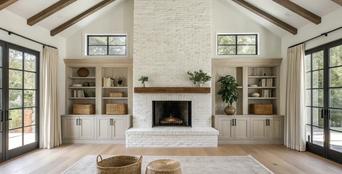
A Designer’s Guide to Small Pantry Design

A sophisticated pantry shouldn’t just store your goods—it should work for you. This is especially true in a compact space, where every feature needs a purpose. Think of your pantry not as a limitation, but as a small, hardworking jewel box in your home. With the right approach to pantry design small areas can become incredibly efficient and feel luxurious. We’ll show you how to use clever, multi-functional elements to transform a simple storage closet into a seamless part of your daily routine, making your life easier and your home more beautiful.

Key Takeaways

  • Think vertically to maximize your space: Use floor-to-ceiling shelving and door-mounted racks to make the most of your pantry’s height. You can also add more utility by integrating multi-functional features, like a small built-in prep counter for a coffee station.
  • Keep everything in sight with smart storage: Use pull-out drawers, corner carousels, and clear containers to make every item easy to find. This approach helps you keep an accurate inventory and makes your daily kitchen tasks feel effortless.
  • Create an open feel with the right design choices: Make your pantry feel larger by choosing a light color palette, reflective surfaces, and a strategic mix of open shelving and closed cabinets. These elements work together to build an airy, uncluttered look that is both organized and stylish.

Planning Your Perfect Small Pantry

A truly exceptional pantry begins long before the first shelf is installed. It starts with a thoughtful plan centered entirely around you and your lifestyle. The most beautiful pantry is useless if it doesn’t function for your daily needs, which is why we always begin by understanding how our clients live. Do you buy in bulk? Are you an avid baker who needs space for specialty flours and sugars? Do you have small children who need easy access to healthy snacks? Answering these questions helps create a blueprint for a space that is not just organized, but intuitive. A well-designed pantry should feel like a natural extension of your kitchen, making meal prep and daily routines feel seamless and simple.

Beyond your current habits, a great plan also looks to the future. It’s about creating a flexible space that can adapt as your life changes. This means considering elements like proper ventilation to protect your food, prioritizing accessibility so nothing gets lost in the back, and designing for your long-term needs. By focusing on these foundational principles, you can build a small pantry that offers lasting value and sophistication. It’s this meticulous, forward-thinking approach that transforms a simple storage closet into a cornerstone of a well-managed and beautiful home, proving that luxury is found in the details that make your life easier.

Consider Your Long-Term Needs

When designing a pantry, it’s tempting to focus only on your immediate storage problems. However, the best designs are built to last. It’s wise to think about how you’ll use the space in the next five to ten years. For example, a growing family might need more room for bulk items and snacks, while empty nesters may want to convert some space for small appliance storage. A truly custom pantry can accommodate these shifts with features like adjustable shelving or modular components that can be reconfigured as your needs evolve. This foresight ensures your pantry remains a perfectly functional and relevant part of your home for years to come, making it a smart and sustainable investment.

Ensure Proper Ventilation

One of the most critical yet often overlooked aspects of pantry design is ventilation. A pantry is a small, enclosed space where you store food, and without proper airflow, it can become a breeding ground for moisture, mold, and pests. Good ventilation helps maintain a consistent, cool temperature and low humidity, which is essential for preserving the freshness of dry goods like flour, pasta, and spices. Simple solutions like a louvered door, a small air vent connected to your HVAC system, or even strategically placed gaps in shelving can make a significant difference. Ensuring your pantry can breathe is a fundamental step in protecting your food and maintaining a healthy home environment.

Prioritize Accessibility and Safety

A pantry is only as good as its accessibility. If you can’t see or reach what you have, you’re more likely to end up with expired food and duplicate purchases. Deep shelves are a common culprit, creating a dark abyss where items get lost forever. To solve this, install shelves that slide out or replace them entirely with deep drawers. This simple change allows you to bring the entire contents of a shelf into view with a gentle pull. For corner spaces, turntables or carousels are perfect for making every item reachable. Additionally, consider safety by storing heavy items like bulk bags of flour or stand mixers on lower, reinforced shelves to prevent accidents.

What is a Good Size for a Small Pantry?

Many homeowners believe they need a large, walk-in space to have a functional pantry, but that’s simply not true. There is no magic number when it comes to size; the focus should be on efficiency, not square footage. In fact, even a compact 4×4 foot closet can be transformed into an incredibly organized and useful pantry with smart design. The key is to move beyond standard, off-the-shelf solutions and embrace a custom approach that maximizes every available inch. A well-designed small pantry can easily outperform a larger, poorly planned one by using vertical space, clever storage mechanisms, and a layout tailored to its contents.

The beauty of custom design is its ability to adapt to any space. A narrow but deep nook can become a highly effective pantry with full-extension pull-out shelving. A shallow wall can be fitted with floor-to-ceiling racks perfect for spices, cans, and jars. At Freddie Ramon, we specialize in creating these bespoke solutions, turning awkward corners and small closets into hardworking, elegant pantries. Ultimately, a “good size” is any size that is thoughtfully designed to meet your specific needs. Don’t let limited space discourage you; with the right plan, you can create a small pantry that feels spacious, organized, and perfectly suited to your home.

Why Modern Design is Perfect for a Small Pantry

A small pantry doesn’t have to feel like a compromise. In fact, it’s the perfect canvas for modern design, which thrives on clean lines, smart functionality, and an uncluttered aesthetic. The goal isn’t just to store your goods; it’s to create a space that feels organized, accessible, and completely integrated into your kitchen’s flow. Modern pantry design is less about cramming everything in and more about thoughtfully curating a system that works for you. It’s where meticulous craftsmanship meets everyday practicality.

By focusing on a few core principles, we can transform a compact closet into a highly efficient and beautiful feature of your home. It’s about making every square inch count, from the floor to the ceiling, and choosing features that serve a distinct purpose. This approach ensures your pantry is not only a storage workhorse but also a space that feels calm and orderly. With the right design strategies for small spaces, you can create a pantry that feels surprisingly spacious and looks effortlessly chic.

Key Principles for Compact Design

When designing for a small pantry, we focus on three key ideas. First, we utilize vertical space. Instead of just thinking about how deep your shelves are, we draw the eye upward, using the full height from floor to ceiling. This not only gives you more storage but also makes everything easier to see and grab. Second, we integrate smart storage solutions. Features like sliding drawers make it simple to reach items tucked away in the back, so nothing gets lost or forgotten. Finally, we design for an open feel. Using light-colored walls, shelves, and cabinets can make the entire space feel bigger and brighter, turning a purely functional area into an inviting one.

Smart Features to Maximize Your Space

To bring those principles to life, we select features that are both clever and elegant. Pull-out shelves and pantry units are game-changers, allowing you to access the entire contents of a shelf without having to dig around. We also think about how to use every available inch with custom organizers and space-saving cabinets. While open shelving can create a beautiful, airy look, it requires careful organization to prevent a cluttered appearance. For a cleaner aesthetic, closed cabinetry keeps everything neatly tucked away. It’s all about choosing the right combination of features to fit your lifestyle and make your daily routine a little smoother.

Exploring Popular Pantry Styles

Once you have the layout and functional elements planned, you can think about the fun part: the style. Your pantry’s design should feel like a natural extension of your kitchen and home. Whether you prefer a sleek, streamlined look or something with a bit more rustic charm, the right aesthetic can make this small space feel special and intentional. Let’s look at a couple of popular directions you can take.

Modern and Minimalist

A small pantry is the perfect canvas for a modern, minimalist approach. This style is all about clean lines, smart functionality, and a beautifully uncluttered look. Instead of trying to hide everything away, a modern pantry design focuses on creating a curated system where every item has its place. Think smooth, handleless cabinets, integrated lighting, and a simple color palette that makes the space feel open and bright. We often use materials like glass, metal, and sleek wood veneers to create a look that is both sophisticated and incredibly practical. It’s where meticulous craftsmanship meets everyday life, resulting in a calm, organized space that simplifies your routine.

Farmhouse and Boho

If you’re drawn to a warmer, more textured aesthetic, a farmhouse or boho style might be the right fit. The farmhouse look brings in rustic charm with elements like natural wood shelving, shiplap or beadboard walls, and woven baskets for storage. It feels cozy, lived-in, and welcoming. The boho style shares that warmth but adds a layer of eclectic personality. You might see more patterns, a mix of vintage and new containers, and unique personal touches. Both styles encourage you to display items you love, turning everyday goods into part of the decor and making your pantry feel like a true reflection of your home’s character.

Clever Storage Ideas for a Small Pantry

A small pantry isn’t a limitation; it’s an opportunity to get creative. The right storage solutions can transform a compact space into a model of efficiency and style, making everything you need easy to find and access. By thinking strategically about how you use every drawer, shelf, and corner, you can create a pantry that feels organized and spacious. These clever solutions are designed to make the most of your space, proving that a well-appointed pantry is achievable regardless of its square footage. It’s all about implementing smart systems that work for you and your lifestyle. From simple additions to custom built-ins, the goal is to create a seamless experience where every item has its place. This approach not only reduces clutter but also brings a sense of calm and order to your kitchen, turning a purely functional area into a thoughtfully designed feature of your home.

Use Pull-Out Drawers and Sliding Shelves

One of the biggest challenges in a small pantry is reaching items tucked away in the back. Pull-out drawers and sliding shelves completely solve this problem. Instead of digging through layers of cans and boxes, you can simply slide the shelf forward, bringing everything into clear view. This small touch of custom cabinetry adds a layer of luxury and convenience to your daily routine. It makes finding ingredients effortless and helps you keep a better inventory of what you have, preventing forgotten items from expiring in the dark corners of your pantry.

Make Corners Accessible with Lazy Susans

Corners and deep shelves can quickly become black holes where jars and spices disappear. A Lazy Susan is a simple yet brilliant fix. These spinning trays allow you to access items with a quick turn, ensuring nothing gets lost in the back. They are perfect for organizing oils, vinegars, canned goods, and spice jars. For a more integrated solution, consider multi-level rotating systems built directly into your corner cabinets. This approach turns an awkward, hard-to-reach space into one of the most functional spots in your pantry, keeping everything organized and within easy reach.

See Everything with Stackable, Clear Bins

Decanting dry goods like pasta, grains, and snacks into clear, stackable containers is a true game-changer. Not only does it create a clean, uniform look, but it also allows you to see exactly what you have at a glance. This visual clarity helps with meal planning and grocery shopping. Stacking containers vertically makes the most of your shelf height, freeing up valuable space. Grouping smaller items like seasoning packets or tea bags into clear bins also helps contain clutter, keeping your shelves looking tidy and streamlined.

Don’t Forget Your Door Space

Don’t forget about the back of your pantry door. This is prime real estate that often goes unused. Installing a door-mounted organizer or a set of slim racks gives you a perfect spot for spices, small jars, cooking oils, or even rolls of foil and plastic wrap. By moving these items off your main shelves, you free up space for bulkier goods like cereal boxes and flour canisters. It’s a simple adjustment that can dramatically increase your pantry’s storage capacity without taking up any additional floor or shelf space.

Make the Most of Awkward Corners

Corners are notoriously tricky, but with the right design, they can become highly efficient storage zones. Instead of letting this space go to waste, think about custom solutions that fit the unique angle. Many modern pantry designs focus on maximizing these often-overlooked areas with specialized corner shelving, pull-out systems, or even small walk-in configurations that wrap around the corner. A custom approach ensures that every inch is put to good use, transforming a challenging spot into a storage powerhouse that is both beautiful and functional.

Add Levels with Risers and Baskets

Flat shelves can make it difficult to see what’s hiding in the back, but you can easily fix this by creating different levels. Tiered risers act like stadium seating for your canned goods, jars, and spices, ensuring every label is visible. This simple addition means you’ll never buy a third jar of paprika by mistake again. To take organization a step further, use baskets to group similar items together. Designate one for baking supplies, another for snacks, and a third for breakfast items. This system not only keeps your pantry looking neat but also makes it incredibly functional—just grab the basket you need without searching through a cluttered shelf.

Use Dispensers and Bins on Wheels

For bulk goods and heavy items, smart storage is essential. Decant cereals, grains, and pastas into clear dispensers for a uniform look that also keeps food fresh and makes portioning simple. For heavier supplies like bags of potatoes, onions, or pet food, wooden or wire bins on wheels are a fantastic solution. Instead of straining to lift a heavy bag from a low shelf, you can effortlessly roll the bin out to access what you need. This approach is especially useful for storing heavy items neatly on the pantry floor, keeping your shelves free for everyday essentials while preventing spills and messes.

Get Creative with Peg Rails and Hanging Organizers

Don’t let your wall space go to waste. A peg rail is a stylish and practical addition that can hold everything from aprons and cutting boards to small wire baskets filled with garlic and shallots. It adds a touch of custom charm while keeping frequently used items within easy reach. Similarly, hanging organizers are perfect for produce like fruits and vegetables, allowing for air circulation to keep them fresh longer. By using these vertical solutions, you can maximize your pantry’s vertical space and free up valuable shelf real estate for boxes, cans, and other staples, creating a system that is both efficient and beautiful.

How to Use Vertical Space in Your Pantry

When designing a small pantry, the most common mistake is only thinking horizontally. We focus on shelf depth and width, but the real opportunity often lies above eye level. Shifting your perspective to include the full vertical plane of your pantry walls can completely transform the space from cramped to capacious. Using vertical space isn’t just about adding more storage; it’s about creating a smarter, more intuitive system where everything has a place and is easy to find. This is where thoughtful design truly shines, turning a challenge into a statement of efficiency and style.

This approach allows you to store less-frequently used items up high and everyday essentials within easy reach, creating a natural workflow. Custom solutions, from floor-to-ceiling shelving units to clever wall-mounted racks, ensure that no inch is wasted. By drawing the eye upward, you also create an illusion of height and openness, making the entire pantry feel larger and more integrated with your kitchen’s design. It’s a simple principle that delivers a significant impact, turning a purely functional area into a beautifully organized feature of your home.

Go Vertical with Floor-to-Ceiling Shelves

One of the most effective ways to use vertical space is with floor-to-ceiling shelving. This strategy immediately draws the eye upward, making a small room feel taller and more spacious. Instead of stopping your shelves at a standard height, extending them all the way up gives you valuable storage for items you don’t use every day, like seasonal serveware or bulk backstock. This approach also ensures you can see everything at a glance, reducing the chances of items getting lost in the back. Custom-built shelving is ideal here, as it can be tailored to the exact dimensions of your space and the specific items you need to store, creating a truly seamless and efficient design that maximizes storage capacity.

A Note on Optimal Shelf Depth

While we love using the full height of a pantry, the depth of your shelves is just as important. It’s tempting to think deeper shelves mean more storage, but they often create the opposite effect: a cluttered space where items get lost in the back. A good rule of thumb is to keep shelves shallow enough to see and reach everything easily—typically no deeper than an arm’s length. This simple adjustment ensures nothing gets forgotten and helps you maintain a clear inventory of your supplies. By combining vertical storage with thoughtful shelf depth, you create a truly functional system where every item is visible and accessible.

Get Creative with Wall-Mounted Storage

Your pantry walls and the back of the door are prime real estate for storage. Instead of letting this space go to waste, consider installing slim, wall-mounted storage systems to hold smaller items. Over-the-door racks are perfect for organizing spices, condiments, and jars, keeping them visible and accessible without cluttering your main shelves. Wall-mounted rails with hooks can hold utensils, while shallow baskets are great for produce or grab-and-go snacks. By moving these smaller items off your shelves, you free up valuable room for larger boxes, appliances, and containers, making your entire pantry feel more organized and less crowded.

Look Up: Smart Overhead Storage

The highest point in your pantry is perfect for items you only need occasionally. Think specialty baking pans, large serving platters, or extra paper towels. Open shelving works beautifully for this, especially when you use stylish baskets or bins to conceal items and create a clean, curated look. This not only provides practical storage but also adds a decorative element to the space. By thoughtfully planning your overhead storage, you ensure that every cubic inch of your pantry is working for you, keeping your most-used items within easy reach and everything else neatly tucked away yet still accessible when you need it.

Choosing the Right Door for Your Pantry

Space-Saving Doors like Pocket or Barn Doors

The door to your pantry is more than just a way to close it off; it’s a key part of your kitchen’s workflow. If your pantry is in a tight corner or opens into a busy walkway, a traditional swinging door can create a bottleneck. This is where space-saving options like pocket or barn doors come in. A pocket door slides discreetly into the wall, completely disappearing when open and creating a seamless, uncluttered look. Similarly, a barn door glides along a track, offering a stylish statement without demanding floor space. Both are excellent choices for maintaining an open feel. For an even brighter space, you can choose designs with glass panels that bring natural daylight into a windowless pantry, making it feel more inviting and efficient.

Maximizing Storage with a Standard Swinging Door

While space-saving doors are fantastic, don’t overlook the classic swinging door. Its main advantage is the storage potential it offers on its interior side—prime real estate that pocket and barn doors can’t provide. By installing slim, door-mounted racks, you gain the perfect spot for spices, oils, and small jars, freeing up valuable shelf space for bulkier items. This simple addition can significantly increase your pantry’s capacity. When paired with smart interior solutions like pull-out shelves, a standard swinging door still allows for excellent accessibility and organization, making it a highly practical and effective choice for any pantry design.

Open Shelving vs. Closed Cabinets: What’s Right for You?

The choice between open shelves and closed cabinets is a classic design dilemma, and it’s especially important in a small pantry. One approach gives you an open, airy feel, while the other offers a clean, streamlined look. There’s no single right answer; the best solution depends entirely on your personal style, how you use your pantry, and your tolerance for tidiness. Let’s walk through the pros and cons of each so you can decide what fits your home and lifestyle perfectly.

Why Choose Open Shelving?

Open shelves are fantastic for making a compact pantry feel larger and more breathable. By removing cabinet doors, you create uninterrupted sightlines that add depth to the space. This style puts your beautiful glassware, matching spice jars, and favorite cookbooks on display, turning everyday items into decor. Of course, this means everything is visible, which encourages you to keep things organized. For some, this is a welcome motivation to stay clutter-free. Plus, you can see and grab what you need in an instant, making your daily routine a little smoother.

When to Use Closed Cabinets

If the thought of having everything on display makes you a bit anxious, closed cabinets are your best friend. They create a calm, uncluttered look by tucking everything neatly behind a door. This is the perfect choice if you prefer a minimalist aesthetic or simply want the freedom to store items without worrying about how they look. Half-empty cereal boxes and mismatched containers are no problem. While it can sometimes be tricky to find items hidden in the back, this is easily solved with smart cabinet organization systems like pull-out trays or tiered risers, ensuring everything remains accessible.

How to Get the Best of Both Worlds

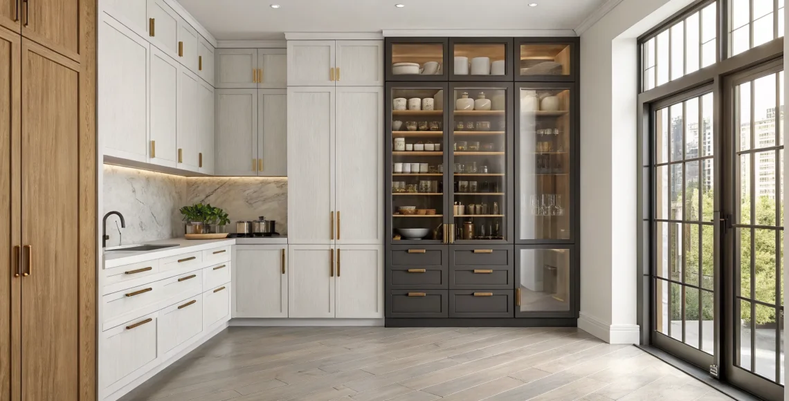
You don’t have to choose just one. In fact, some of the most beautiful and functional pantries feature a mix of open and closed storage. This hybrid approach gives you a personalized solution that caters to both style and utility. Consider using open shelving for your most-used items or for displaying a collection of beautiful ceramic bowls. Below, you can install closed cabinets or deep drawers to store bulkier appliances, less attractive packaging, and backstock items. This balanced kitchen design creates visual interest while keeping your pantry practical for everyday life.

Consider Glass-Front Cabinet Doors

If you love the airy feel of open shelving but want a bit more polish, glass-front cabinet doors are a perfect solution. They offer a beautiful middle ground, allowing you to see what’s inside without leaving everything completely exposed. This creates a sense of openness and light, making your pantry feel larger while still keeping items protected from dust. It’s also a wonderful way to turn your storage into a display, showcasing beautiful glassware, matching containers, or stacks of your favorite dishes. The visibility encourages you to keep things tidy, turning organization into a natural part of your routine.

Of course, you don’t have to put everything on display. A popular strategy is to use a hybrid approach, mixing glass-front doors with solid ones. This allows you to showcase your prettiest items while keeping less attractive packaging neatly tucked away. For even more subtlety, consider using frosted or reeded glass. These options obscure the contents just enough to maintain a clean look while still contributing to that light, open aesthetic. It’s a custom touch that gives you the best of both worlds: the structure of a cabinet and the style of open shelving.

Colors and Materials That Make a Small Pantry Look Bigger

The right colors and materials can completely transform a small pantry, making it feel spacious, organized, and even luxurious. It’s a design secret that goes beyond simple storage solutions. By making thoughtful choices, you can create an illusion of depth and openness that turns a purely functional nook into a beautiful extension of your kitchen. The key is to select finishes that reflect light and minimize visual clutter. This approach not only makes the space feel larger but also adds a layer of sophistication, ensuring every corner of your home aligns with your elegant aesthetic. From the paint on the walls to the finish on your shelves, every detail contributes to the final look and feel.

Brighten Up with Light Colors

One of the most effective ways to open up a small space is with a light color palette. As noted by design experts, “Light colors can significantly enhance the perception of space in small areas.” By painting your pantry walls, shelves, and any cabinetry in shades of soft white, light gray, or even a pale beige, you create a bright, airy environment. These hues are excellent at reflecting light, which instantly makes the pantry feel less confined. This simple change can make a world of difference, turning a cramped closet into an inviting and organized space. For more inspiration, you can explore other small pantry ideas that use color to create a sense of spaciousness.

Popular Pantry Color Palettes

While a simple coat of white paint is effective, you can create a more custom feel with a few timeless color palettes. A monochromatic scheme using soft grays and crisp off-whites is a classic for a reason; it delivers a seamless, sophisticated look that feels both clean and expansive. If you prefer a warmer aesthetic, consider layering creamy neutrals like taupe and beige. These tones add a gentle, inviting feel while still keeping the space bright. For a subtle touch of personality, a whisper of color like a pale sage green or a muted sky blue can make the pantry feel like a thoughtful extension of your kitchen, reflecting your unique style without overwhelming the small footprint.

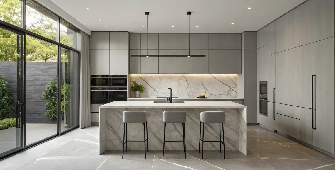
Choose Sleek, Modern Materials

The materials you choose are just as important as the colors. Modern design often leans toward materials that feel light and uncluttered. For instance, opting for open shelving instead of bulky, traditional cabinets can make a pantry feel much larger. This design choice removes heavy cabinet doors, creating clean lines and a more spacious atmosphere. Consider materials like light-grained wood for a warm, organic feel, or sleek metal for a more contemporary look. The goal is to select finishes that contribute to an open, streamlined aesthetic rather than weighing the space down.

Selecting Countertops and Backsplashes

If your pantry design includes a small prep counter—perfect for a coffee station or for setting down groceries—the material you choose can add a significant touch of luxury. Durable and beautiful options like quartzite, quartz, or even a warm butcher block provide a functional surface that stands up to daily use. These materials bring a custom, high-end feel to the space. For the backsplash, a simple, light-colored tile can help reflect light, while using a continuous slab of the same material as your countertop creates a seamless, sophisticated look. You can find many pantry ideas that show how these finishes can work together beautifully.

Don’t Overlook Your Flooring

Flooring is a foundational element that can either unify your pantry with the kitchen or give it a distinct personality. Continuing your kitchen’s flooring into the pantry is a great way to create a seamless flow, making the entire area feel more open and cohesive. Alternatively, you can use flooring to make a statement. A classic checkerboard pattern or a beautiful geometric tile can turn the pantry into a hidden gem, adding an element of surprise and style. Thinking about different flooring options early in the design process ensures this small space feels just as thoughtfully considered as the rest of your home.

Add a Little Shine with Reflective Surfaces

To really make your pantry feel bigger, introduce elements that bounce light around the room. “Reflective surfaces, such as glossy finishes and glass elements, can amplify light and create a sense of openness in your pantry.” You can achieve this by choosing a backsplash with a subtle sheen, using glass canisters to store dry goods, or selecting hardware with a polished finish. Even a high-gloss paint on your shelves can make a significant impact. These materials not only help visually expand the space but also add a touch of modern elegance, making your pantry feel both functional and refined.

How to Add Style to a Small Pantry

A pantry is more than just a place to store food; it’s an extension of your kitchen and a reflection of your home’s overall design. Even the most compact pantry can become a stylish feature with a few thoughtful touches. The key is to focus on the details that transform a purely functional space into one that feels intentional and beautiful. By carefully selecting your containers, hardware, and lighting, you can create a small pantry that is as elegant as it is efficient. These elements work together to build a cohesive look, proving that great design can happen in any space, no matter its size.

Choose Containers That Are Stylish and Functional

One of the quickest ways to add a sense of order and style is to decant dry goods into beautiful, uniform containers. Transferring items like flour, pasta, and cereal into clear glass jars or sleek ceramic canisters instantly creates a clean, curated look. This approach isn’t just about aesthetics; it also helps you keep track of your inventory at a glance. Choose containers that complement your kitchen’s style, whether that’s minimalist glass, warm wood lids, or modern white ceramic. Adding custom labels provides a polished finishing touch that makes your pantry feel like a bespoke part of your home.

Tip: Use Wide-Mouth Jars for Easy Access

When you’re decanting bulk goods like flour, sugar, or even large pastas, the opening of your container makes all the difference. Opting for storage containers with a wide mouth is a small detail that has a huge impact on daily use. It allows you to easily scoop out exactly what you need without making a mess on the counter. This simple, practical choice also helps you store more at once, making it an efficient way to organize your pantry. It’s a perfect example of how thoughtful design choices can make everyday tasks feel a little more seamless and refined.

Select Hardware That Makes a Statement

Think of hardware as the jewelry for your cabinetry. The knobs, pulls, and handles you choose can have a significant impact on the overall feel of your pantry. This is a perfect opportunity to introduce a touch of luxury and personality. Consider finishes like brushed brass, matte black, or polished nickel to coordinate with your kitchen fixtures and create a seamless design flow. Even the brackets for open shelving can become a decorative element. Upgrading your hardware is a simple change that adds a custom, high-end feel, turning simple doors and drawers into a thoughtful design feature.

Use Lighting to Set the Mood

Good lighting is essential in any space, and the pantry is no exception. The right light not only makes it easier to find what you need but also creates a warm and inviting atmosphere. If you have the option, a small window or a glass-paneled door can bring in beautiful natural light. For artificial lighting, consider adding LED strips under your shelves to illuminate your goods and reduce shadows. A small, stylish flush-mount fixture or even a miniature pendant can serve as a beautiful focal point. Thoughtful lighting design makes the pantry feel like an integrated and well-planned part of your home, rather than a forgotten closet.

Add Personality with Wallpaper and Murals

Your pantry is the perfect place for a surprise pop of personality. Since it’s a small, enclosed space, you can be more adventurous with pattern and color than you might be in a larger room. A beautiful wallpaper or a custom mural can turn a simple storage closet into a hidden gem. Think of it as lining a jewelry box with a gorgeous fabric—it’s an unexpected touch of luxury. If you’re hesitant to commit, peel-and-stick wallpaper offers a fantastic way to experiment with a bold print without a long-term commitment, allowing you to add charm and character that can be updated whenever you wish.

Incorporate Architectural Details like Beadboard

To give your pantry a sense of permanence and character, consider adding architectural details. Paneling like beadboard or shiplap can introduce texture and a custom, built-in feel that speaks to meticulous craftsmanship and thoughtful design. Painted in a crisp white or a soft, muted tone, beadboard can create a classic, cottage-style charm. Alternatively, a coat of dark, moody paint can give it a sophisticated, modern edge. This small detail bridges the gap between a purely utilitarian closet and a beautifully integrated feature of your home.

Soften the Look with Curtains

If you have an open pantry or want to conceal the contents of a few shelves, a curtain can be a soft and stylish solution. Instead of a solid door, a beautiful fabric curtain adds texture, color, and a touch of charm. Choose a high-quality material like linen or a custom block-printed cotton that complements your kitchen’s decor. A simple cafe curtain can hide everyday essentials while still feeling light and airy. This approach is perfect for adding a layer of visual interest and softness, turning a practical storage area into a thoughtful design moment.

A Simple System for an Organized Pantry

A beautifully designed pantry is a joy to behold, but its true value lies in its function. When your pantry is thoughtfully organized, it transforms your daily routine, making meal prep smoother and your kitchen feel more serene. The secret isn’t about having a massive space; it’s about creating smart systems that work for you. By implementing a few key strategies, you can turn even the most compact pantry into a model of efficiency that supports your lifestyle.

An organized pantry saves you time and money. You’ll know exactly what you have at a glance, which means fewer duplicate purchases and less food waste. More importantly, it brings a sense of calm to your kitchen. Instead of searching through cluttered shelves, you can find what you need instantly, allowing you to focus on the joy of cooking. We’ll walk through four simple steps to get your pantry in perfect order: grouping similar items, using the right containers, creating a clear labeling system, and adopting simple habits to keep it that way. These aren’t just organizing tips; they are foundational practices for maintaining a graceful and functional home.

Create Zones for Different Categories

The first step to a streamlined pantry is creating logical zones. Think of it like a boutique grocery store where everything has its place. When you group similar items, you create an intuitive flow that makes finding ingredients effortless. For example, keep all your baking supplies together, or dedicate one shelf to your morning coffee and tea ritual. This simple act of categorizing eliminates frantic searching and helps you take a quick inventory before your next shopping trip. Common zones include breakfast items, pasta and grains, snacks, canned goods, and oils and vinegars. Arranging your pantry this way makes cooking feel less like a chore and more like a creative process.

Pick the Perfect Containers

Decanting dry goods into uniform containers is a true game-changer for both aesthetics and function. Using clear, stackable containers for items like pasta, rice, and cereal allows you to see exactly what you have while creating a clean, cohesive look. As design experts at Houzz note, when you “put dry foods like flour or oatmeal into clear glass jars or bins,” it not only helps you see your inventory but also makes the pantry look incredibly neat. This approach is especially effective in small spaces, as stacking containers maximizes vertical storage. Opt for high-quality, airtight containers to keep your food fresh and your pantry looking polished and orderly.

Create a Simple Labeling System

Even with clear containers, a simple labeling system is essential for peak efficiency. Labels eliminate guesswork, especially for similar-looking ingredients like all-purpose flour and bread flour, or sugar and salt. A clear label helps you grab the right item quickly and confidently. Your labeling system can also become a subtle design element. Whether you prefer minimalist printed labels, elegant script, or a simple label maker, consistency is key. You can also add expiration dates to your labels to ensure you’re always using the freshest ingredients. This small detail adds a layer of order that makes a significant difference in your daily kitchen routine.

Try Color-Coding for Quick Identification

To take your organization a step further, try color-coding. This system adds a visual shortcut to your pantry, making it even easier to find what you need in a hurry. The idea is simple: assign a specific color to each food category. For example, you could use blue labels for all your grains and pastas, green for snacks, and yellow for baking supplies. This visual cue helps you quickly identify items at a glance, which is especially helpful for containers stored on high shelves. Instead of reading every label, you can just look for the right color. This not only saves time but also makes your cooking process feel more streamlined and less chaotic. You can implement this with colored dot stickers on your lids, different colored labels, or even by choosing containers with colorful accents. It’s a simple but powerful trick that adds another layer of efficiency to your beautifully organized pantry.

How to Keep Your Pantry Organized for Good

A beautifully organized pantry will only stay that way if you build simple habits to maintain it. First, always store the items you use most often in the easiest-to-reach places, like on shelves at eye level. Less-used or specialty ingredients can go on higher or lower shelves. Second, make it a rule to put things back in their designated zones immediately after use. As any designer will tell you, “without careful organization, open shelves can look messy fast.” A quick weekly reset, taking just five minutes to tidy up, can prevent clutter from building up and keep your pantry looking pristine.

Smart Multi-Functional Features for Small Pantries

A truly sophisticated pantry does more than just store your goods; it works for you. In a compact space, every feature should serve a purpose, and ideally, more than one. By integrating multi-functional elements, we can create a pantry that feels both luxurious and incredibly efficient. Think of it as a small, hardworking jewel box in your home, where smart design transforms a simple storage area into a seamless part of your daily routine. It’s about looking beyond simple shelves and asking how your pantry can actively contribute to the flow of your kitchen. Can it also be a prep space? A coffee bar? A beautifully organized display?

This approach is especially powerful in smaller homes where every square inch counts. Instead of seeing a small pantry as a limitation, we see it as an opportunity for clever, custom design. The goal is to create a space that is not only perfectly organized but also a pleasure to use. By incorporating furniture that pulls double duty, storage that adapts to your needs, and even small prep areas that add incredible convenience, your pantry becomes an extension of your kitchen’s functionality and style. These features are about making your life easier and your home more beautiful, proving that you don’t need a large footprint to have a major impact.

Choose Furniture with More Than One Job

Why settle for simple shelving when your pantry can feature pieces that are both beautiful and practical? A hybrid approach is a perfect solution for a small space. Imagine elegant, open cabinet shelving on top to display your favorite ceramics or glassware, creating a sense of openness and personal style. Below, closed cabinets or deep drawers can hide away less-sightly bulk items, keeping the overall look clean and uncluttered. This combination gives you the best of both worlds: a place to showcase beautiful objects while maintaining practical, concealed storage for everyday necessities.

Try Convertible and Collapsible Storage

Flexibility is key in a small pantry. Your storage needs can change over time, so your pantry should be able to adapt. Convertible solutions, like adjustable shelving, allow you to reconfigure the space as needed, whether you’re storing tall cereal boxes or short cans. Open shelves are a fantastic choice here, as they eliminate the visual bulk of cabinet doors and make the pantry feel more spacious. Having everything on display also encourages you to keep items tidy and organized, turning your pantry staples into a curated collection.

Carve Out a Small Prep Area

Transform your pantry from a simple closet into a functional prep station. A small, built-in countertop can become a dedicated coffee bar, a baking station, or a place to keep your stand mixer and other small appliances off your main kitchen counters. This clever use of space adds immense value and streamlines your workflow. Paired with deep sliding drawers underneath, you can easily access everything you need without having to dig through the back of a dark cabinet. It’s a small luxury that makes a big difference in how you use your kitchen every day.

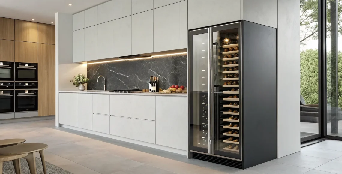
Integrate Built-in Appliances

To truly make your pantry a hardworking extension of your kitchen, consider integrating small, built-in appliances. This is where a pantry transforms from simple storage into a seamless part of your daily routine. Imagine a dedicated spot for your coffee maker, complete with mugs and supplies, or a small microwave tucked away in a custom appliance garage to keep your main countertops clear. You could even incorporate a wine fridge or a beverage center. As we often say, a well-designed pantry is like a “small, hardworking jewel box in your home.” By thoughtfully planning for these features, you create a space that is not only organized but also incredibly efficient, adding a layer of custom luxury that simplifies your life.

Designate a Nook for Pets

For many of us, pets are part of the family, but their food and water bowls can create clutter in the main kitchen. A custom pantry design offers the perfect solution. We can carve out a dedicated nook at the base of your cabinetry for food and water dishes, keeping them neatly contained and out of the way. Another elegant option is a low pull-out drawer that holds the bowls, allowing you to slide them away when not in use. Above this station, you can use vertical storage for airtight pet food containers and treats. Creating a special spot like this is a thoughtful detail that shows how a client-centered approach can cater to every member of your household.

Common Pantry Design Mistakes (and How to Avoid Them)

A thoughtfully designed pantry is a true luxury, but creating one that is both beautiful and functional requires careful planning. It’s easy to get swept up in stunning inspiration photos, but a few common missteps can turn your dream pantry into a daily frustration. The difference between a pantry that works and one that doesn’t often comes down to small details that have a big impact on your daily life. A truly successful design is one that feels intuitive and supports your lifestyle, not just one that looks good on the surface. It should anticipate your needs, making meal prep smoother and grocery runs more efficient. A well-designed pantry isn’t just about storage; it’s about creating a system that brings a sense of calm and order to your home. By sidestepping these frequent design mistakes, you can create a space that feels effortless, organized, and perfectly tailored to you. Let’s walk through the most common pitfalls we see and, more importantly, how to avoid them so your pantry becomes a cornerstone of your kitchen, not a source of clutter.

Mistake #1: Trying to Fit Too Much In

When you have a small pantry, the instinct is often to maximize every single inch of storage. However, filling a space to its absolute capacity can backfire, making it feel cramped and chaotic. This is especially true with open shelving, where a lack of careful organization can quickly lead to visual clutter. A crowded pantry makes it difficult to find what you need, leading to duplicate purchases and expired goods. The solution isn’t about having less, but about creating a system. Implement smart storage solutions like clear bins and tiered shelves that allow you to see everything at a glance, ensuring your pantry remains functional and serene.

Mistake #2: Forgetting to Measure Twice

The old saying “measure twice, cut once” is critical in pantry design. This goes beyond simply making sure shelves fit. It’s about ensuring the entire space is usable. For example, with closed cabinets, it can be a real challenge to locate and access items stored in the back or on high shelves. Before you finalize a layout, measure your largest containers, your favorite small appliances, and bulk items. This ensures your shelving depth and height are truly practical. Thoughtful measurements guarantee that every item has an accessible home, preventing things from getting lost in the back of a deep, dark cabinet.

Mistake #3: Ignoring How You Actually Use It

Your pantry should be designed around your life, not the other way around. A beautiful design is useless if it doesn’t align with your daily routines. Think about how you cook and live. If you’re an avid baker, your flour, sugar, and spices should be within easy reach. If your kids grab their own after-school snacks, place them on a lower, accessible shelf. This is where you must honestly assess your habits. For instance, open shelving can provide a clean, curated look, but it also requires a bit of extra upkeep to stay tidy. A pantry that balances functionality and aesthetics is one that makes your daily life simpler and more enjoyable.

Related Articles

Frequently Asked Questions

I want to redesign my small pantry, but I’m overwhelmed. Where’s the best place to start? The best first step is to think about how you actually use the space every day. Before you think about colors or containers, consider your daily flow. What items do you reach for most often? What frustrates you about your current setup? Answering these questions will help you create a design that is truly functional for your lifestyle, ensuring that your most-used items are accessible and the layout feels intuitive.

Is open shelving a good idea if I’m not naturally a tidy person? That’s a great question, and it’s something you should be honest with yourself about. While open shelving looks beautiful and can make a space feel larger, it does require you to keep things organized. If you prefer to not worry about how every box and bag looks, you might be happier with closed cabinets. A perfect compromise is a hybrid design, using a few open shelves for your most beautiful items and closed cabinets to conceal everything else.

What’s the most important thing to consider to make a small pantry feel high-end? To give a small pantry a luxurious feel, focus on cohesion and quality materials. This means choosing hardware, like cabinet pulls and shelf brackets, that complements your kitchen fixtures. It also means investing in uniform, high-quality containers for your dry goods. These details create a sense of intention and custom craftsmanship, turning a simple storage closet into a sophisticated feature of your home.

How can I add more storage without making the space feel crowded? The key is to think vertically. Instead of focusing on deep shelves that can become cluttered, draw the eye upward with floor-to-ceiling shelving. This uses the full height of the room and makes the space feel taller. Also, use clever solutions like pull-out drawers and door-mounted racks to make every inch accessible without adding visual bulk.

Do I need a full custom build-out, or can I improve my pantry with smaller changes? You can absolutely make a big impact with smaller changes. Swapping out old containers for a matching set, adding a door rack for spices, or upgrading your cabinet hardware can instantly make the space feel more organized and stylish. A full custom build-out, however, is the best way to solve fundamental layout problems and truly maximize every available inch for a seamless, perfectly tailored solution.

Modern coffered ceiling design with recessed lighting in a residential living room.

Modern Ceiling Design for Your Luxury Home

Your home should be a direct reflection of your personal style, and every surface is an opportunity for expression. We pour so much energy into our walls, but what about the biggest blank canvas in the room? The ceiling is a space where you can be subtle or bold, adding a layer of character that is uniquely yours. This is where modern ceiling design truly shines. Whether you’re drawn to the clean lines of integrated lighting or the warm, organic texture of wood beams, your ceiling can become a defining feature that makes the entire room feel complete.

Key Takeaways

  • Treat your ceiling as an essential design element: Move beyond a flat, white surface and recognize the ceiling as a key component of a room’s architecture. Intentional choices, like adding a tray ceiling for dimension or coffered details for structure, create a custom and complete look.
  • Layer materials and light for custom ambiance: The right materials and lighting work together to define a room’s atmosphere. Use wood to add natural warmth, metal for a sleek finish, or integrated LED lighting to cast a soft, ambient glow that feels both modern and luxurious.
  • Prioritize proportions for a harmonious design: A successful ceiling design always complements the room’s scale. Ensure your chosen style enhances the space rather than overwhelming it, creating a balanced and thoughtful environment where every detail feels perfectly in place.

What Is Modern Ceiling Design?

When you think about designing a room, your mind probably goes straight to the walls, floors, and furniture. But what about looking up? The ceiling is one of the largest uninterrupted surfaces in any space, yet it’s often treated as an afterthought. Modern residential design changes that. It treats the ceiling not just as a structural necessity, but as a canvas for creativity and a key player in the room’s overall atmosphere. It’s about moving beyond a simple coat of white paint and exploring how form, texture, and light can work together to create something truly special. A modern ceiling is intentional, integrated, and essential to a cohesive, luxurious home.

What Makes a Ceiling Design Modern?

Modern design is rooted in the idea of “less is more,” and that principle extends all the way up to the ceiling. Instead of ornate plasterwork or heavy details, modern ceilings emphasize clean lines, uncluttered surfaces, and geometric simplicity. The goal is to create a look that feels calm, clean, and stylish. This might mean incorporating recessed lighting for a seamless effect, introducing subtle layers to add depth, or using unexpected materials to create texture. A well-designed modern ceiling can completely change a room’s character, turning a standard space into one that feels exciting and inviting from top to bottom.

Why Your Ceiling Is the “Fifth Wall” in a Luxury Home

In the world of interior design, we often refer to the ceiling as the “fifth wall” because it’s a powerful surface that can make a huge statement and truly complete the look of a room. In a luxury home where every detail matters, leaving this surface blank is a missed opportunity. Thoughtful ceiling design can make a space feel larger, draw the eye upward to create a sense of grandeur, and add a layer of polish that feels custom and refined. Whether through architectural details, a bold color choice, or unique materials, treating the ceiling as an integral part of your design plan is what separates a nice room from an unforgettable one.

Key Considerations Before You Begin

Jumping into a ceiling redesign is exciting, but a little planning goes a long way. Before you start picking out materials or finalizing a look, there are a few key factors to think through. Considering these elements from the start will help ensure your new ceiling not only looks beautiful but also feels perfectly suited to your home and your lifestyle. Taking the time to assess your space, style, and budget will set the foundation for a design that you’ll love for years to come.

Room Size and Ceiling Height

The first thing to assess is the room itself. Before you get attached to a specific design, take a good look at the room’s size and how high the ceiling is. A grand, multi-layered design might look incredible in a magazine, but it could make a small room with low ceilings feel cramped and heavy. On the other hand, a large, open space with soaring ceilings can handle more complex and dramatic features, like deep coffers or bold wood beams. The goal is to find a design that creates balance and enhances the room’s natural proportions, making the space feel intentional and harmonious.

Your Home’s Architectural Style

Your ceiling design shouldn’t exist in a vacuum; it needs to feel connected to the rest of your home. The architectural style of your house provides a great starting point for your design choices, helping you create a cohesive look that flows from room to room. A sleek, minimalist home might call for a simple tray ceiling with integrated lighting, while a home with more traditional bones could be the perfect backdrop for a modern take on a coffered design. When the ceiling harmonizes with the home’s overall character, it makes the entire space feel more inviting and thoughtfully designed. It’s this attention to detail that truly makes a house feel like a custom home.

Defining Your Budget

Finally, let’s talk about the practical side of things: your budget. It’s important to have a clear financial plan before you begin, as this will guide your decisions on materials and design complexity. The cost of a ceiling project can vary significantly—a simple skim coat and a fresh coat of paint is very different from installing custom-milled wood paneling. When you decide to update your ceilings, it’s important to work with skilled professionals to make sure your vision comes to life within your financial framework. Establishing a budget early on helps you and your design team make smart choices that align with your goals, ensuring a beautiful result without any surprises.

Ceiling Designs We’re Loving Right Now

The ceiling is your home’s greatest untapped canvas. For too long, it’s been an afterthought, but we see it as a key opportunity to define a room’s character and atmosphere. Moving beyond a simple coat of white paint can completely transform your space, adding depth, drama, and a sense of intention that ties your entire design together. Whether you’re drawn to quiet sophistication or a bold artistic statement, the right ceiling design sets the tone from the top down.

We’re seeing a wonderful shift toward treating the ceiling with the same creative consideration as the walls and floors. From subtle textures that play with light to architectural forms that become a focal point, the possibilities are inspiring. These designs aren’t just trends; they are lasting expressions of personal style. Here are a few of the approaches we’re loving right now, each offering a unique way to bring personality and luxury to your home.

Layered Lighting for a Minimalist Look

Sometimes, the most impactful design is the most understated. This approach is all about creating a clean, serene, and sophisticated look using smooth surfaces and simple lines. Think of a ceiling that feels calm and uncluttered, adding a sense of spaciousness to the room. The magic here often lies in the integration of layered lighting. By incorporating soft, indirect light from coves or recessed channels, you can add beautiful depth and a warm ambiance without any visible fixtures. It’s a minimalist philosophy that feels both modern and timeless.

Go Bold with Geometric and 3D Shapes

For those who want the ceiling to be a conversation starter, bold geometric and 3D forms deliver incredible visual impact. This is where the ceiling becomes a piece of sculpture. Instead of a flat plane, imagine layered panels, dramatic angles, or even soft, curved shapes that draw the eye upward. These architectural elements add a dynamic and artistic quality to a room, turning a simple surface into a stunning focal point. This approach is perfect for entryways, dining rooms, or living spaces where you want to make a memorable impression with custom craftsmanship.

Bring the Outdoors In with Natural Materials

There is a growing desire to connect our living spaces with the natural world, and the ceiling is a perfect place to do it. Incorporating natural materials like wood brings immediate warmth, texture, and character to a room. This can range from rustic exposed beams that add a sense of history to sleek wood paneling for a more contemporary feel. This concept, often called biophilic design, is about creating environments that feel grounding and restorative. The organic beauty of these materials makes a space feel more inviting and connected to its surroundings.

Making a Statement with Bold Color

Never underestimate the power of paint. Treating your ceiling to a coat of rich, unexpected color is a fantastic way to add personality and drama to a room. A dark ceiling in a room with high walls can create a cozy, intimate atmosphere, while a soft, subtle hue can add a touch of playful elegance. This technique, sometimes called “color capping,” draws the eye up and can make a room feel more complete and thoughtfully designed. It’s a relatively simple change that offers a major design payoff, allowing you to choose from an endless palette of ceiling paint colors to set the perfect mood.

Emerging Trends in Ceiling Design

As design evolves, so do the ways we think about every surface in a home. The ceiling is no exception. It’s moving from a forgotten plane to a central feature that can define a room’s entire mood. We’re seeing a clear shift toward ceilings that are more dynamic, integrated, and expressive. These emerging trends are less about fleeting styles and more about new ways to think about space, light, and materials. From soft, organic curves that soothe the eye to smart technology that simplifies life, the future of ceiling design is all about creating environments that are as functional as they are beautiful. It’s an exciting time to look up.

Embracing Curves and Organic Shapes

The straight line is giving way to something softer and more fluid. We’re seeing a beautiful trend toward ceilings that feature gentle curves, arches, and other organic shapes. This approach breaks away from rigid, boxy room structures, creating a sense of movement and grace that feels incredibly welcoming. A curved ceiling detail can make a room feel taller and more open, drawing the eye upward in a natural, flowing motion. It’s a design choice that feels both sophisticated and calming, transforming a simple room into a space with architectural soul and a more human-centric feel.

Integrating Smart Ceiling Technology

Luxury is often about what you don’t see. The latest trend in modern ceiling design is the seamless integration of smart technology. Imagine lighting that adjusts automatically to mimic the natural rhythm of the day, hidden speakers that provide ambient sound throughout your home, or climate control systems that operate silently from above. This isn’t science fiction; it’s the new standard for high-end, custom homes. By building technology directly into the ceiling, you can maintain a clean, uncluttered aesthetic while enjoying all the benefits of a fully connected environment. It’s the ultimate in discreet, effortless sophistication.

Using Eco-Friendly and Sustainable Materials

Thoughtful design now goes hand-in-hand with environmental responsibility. Homeowners are increasingly looking for ways to incorporate sustainable materials without compromising on luxury, and the ceiling is a great place to start. This trend involves using materials like reclaimed wood, recycled metal, and low-VOC paints to create beautiful, eco-conscious spaces. It also extends to function, with features like energy-efficient LED lighting becoming a standard. Choosing sustainable options for your ceiling is a powerful way to create a home that not only looks good but also aligns with your values, proving that high-end design can be both beautiful and mindful.

Applying Subtle Textures for Depth

Sometimes, the most powerful statements are made quietly. Instead of bold patterns, a growing trend is the use of subtle textures to add depth and character to the ceiling. Finishes like Venetian plaster, limewash, or specialty paints can create a soft, tactile quality that interacts beautifully with light throughout the day. These gentle textures add a layer of visual interest that feels rich and sophisticated without overwhelming the space. It’s a technique that speaks to meticulous craftsmanship, turning a flat surface into a canvas of delicate shadows and highlights that adds warmth and dimension to any room.

Mixing Materials like Wood, Metal, and Fabric

Why settle for one material when a combination can create something truly unique? We’re seeing designers mix materials on the ceiling to create rich, layered looks with incredible personality. Imagine the warmth of wood planks set against the sleek coolness of metal trim, or fabric panels used to soften a room and improve acoustics. This approach allows for endless creativity and results in a ceiling that feels custom and intentional. At Freddie Ramon, we love this trend because it allows our team to blend different elements to reflect a client’s unique vision, creating a dynamic and cohesive design that feels anything but standard.

Treating the Ceiling as an Artistic Installation

For those who want to make a truly unforgettable statement, the ceiling is becoming a canvas for art. This trend moves beyond basic design and transforms the “fifth wall” into a bespoke installation. This could be a dramatic, sculptural light fixture that serves as the room’s centerpiece, a custom-molded geometric pattern, or even an interactive light display that changes with sound or movement. These designs are more than just decorative; they are functional works of art that can also help with things like room acoustics. It’s the ultimate expression of personal style, turning your home into a one-of-a-kind gallery.

Which Modern Ceiling Style Is Right for You?

When we design a room, it’s easy to focus on the four walls around us, but the ceiling holds just as much potential to define a space. Choosing the right ceiling style is about more than just covering the rafters; it’s about creating an architectural statement that complements your home’s character. While countless trends emerge, a few classic styles have proven their staying power, offering a perfect foundation for modern luxury. These designs can make a room feel grand and expansive or cozy and intimate, all while adding a layer of custom detail that feels intentional and thoughtfully crafted.

From the structured elegance of coffered ceilings to the airy drama of a vaulted design, the right style sets the tone for everything below it. These aren’t just features for traditional homes, either. When approached with a modern eye, classic ceiling treatments can feel fresh, clean, and perfectly suited to a contemporary lifestyle. Let’s look at a few of our favorite styles that consistently deliver that “wow” factor, turning an often-overlooked surface into a stunning focal point. Each one offers a unique way to add dimension, character, and a sense of bespoke luxury to your home.

Coffered Ceilings for Classic Structure

A coffered ceiling is a timeless way to add architectural interest and a sense of refined structure to a room. This style features a grid of sunken panels, creating a pattern that adds depth and sophistication. While it has historical roots, its versatility allows it to fit into many design aesthetics, from classic to modern and contemporary. In a modern home, we often design coffered ceilings with clean lines and a monochromatic paint scheme to maintain a crisp, uncluttered feel. This approach adds visual weight and a custom touch without feeling overly ornate, making it a perfect choice for a formal living room, study, or dining area where you want to create an elegant and grounded atmosphere.

Waffle Ceilings

Think of a waffle ceiling as a more contemporary and intricate take on the classic coffered style. This design uses a grid of beams to form a pattern of recessed squares, adding incredible depth and visual texture that can truly define a room. It’s a beautiful example of how architectural details can become a central feature, turning a plain surface into a work of art. The clean, repeating geometry feels modern and sophisticated, making it an excellent choice for spaces where you want to add a sense of grandeur without overwhelming the design. It’s a versatile architectural feature that works just as well in a spacious great room as it does in a cozy study, offering a custom, high-end finish that speaks to meticulous craftsmanship.

Tray Ceilings to Add Depth and Dimension

If you want to add height and a subtle sense of drama, a tray ceiling is an excellent choice. This design features a raised central section, resembling an inverted tray. It’s a fantastic way to create a focal point that can enhance the overall design of a room without requiring major structural changes. Tray ceilings are especially effective in bedrooms and dining rooms, where they can define the space and create a more intimate feel. We love to accentuate the different levels with strategic lighting, like hidden LED strips, or by painting the inner section a contrasting color. This technique draws the eye upward and makes the room feel taller and more spacious.

Design Idea: Use Contrasting Materials

A truly custom ceiling design often comes from the thoughtful interplay of different textures and finishes. Instead of a single, uniform surface, imagine pairing materials that create a beautiful contrast. Think of the warmth of natural wood planks set against the clean lines of sleek metal accents, or the soft touch of a fabric panel inset within a smooth plaster frame. This technique is a powerful way to add visual interest and depth, turning the ceiling into a dynamic focal point. By layering materials, you create a rich, textured look that feels both sophisticated and deeply personal. We especially love this approach because it allows us to bring in natural materials like wood, which adds immediate warmth and character, making a room feel more grounded and inviting.

Vaulted Ceilings for That Grand, Airy Vibe

Nothing creates a sense of openness quite like a vaulted ceiling. By sloping upwards to a central peak, this design transforms a room, making it feel airy, expansive, and full of light. Vaulted ceilings create a sense of spaciousness and grandeur that is perfectly suited for modern homes that prioritize open-concept living. They are a natural fit for great rooms, entryways, and primary suites where you want to make a bold architectural statement. The soaring height provides a stunning canvas for statement lighting fixtures and allows large windows to fill the space with natural light, connecting the interior with the outdoors and creating an environment that feels both impressive and inviting.

Practical Consideration: Lighting and Maintenance

Beyond choosing a beautiful chandelier, modern ceiling design thinks about how light itself shapes the space. The most sophisticated designs integrate lighting directly into the architecture. By building soft, indirect lighting into coves or recessed channels, you create a warm ambiance without a single visible fixture, allowing the clean lines of the ceiling to stand out. This seamless approach also opens the door for smart home technology. We can integrate systems for adjustable lighting, hidden audio, and climate control, making your ceiling as intelligent as it is beautiful and ensuring every element works in harmony to support your lifestyle.

A stunning ceiling should stay that way, so thinking about maintenance from the start is key. The materials you choose will influence long-term care. A bold, painted ceiling is simple to refresh, while intricate wood paneling might require more specialized attention to keep it looking its best. The complexity of the design also matters; a ceiling with many layers or sharp angles can be more challenging to clean than a smooth, minimalist surface. This is where professional guidance is invaluable. We help you select materials and create designs that not only look incredible but also fit your lifestyle, ensuring the final result is both practical and beautiful for years to come.

Exposed Beams for Warmth and Character

Exposed beams bring an element of warmth and texture that can beautifully balance a modern interior. Whether they are original to the home or added for aesthetic appeal, beams introduce a natural, sometimes rustic, element that prevents a space from feeling too sterile. Exposed wood beams can add a soft, lacy texture and warmth to a room, breaking up the flat plane of the ceiling and adding character. In a modern context, beams don’t have to feel rustic. They can be painted to match the ceiling for a subtle textural effect or stained in a dark, sleek finish to create a bold, graphic contrast against a white ceiling.

Practical Consideration: Room Proportions

While exposed beams add incredible character, it’s important to get the scale just right. A successful ceiling design always complements the room’s proportions, enhancing the space rather than overwhelming it. In a room with lower ceilings, large, dark beams can make the space feel heavy and cramped. Conversely, thin, delicate beams might get lost in a grand room with soaring ceilings. The goal is to create a balanced and thoughtful environment where every detail feels perfectly in place. This is where working with a design team is invaluable; we can help you find that perfect equilibrium, ensuring the final look feels both intentional and harmonious.

Exposed Industrial Ceilings

For a different take on the exposed look, an industrial-inspired ceiling offers a raw, modern edge. Instead of warm wood, this style embraces materials like steel beams, exposed ductwork, and concrete. The key to making this work in a luxury home is balance. By pairing these utilitarian elements with refined finishes—like polished floors, plush textiles, and sophisticated lighting—you create a compelling contrast that feels intentional and chic, not unfinished. It’s a confident design choice that celebrates the structural bones of a home, turning them into a powerful aesthetic feature that is both honest and artistic.

Domed Ceilings for a Luxurious Focal Point

A domed ceiling is a truly elegant way to create a stunning main feature in a room. This classic architectural element, with its graceful upward curve, instantly draws the eye and adds a sense of grandeur and volume. It’s a design that feels inherently luxurious, especially when a beautiful chandelier is hung from its center, creating a cascade of light that highlights the dome’s gentle slope. This style is perfect for making a statement in a formal entryway, a dining room, or a primary suite, where it can establish a sophisticated and memorable atmosphere that feels both timeless and impressive.

While domes have a long history in architecture, they can be adapted beautifully for modern interiors. A contemporary take might involve a more subtle, shallow curve or a clean, unadorned finish that emphasizes the purity of the shape. You can also integrate lighting around the base of the dome to create a soft, ambient glow that washes over the ceiling. This approach maintains the architectural drama while aligning with a clean, minimalist aesthetic, proving that classic forms can feel right at home in a modern space.

Stretch Ceilings for a Flawless, Modern Surface

For the ultimate in clean lines and minimalist perfection, a stretch ceiling offers a flawless, contemporary finish. This innovative system uses a lightweight PVC film that is stretched across a track installed along the perimeter of the room. The result is a perfectly flat, smooth surface that conceals any imperfections in the original ceiling, like cracks or uneven textures. It’s a fantastic solution for creating a sleek, uninterrupted plane that contributes to a calm and uncluttered atmosphere, which is a cornerstone of modern luxury design.

The versatility of stretch ceilings is what makes them such a powerful design tool. The material comes in a huge range of finishes, from a simple matte white to a high-gloss surface that can reflect light and make a room feel larger and brighter. You can even opt for backlit panels that turn the entire ceiling into a soft, glowing light source or have custom graphics printed on the material for a truly unique artistic statement. This level of customization allows for a seamless integration of lighting and design, producing a high-end, bespoke look.

False (or Drop) Ceilings for a Clean, Practical Finish

The term “drop ceiling” might bring to mind commercial office spaces, but in a luxury residential setting, it’s a clever tool for achieving a clean, integrated design. A false ceiling is a secondary ceiling built below the main structural one, and its primary function is practical: it’s the perfect way to hide things like electrical wiring, plumbing, and air conditioning ducts. This allows for a completely uncluttered look, where all the functional components of a modern home are neatly tucked away, leaving you with a pristine and polished surface.

Beyond its practicality, a false ceiling opens up a world of design possibilities. It allows you to play with height and dimension, creating recessed areas for ambient cove lighting or designing multi-level surfaces that add architectural interest. This is how you achieve those beautiful “floating” ceiling effects or perfectly integrated, invisible speakers for a whole-home audio system. By turning a functional necessity into a design feature, you can create a space that feels both incredibly sophisticated and effortlessly streamlined.

How Materials Can Define Your Ceiling Design

The material you choose for your ceiling does more than just cover a surface; it defines the room’s entire atmosphere. From the organic comfort of wood to the polished gleam of metal, the right material can complement your home’s architecture and reflect your personal style. Here’s how different materials can transform your space.

The Natural Warmth of Wood

Designers consistently turn to wood for a reason. It’s a classic choice that instantly adds warmth and character to any room, making a space feel grounded and inviting. Wood is incredibly versatile, available in everything from wide planks to rustic beams. For a modern Las Vegas home, consider light-toned woods like white oak for a clean, airy feel, or go bold with dark walnut for rich elegance. Wood ceilings create a cozy retreat in a bedroom or a sophisticated statement in a living area.

Design Idea: Create a Floating Wood Ceiling

For a truly modern and sophisticated take on the wood ceiling, consider a floating design. Instead of covering the entire surface, this style features a custom wood panel suspended just below the structural ceiling, creating a clean gap around the perimeter. This detail not only adds incredible architectural depth but also provides the perfect opportunity to integrate hidden LED lighting. The soft, indirect glow washes over the walls and highlights the natural grain of the wood, creating a warm and inviting ambiance. It’s a stunning feature that feels both intentional and effortlessly luxurious, turning the ceiling into a true work of art.

A floating wood ceiling is a brilliant way to define a specific zone within a larger, open-concept space. Imagine one suspended over a dining table or a cozy seating area—it anchors the space while maintaining an airy, open feel. This approach beautifully incorporates biophilic design principles by bringing in natural materials that make a room feel more grounding and restorative. At Freddie Ramon, we love this concept because it showcases meticulous craftsmanship and allows for a truly personalized statement, blending clean lines with the organic warmth of wood.

Metal Finishes for a Sleek, Modern Edge

For a sharp, contemporary, and luxurious look, metal is an excellent choice. Mixing materials is a hallmark of modern design, and incorporating metallic details gives your ceiling a refined, polished edge. Consider patterned panels accented with sleek metal trims in finishes like brushed gold or matte black. These elements can define a space, add industrial chic, or create a glamorous surface that plays with light. Metal works especially well in kitchens and entertainment spaces where you want a sophisticated statement.

Gypsum Board: The Ultimate Blank Canvas

Gypsum board is a workhorse in modern ceiling design. Because it’s so smooth and flexible, it’s perfect for crafting custom designs like elegant coves or dramatic tray effects. It creates a flawless surface that acts as a blank canvas. You can paint it to match your walls for a cohesive look or choose a bold, contrasting color to turn the ceiling into a focal point. Its adaptability makes it a foundational material for achieving a personalized design.

Get Creative with Glass and Mixed Media

To create a truly unique and high-impact ceiling, consider glass or other mixed media. A glossy finish or mirrored panels can reflect natural light, making a room feel brighter and more open. Frosted or back-painted glass adds a soft, diffused glow when paired with integrated lighting. These materials bring a layer of texture and sophistication that is hard to replicate. Using them on the ceiling is an unexpected touch that signals a commitment to custom, detail-oriented design.

Choosing the Right Ceiling Texture

Texture is one of the most subtle yet powerful tools in interior design. Just as the right fabric can change the feel of a sofa, the right texture can completely transform a ceiling, turning it from a blank slate into a surface with depth and personality. The choice of texture affects how light plays in a room, influences the overall mood, and can either complement or compete with your home’s architectural style. It’s a detail that speaks volumes. A heavily textured ceiling might feel cozy and traditional, while a perfectly smooth surface communicates modern sophistication. The key is to select a finish that aligns with your design vision and the atmosphere you want to create in your home.

Making this decision involves balancing aesthetics with practicality. Some textures are brilliant at hiding minor imperfections in the drywall, while others require a flawless surface to look their best. Maintenance is another factor; some finishes are easy to clean and repair, while others demand a specialist’s touch. As you explore the options, think about the function of the room and your personal style. Are you aiming for a clean, minimalist backdrop that lets your furniture and art take center stage, or do you want the ceiling itself to be a decorative feature? Understanding these different finishes will help you make an intentional choice that feels right for your space.

Smooth Texture

A smooth ceiling is the definition of modern elegance. Achieved by carefully sanding and finishing the surface until it’s perfectly flat, this texture provides a clean, crisp look that feels both timeless and sophisticated. It’s the ultimate minimalist choice, creating an uncluttered canvas that allows other design elements—like a stunning light fixture or dramatic wall color—to shine. A smooth finish reflects light evenly, which can make a room feel brighter and more spacious. While it requires expert installation to achieve a flawless surface, its refined appearance is the gold standard in high-end custom homes, offering a quiet luxury that never goes out of style.

Orange Peel Texture

If you want a touch of texture without overwhelming the space, orange peel is an excellent option. As the name suggests, this finish has a subtle, dimpled surface that resembles the skin of an orange. It’s created by spraying a thin layer of thinned joint compound onto the ceiling. This texture is a popular choice in modern homes because it offers a bit more visual interest than a flat surface and is fantastic at hiding small imperfections. It’s also durable and easier to clean than heavier textures, making it a practical and stylish choice for almost any room in the house, from hallways to bedrooms.

Knockdown Texture

Knockdown texture strikes a beautiful balance between the subtlety of orange peel and the more dramatic look of heavier finishes. The process involves spraying on a compound and then lightly troweling—or “knocking down”—the peaks, creating a varied, organic pattern. The result is a modern, dimensional look that adds character without feeling dated. It’s more effective at concealing surface flaws than lighter textures and is relatively easy to patch if repairs are needed. This versatility makes it a great fit for living areas and great rooms where you want a custom feel that is both sophisticated and forgiving.

Swirl Texture

For a more artistic and decorative statement, a swirl texture adds a sense of movement and elegance to the ceiling. This finish is typically applied by hand using a trowel or brush to create overlapping patterns of arches or circles. Because it’s hand-crafted, each application is unique, giving your room a truly custom touch. The swirling patterns can range from soft and subtle to bold and dramatic, depending on the technique used. This style works beautifully in formal spaces like dining rooms or primary bedrooms, where you want to add a layer of classic charm and visual interest overhead.

Lace Texture

Lace is one of the most intricate and delicate ceiling textures available, creating a pattern that resembles fine fabric. This look is achieved by spraying a base texture and then using a knife to knock it down in a way that leaves a detailed, web-like design. It’s a highly decorative finish that brings a soft, romantic, and timeless feel to a space, making it a beautiful choice for bedrooms or formal sitting rooms. Achieving a consistent and beautiful lace texture requires a high level of skill, but the result is a stunning, elegant surface that adds a unique layer of custom craftsmanship to your home.

Popcorn Texture

Once a popular choice for its ability to hide imperfections and absorb sound, the popcorn ceiling has a distinct, bumpy texture. While it served a practical purpose for many years, its heavy, cottage-cheese-like appearance is now widely considered dated and is rarely used in modern residential design. Popcorn ceilings are also notoriously difficult to clean and repair, as the texture can easily flake off. For homeowners seeking a clean, luxurious, and contemporary aesthetic, we almost always recommend removing this texture in favor of a smoother, more refined finish that better complements a modern interior.

How a Great Ceiling Can Transform a Room

A ceiling does more than just cap a room; it’s a blank canvas that can completely redefine the atmosphere of your home. By thoughtfully designing this “fifth wall,” you can influence everything from the perception of space to the overall mood. A well-executed ceiling design ties the entire room together, turning a simple space into a sophisticated and immersive environment. It’s an opportunity to add architectural interest, play with light, and introduce unique character that reflects your personal style.

Create the Illusion of Height and Space

One of the most powerful things a ceiling can do is alter a room’s perceived proportions. Architectural features are key to achieving this. For instance, a tray ceiling, with its recessed center, naturally draws the eye upward. This simple design trick creates an illusion of height, making the entire room feel more spacious and grand. It’s a classic technique for adding dimension and a touch of formal elegance to living rooms, dining areas, or primary bedrooms without undertaking a major structural renovation.

Set the Mood with Color and Texture

Color and texture are your best tools for setting the emotional tone of a room, and the ceiling is no exception. Painting a ceiling a deep, dramatic color can make a large room feel more intimate and cozy, while a soft, light hue enhances an airy, open atmosphere. For a more dynamic statement, consider applying wallpaper. A beautifully patterned or textured wallpaper can turn your ceiling into a stunning focal point, adding a layer of visual interest that paint alone cannot achieve. This approach allows you to introduce personality and curate a specific mood for the space.

Design Your Ceiling to Maximize Natural Light

The right ceiling finish can work wonders for brightening a room. A surface with a subtle sheen, like a satin or semi-gloss paint, reflects light instead of absorbing it. When natural light pours in from windows, a reflective ceiling bounces it around the room, enhancing brightness and creating a more vibrant feel. This is particularly effective in rooms with limited natural light sources or smaller spaces you want to feel more expansive. This simple choice of paint finish can make your entire home feel more open and welcoming.

Integrate Smart Lighting for a Seamless Look

Modern ceiling design allows for sophisticated and seamless lighting solutions. Instead of relying on a single, central fixture, you can integrate lighting directly into the ceiling’s architecture. Hidden LED strips tucked into coves or tray ceilings provide a soft, ambient glow, while strategically placed spotlights can highlight artwork or specific functional zones. With smart lighting systems, you can control the intensity and color temperature to create layers of light that adapt to any occasion, from a bright, productive workspace to a warm, relaxing evening retreat.

High-Impact Ceiling Updates on a Budget

Creating a luxurious space doesn’t always require a complete overhaul. Sometimes, the most impactful changes are the ones you can tackle in a weekend. If you’re looking for ways to refresh your home without committing to a major renovation, look up! Your ceiling offers a fantastic canvas for creative updates that are both stylish and budget-friendly. These ideas prove that a little effort can go a long way in transforming the look and feel of a room, adding custom character without the custom price tag.

Never Underestimate a Fresh Coat of Paint

Never underestimate what a fresh coat of paint can do. Painting your ceiling is one of the most affordable and effective ways to change the entire atmosphere of a room. A dark, dramatic color in a dining room or study can create a cozy, intimate vibe, while a high-gloss finish can help reflect light and make a space feel brighter and more expansive. You can use bold colors to change the mood or try color blocking to create visual interest, especially in a kid’s room or creative space. For a seamless, modern look, try painting the ceiling the same color as the walls to blur the lines and make the room feel taller.

Add Elegance with Molding and Trim

For a timeless touch of sophistication, consider adding architectural details like crown molding. This decorative trim runs along the top of the wall where it meets the ceiling, and it instantly makes a room look more elegant and finished. It’s a classic detail that adds a sense of history and craftsmanship to a space. You don’t have to stick to traditional, ornate styles, either. There are many molding profiles available, from sleek and simple to more detailed designs, allowing you to find the perfect match for your home’s aesthetic. This small addition creates a polished transition that feels intentional and high-end.

Try DIY Paneling or Beadboard

If you want to add texture and warmth, beadboard or tongue-and-groove planks are fantastic options. These materials are relatively easy to install and can completely change the character of a room, making it feel cozy and inviting. They are also a brilliant solution for hiding imperfect ceilings, like those with minor cracks or an outdated popcorn texture. Once installed, you can paint the paneling to match your decor, whether you’re aiming for a crisp white coastal look or a moody, painted finish. This approach adds a layer of architectural interest that feels both charming and custom.

Try Removable Wallpaper for a Quick Change

For a truly bold and unexpected design moment, apply wallpaper to your ceiling. This is a wonderful way to add pattern, color, and excitement to a room, drawing the eye upward and creating a memorable focal point. It’s an especially effective strategy in rooms with limited wall space, like powder rooms, laundry rooms, or entryways. The best part? With so many high-quality removable wallpapers available, you can make a big statement without a long-term commitment. It’s a perfect solution if you love to experiment with trends or want to add a playful touch to a nursery or home office.

How to Choose the Right Design for Each Room

The perfect ceiling design isn’t a one-size-fits-all solution. The right choice depends entirely on the room’s purpose, its existing architecture, and the atmosphere you want to create. A dramatic design that works wonders in a grand entryway might feel overwhelming in a cozy bedroom. Thinking about how you use each space is the first step to choosing a ceiling that not only looks beautiful but also enhances your daily life. Let’s walk through how to approach the main areas of your home.

Ceiling Ideas for Living and Entertaining Spaces

Your living room is where you welcome guests and make memories, so the ceiling should set an inviting and sophisticated tone. For rooms with high ceilings, a coffered design is a classic choice that adds architectural depth and a sense of grandeur. It draws the eye upward and makes the entire space feel more intentional and complete. The goal is to create an inviting area that feels both impressive and comfortable. By turning the ceiling into a deliberate feature, you transform a simple room into a stunning backdrop for gatherings.

Creating a Serene Bedroom Retreat

In the bedroom, the focus shifts from drama to tranquility. Your ceiling should contribute to a calm, relaxing environment that helps you unwind. Soft, ambient lighting is key. You can achieve this with hidden LEDs in a tray ceiling or by installing cove lighting, which casts a gentle, indirect glow throughout the room. Incorporating natural materials like wood paneling or beams can also add a layer of warmth and texture, making the space feel like a true sanctuary. The right design here is less about making a bold statement and more about creating a peaceful escape.

Ceiling Designs for Functional, Stylish Kitchens

Kitchens are the heart of the home, and their ceilings need to balance style with practicality. Because this space is often full of hard surfaces like stone and metal, adding warmth overhead can make a huge difference. Wood is a fantastic material for kitchen ceilings, whether you opt for simple paneling or rustic exposed beams. These elements introduce organic texture and character, turning the ceiling into a beautiful focal point. A well-designed kitchen ceiling proves that even the most functional rooms in your home can have a touch of custom elegance and thoughtful design.

Common Ceiling Design Mistakes to Avoid

A stunning ceiling can be the defining feature of a room, but a few common missteps can throw off the entire design. The goal is to create a space that feels intentional, balanced, and harmonious from floor to ceiling. By being mindful of a few key principles, you can ensure your “fifth wall” enhances your home’s beauty instead of detracting from it. Let’s walk through some of the most frequent design mistakes we see and how you can easily sidestep them.

Avoiding Designs that Overpower a Small Room

It’s easy to fall in love with a grand ceiling design, but it’s crucial to consider your room’s proportions. An elaborate or dark design can make a small space feel cramped and claustrophobic. For instance, while coffered ceilings add incredible depth, they typically require higher ceilings to feel right. Similarly, painting a low ceiling a dark, dramatic color can make it feel like it’s closing in on you. For smaller rooms or those with standard-height ceilings, it’s often better to choose lighter colors and simpler ceiling styles that create an illusion of height and openness.

Getting the Scale and Proportion Just Right

Beyond just the size of the room, think about how the scale of your ceiling design relates to the space and its purpose. Every element should feel like it belongs. A massive chandelier hanging from a simple, flat ceiling in a small study will feel out of place, just as tiny recessed lights might get lost in a grand, vaulted living room. A well-designed ceiling considers how you use the room. For example, lowering a section of the ceiling with a tray design over a dining table can create a more intimate, cozy atmosphere in an otherwise large, open space. Looking at a variety of ceiling ideas can help you get a feel for what works.

Making Sure Your Lighting Fits the Design

Lighting should never be an afterthought. A beautiful ceiling design can be completely undermined by poor lighting choices. The best approach is to plan your lighting and ceiling structure together from the very beginning. Think about how you can use light to accentuate architectural details and create the right mood. Modern false ceiling designs often incorporate integrated smart lighting or hidden cove lighting, which casts a warm, indirect glow that makes a room feel cozy and relaxing. This seamless integration ensures your lighting is both functional and a beautiful part of the overall design.

When to Partner with a Design Professional

While some updates are simple enough to tackle on your own, a truly transformative ceiling design often requires professional expertise. A designer brings a trained eye for detail, technical knowledge, and an understanding of how to blend ambitious ideas with practical execution. They act as your partner, ensuring your vision is realized beautifully and efficiently, saving you from potential headaches and costly revisions. Their guidance is invaluable for achieving a high-end, polished result that feels both personal and timeless.

When You’re Making Complex Structural Changes

If your vision involves more than a simple surface treatment, it’s time to bring in a professional. Projects like installing coffered ceilings, adding exposed beams, or creating a multi-level tray ceiling involve significant structural work. A designer can assess the feasibility of your ideas, considering factors like ceiling height, room size, and existing joists. They also manage the technical side, from rerouting electrical wiring for new lighting to coordinating with architects and contractors. This ensures that every change is not only beautiful but also safe and compliant with local building codes, giving you peace of mind.

When You Need Help Creating a Cohesive Vision

A ceiling shouldn’t exist in isolation. Designers often refer to it as the “fifth wall” because it plays a crucial role in tying a room together. A professional ensures your ceiling design complements the architecture of your home and the overall aesthetic of the space. They help you see the bigger picture, selecting materials, colors, and lighting that harmonize with your walls, flooring, and furnishings. This holistic approach turns a simple room into a curated experience, where every element feels intentional. A designer’s expertise can transform your ceiling from an overlooked surface into a stunning focal point that completes your home’s narrative.

When You Want to Maximize Your Home’s Value

Investing in high-quality design is also an investment in your property. A design professional understands which features add the most value and appeal in the luxury market. Strategic ceiling enhancements can make a room feel more spacious, polished, and unique, setting your home apart. Whether it’s adding architectural molding for a touch of elegance or designing a custom lighting plan that highlights the room’s best features, a designer knows how to make an impact. They guide you toward timeless choices that will not only bring you joy but also provide a significant return on your investment should you decide to sell in the future.

Related Articles

Frequently Asked Questions

What if my home has low ceilings? Are interesting designs still an option? Absolutely. You don’t need soaring heights to make a statement. For lower ceilings, the key is to create an illusion of space. A tray ceiling, for example, adds vertical dimension in the center of the room, drawing the eye up. You can also use a paint finish with a subtle sheen, like satin or semi-gloss, to reflect light and make the space feel brighter and more open. Simple, clean designs like minimalist molding or a single, bold color can add character without making the room feel crowded.

How do I decide which ceiling style is right for my home’s overall look? Start by looking at your home’s existing architecture and your personal style. A ceiling should feel connected to the rest of the space. If your home is very modern with clean lines, a sleek tray ceiling or integrated lighting might be a perfect fit. If you have a more traditional or transitional style, a coffered ceiling or exposed beams could add beautiful character. Think of the ceiling as the finishing touch that completes the room’s story.

Will a bold ceiling design feel dated in a few years? That’s a great question. The key to a timeless design is to focus on classic architectural forms and high-quality materials rather than chasing a fleeting trend. Styles like coffered ceilings, vaulted ceilings, and wood paneling have been around for centuries for a reason: they add lasting beauty. When you approach these with a modern sensibility, using clean lines and a refined color palette, you create a look that feels both current and enduring.

How does a designed ceiling work in an open-concept floor plan? In an open-concept home, a designed ceiling is a fantastic tool for defining different functional zones without putting up walls. You can use a change in ceiling height or material to create a visual separation. For instance, a tray ceiling can define the dining area, while a section of wood paneling can add warmth and intimacy to the living room space. It’s a sophisticated way to create distinct “rooms” within a larger, open area.

Besides paint, what’s one simple change that makes a big impact? Adding crown molding is a relatively simple update that delivers a major dose of elegance. It creates a beautiful, finished transition between the walls and the ceiling, making any room feel more polished and custom. You don’t have to choose an ornate, traditional style, either. There are many sleek, modern molding profiles available that can add a touch of architectural interest while maintaining a clean, contemporary feel.

Mid-century modern living room design idea with a leather sofa, wood furniture, and large windows.

Your Guide to a Flawless Mid-Century Modern Room

There’s a reason Mid-Century Modern design feels so perfect for Las Vegas. The clean lines, organic shapes, and focus on natural light just work with our desert lifestyle. It’s about creating a mid-century modern room that acts as a sophisticated retreat—a calm, uncluttered space that’s both beautiful and incredibly livable. This guide is all about bringing that feeling home. We’ll walk through specific living room design ideas tailored for our unique environment, showing you how to use color, texture, and layout to create a stunning space that feels both timeless and perfectly suited to desert living.

Key Takeaways

  • Prioritize Clean Lines and Purposeful Design: The essence of this style is its focus on functionality. Choose furniture with strong, simple silhouettes and create an open layout that allows each piece to stand out, ensuring your space feels both intentional and uncluttered.
  • Layer Natural Materials with Strategic Color: Build your room around the warmth of natural woods like walnut and teak. Use this organic foundation as a canvas for a balanced color palette, mixing in earthy tones and vibrant accents through textiles, art, and decor.
  • Create a Collected Look, Not a Museum: A truly successful design feels personal. Blend iconic Mid-Century pieces with contemporary art, modern comforts, and unique accessories to create a sophisticated space that reflects your own style rather than simply replicating a specific era.

What Makes Mid-Century Modern Design So Timeless?

Mid-Century Modern design has a staying power that few other styles can claim. It feels both nostalgic and forward-thinking, fitting seamlessly into contemporary homes while honoring a rich design history. This style isn’t about recreating a museum; it’s about embracing a philosophy that values clean lines, functionality, and a deep connection to the natural world. For those of us in Las Vegas, where the architecture often celebrates open spaces and indoor-outdoor living, the principles of Mid-Century Modern feel particularly relevant. It’s a look that is sophisticated without being stuffy and intentional without feeling cold. By understanding its core elements, you can bring its timeless elegance into your own living room.

Understanding Its Post-War Origins

The story of Mid-Century Modern design begins before its time, with roots in Germany’s influential Bauhaus movement. This school of thought championed the idea that form should follow function, stripping away unnecessary ornamentation to celebrate simplicity and craftsmanship. Emerging between the 1930s and 1960s, the Mid-Century Modern style took these principles and adapted them for a new era. Designers responded to post-war optimism and a desire for modern living by creating furniture and spaces that were practical, accessible, and connected to nature. This blend of European modernism and American ingenuity resulted in a design language that still speaks to us today.

Scandinavian and Bauhaus Influences

While the Bauhaus provided the foundational belief in simplicity and usefulness, Scandinavian design contributed its own distinct warmth and organic sensibility. Think of it as a perfect partnership: the German Bauhaus movement brought a disciplined focus on function, stripping away anything that wasn’t essential. At the same time, Scandinavian design infused the style with a deep appreciation for natural materials, clean lines, and organic forms that feel connected to the landscape. This combination is what gives Mid-Century Modern its unique character—it’s both highly practical and deeply human. The result is a design philosophy that values how things work just as much as how they look, creating spaces that are both beautiful and effortlessly livable.

Key Characteristics of the Style

What makes this style so recognizable are its distinct characteristics. Mid-Century Modern design is defined by its clean, simple lines and beautiful, organic forms. Think of the gentle curve of an Eames lounge chair or the sleek profile of a Danish sideboard. Functionality is at the heart of every piece; nothing is purely decorative. The style also emphasizes a connection to the outdoors, favoring large windows, open-concept floor plans, and the use of natural materials like wood, leather, and stone. This creates a harmonious and uncluttered environment where every object has a purpose and every space feels inviting. It’s this thoughtful balance of form and function that makes the style so enduringly popular.

The “Less is More” Philosophy

At its core, the “less is more” philosophy is about intentionality. This isn’t about creating a cold, empty room; it’s about curating a space where every single item has a purpose and a place. Mid-Century Modern design champions the idea that furniture and decor should be both beautiful and useful, eliminating anything that feels purely ornamental or excessive. This thoughtful approach results in calm, uncluttered spaces that feel both sophisticated and incredibly livable. By giving each piece room to breathe, you highlight its unique form and craftsmanship. It’s a design strategy that prioritizes quality over quantity, creating a serene sanctuary where you can truly unwind.

Choosing the Right Mid-Century Modern Furniture

Finding the right furniture is the key to creating an authentic mid-century modern living room. This design era celebrated pieces that were as functional as they were beautiful, focusing on clean lines, organic curves, and honest materials. The goal isn’t to create a museum replica but to select furniture that captures the spirit of the style while fitting seamlessly into your modern life. When we work with clients, we focus on sourcing pieces that tell a story and reflect their personality, which is the essence of a well-designed space.

Think of each piece as a carefully chosen sculpture that also happens to be a comfortable place to sit or a practical spot to store your belongings. The beauty of mid-century modern furniture lies in its simplicity and craftsmanship. You’ll notice an emphasis on natural wood grains, tapered legs that create a sense of lightness, and upholstery in rich, textural fabrics. From the iconic sofa that anchors the room to the statement coffee table that sparks conversation, your furniture choices will define the space. Let’s explore how to select the perfect seating, tables, and storage to build a living room that feels both timeless and uniquely yours.

Start with Iconic Seating

Your seating sets the tone for the entire room. Look for sofas that are low to the ground, featuring clean, horizontal lines, neat cushions, and distinctive tapered legs. These elements create a grounded yet airy feel. For accent chairs, choose pieces with strong shapes and gentle curves that invite you to sit down and relax. Whether it’s a classic armchair in a rich leather or a sculptural piece in a bold fabric, your seating should be a focal point. These iconic designs are celebrated for their blend of comfort and artistic form, making them perfect for both everyday living and entertaining guests.

Iconic Pieces: The Egg Chair

Some furniture pieces are so influential they become functional sculptures, and the Egg Chair is a perfect example. Designed by Arne Jacobsen in 1958, its enveloping, organic shape is instantly recognizable and serves as a powerful focal point in any living room. Incorporating a piece like this is about more than just adding a seat; it’s about making a statement. Its unique form provides a striking contrast to the straight lines of a sofa or console, adding a layer of artistic sophistication. While you don’t need a room full of famous designs, selecting one or two investment pieces like the Egg Chair or a Saarinen Tulip Table can anchor your entire design scheme.

Look for Clean Lines and Square Arms

When selecting larger furniture, especially sofas, focus on the silhouette. Mid-Century Modern sofas are characterized by their clean lines, low profiles, and a sense of lightness. Look for designs with neat, tailored cushions and strong, square arms that contribute to a structured, uncluttered look. A key feature to watch for is exposed, tapered legs, which lift the sofa off the floor and create an airy, open feeling underneath. This prevents the piece from appearing too heavy or bulky, which is essential for maintaining the style’s balanced and spacious aesthetic. This combination of features creates a piece that feels both substantial and graceful.

Choose Statement Tables and Storage

Mid-century modern design masterfully blends form and function, and this is especially true for tables and storage. A coffee table with slender hairpin legs or a simple, organic shape can anchor your seating area without overwhelming it. Side tables should be just as thoughtfully chosen, offering a surface for a lamp or a drink while contributing to the room’s aesthetic. Don’t hide your storage away; make it a feature. A beautiful wood credenza or sideboard not only keeps clutter at bay but also serves as a stunning decorative element. These versatile pieces provide a perfect surface for displaying art, plants, or a vintage record player.

The Saarinen Tulip Coffee Table

If you’re looking for a true icon, the Saarinen Tulip Coffee Table is it. This piece perfectly captures the essence of Mid-Century Modern design with its sleek, sculptural form. It features a smooth, round top supported by a single, elegant pedestal base—a design that cleverly eliminates the clutter of traditional table legs. This not only maximizes space but also creates a wonderful sense of openness, making it an ideal choice for the airy, uncluttered aesthetic that characterizes the style. It’s a piece that feels both artistic and incredibly practical, anchoring a seating area without overwhelming it.

The Tulip Table’s minimalist silhouette allows it to blend seamlessly with various seating arrangements, enhancing the overall flow of the room. Moreover, the use of materials is a signature of this design era. The table often features a marble or laminate top, which adds a touch of elegance and reflects the Mid-Century Modern emphasis on using natural materials like wood and stone. This connection to nature is particularly fitting here in Las Vegas, where our design often aims to integrate indoor and outdoor living. Adding this table to your living room serves a practical purpose and acts as a statement piece that captures the sophisticated spirit of the era.

Work in Built-In and Modular Pieces

To maintain the open, uncluttered feel of a mid-century modern living room, think about integrating smart storage solutions. Modular bookshelves are a fantastic way to display your favorite books and objects, and their flexible nature allows you to create a custom arrangement that fits your wall perfectly. For larger spaces, a sectional sofa can provide ample seating while maintaining clean lines. Alternatively, arranging two smaller sofas facing each other creates an intimate conversation area. These clever layouts show how pieces like credenzas and sideboards can define a space, offering both essential storage and a strong horizontal element that complements the room’s architecture.

How to Choose a Mid-Century Modern Color Palette

The Mid-Century Modern color palette is a beautiful study in contrasts, pairing calm, organic colors with the bright, optimistic hues of the post-war era. This blend creates spaces that feel both grounded and full of life. The key is striking the right balance. Instead of painting every wall a different color, think of it as creating a neutral canvas and then strategically adding pops of personality. By starting with a simple base and layering in earthy and bold tones, you can build a color story that feels authentic and timeless.

Start with a Neutral, Natural Foundation

The foundation of any great Mid-Century Modern room is a clean, neutral backdrop. This approach allows the iconic shapes of your furniture and the richness of materials to take center stage. Using white or a soft off-white for walls creates a bright background that makes the space feel open and airy. This neutral base is the perfect starting point for layering in color, as you can see in these beautiful examples. Natural wood tones from flooring or furniture also act as a key neutral element, adding essential warmth and texture to the room without overwhelming it.

Layer in Bold Accent Colors

This is where you can infuse your living room with classic Mid-Century optimism. Bold accent colors are essential for capturing the style’s energetic spirit, but they are best used in focused, intentional ways. Think of a statement sofa in a rich teal, an accent chair in a sunny orange, or throw pillows in a vibrant cherry red. These pops of color create visual interest and draw the eye around the room. Some of the most popular accent colors from the era include mustard yellow, avocado green, and deep blues, which all pair beautifully with warm wood tones.

Balance Earthy Tones with Vibrant Hues

The true magic of this palette lies in the harmony between earthy and vibrant colors. This style is deeply connected to the outdoors, so grounding your space with nature-inspired tones is crucial. Mix in colors like desert rust, earthy greens, and warm mustard to create an inviting atmosphere. The trick is to balance these richer tones with your neutral foundation so the room doesn’t feel too busy. A great design approach is pairing a rust-colored sofa with warm wood furniture against a crisp white wall. This combination feels sophisticated and true to the aesthetic.

How to Light Your Mid-Century Modern Room

Lighting in a Mid-Century Modern home is never just an afterthought; it’s a core element of the design. These fixtures are functional sculptures, blending innovative forms with warm, inviting light. The key is to layer different types of lighting to create a space that is both beautiful and livable, ensuring every corner has purpose and personality. By combining ambient, task, and accent lighting, you can craft an atmosphere that feels dynamic and complete.

Layer with Sculptural Floor and Table Lamps

Think of your lamps as pieces of art that also happen to light up a room. Mid-century designers created some of the most iconic lighting, and incorporating these sculptural forms is a perfect way to add character. Look for table lamps with ceramic bases or classic mushroom shapes to place on sideboards and end tables. A tripod floor lamp with a simple drum shade can add height and warmth to a reading nook. These pieces provide essential task lighting while also serving as stunning decorative objects that reinforce the room’s clean, organic lines.

Hang a Statement Pendant or Chandelier

Every living room deserves a focal point, and a dramatic ceiling fixture is a classic Mid-Century Modern move. This is your chance to be bold. Choose a large, unique fixture that commands attention, like a multi-armed Sputnik chandelier radiating over your seating area or a grand arc lamp elegantly bending over a sofa. When selecting a piece, consider the scale of your room to ensure it feels balanced, not overwhelming. This single element can define the space, adding a touch of glamour and playful energy that is central to the spirit of mid-century design.

Maximize Natural Light

The connection to the outdoors is fundamental to Mid-Century Modern architecture and design. The goal is to blur the lines between your living space and the natural world. If you have large windows, make them a feature. Keep window treatments minimal; simple sheer curtains can soften the light without obstructing the view. If your space lacks abundant natural light, you can create the illusion of it. A large, well-placed mirror can reflect light throughout the room, making it feel brighter and more open. This emphasis on sunlight creates an airy, optimistic atmosphere that is the hallmark of the style.

Choosing Authentic Mid-Century Textures and Materials

The soul of mid-century modern design lies in its honest and intentional use of materials. This style is all about creating a rich sensory experience through texture and contrast. Think about the smooth, warm grain of a walnut credenza next to the cool gleam of a brass lamp, or a plush velvet sofa set against a simple, neutral wall. This thoughtful mix of natural and man-made materials is what gives these spaces their timeless appeal. It’s a design philosophy that moves away from fussy ornamentation and instead lets the inherent beauty of each material speak for itself.

This approach was groundbreaking. Designers of the era celebrated new materials and production methods while maintaining a deep respect for natural elements. The result is a look that feels both innovative and grounded, sophisticated yet comfortable. By carefully selecting a palette of authentic textures, you can create a living room that feels layered, interesting, and true to the mid-century spirit. It’s less about filling the room with things and more about choosing pieces with integrity, where form and material work in perfect harmony. Getting the material mix right is the key to a room that feels curated, not copied.

Incorporate Natural Woods and Organic Forms

Wood is the undisputed star of mid-century modern design. Look for pieces made from teak, walnut, oak, and rosewood, often finished in a way that celebrates the natural grain. This style brings the outdoors in, and the warmth of wood is the primary way it achieves that connection. The era’s designers masterfully used wood to create furniture with clean lines and gentle, organic shapes. Think of the iconic tapered legs on a coffee table or the soft, curved back of a dining chair. These details allow the wood’s natural beauty to become a key decorative feature, adding character and warmth without any extra fuss.

Embrace a Mix of Natural and Man-Made Materials

The true beauty of Mid-Century Modern design is found in its thoughtful blend of materials. This style celebrates contrast, pairing the organic warmth of natural elements with the sleek finish of new, man-made materials. It’s a tactile approach to design that creates a rich sensory experience. Imagine running your hand over a smooth walnut sideboard topped with a cool marble accent, or sinking into a plush velvet armchair set against a wall of exposed brick. This intentional mix is what gives the style its depth and character, creating a space that feels both sophisticated and invitingly real.

Use Sleek Surfaces like Plastic and Lacquer

Mid-century designers were pioneers, excited by the possibilities of modern materials like molded plastic, fiberglass, and acrylic. These innovations allowed for the creation of new, sculptural forms that were previously impossible to achieve with traditional materials. Think of the iconic, single-form shell of an Eames chair. These sleek, often colorful pieces bring a playful and futuristic quality to a room. When placed alongside natural wood and textured fabrics, these smooth surfaces create a compelling visual dialogue between the natural and the manufactured, a core principle of the Mid-Century Modern aesthetic.

Incorporate Glass and Natural Stone

To further enhance the material palette, look to glass and natural stone. Glass, whether used for a coffee tabletop or as part of a light fixture, adds a feeling of weightlessness and transparency. It keeps sightlines open and allows light to move freely, contributing to the airy, uncluttered feel of the space. Natural stone, such as slate for a fireplace surround or travertine for a side table, introduces an earthy, grounding element. These materials bring a touch of raw, organic luxury and texture, reinforcing the design’s connection to the natural world and adding another layer of timeless sophistication.

Ground the Space with Natural Flooring

The right flooring provides a quiet, cohesive foundation that allows your furniture and decor to shine. In a Mid-Century Modern living room, the goal is to create a seamless flow, so simple, natural materials are your best bet. Hardwood floors in warm tones like oak or walnut are a classic choice that perfectly complements the wood furniture. For a look that feels especially at home in our Las Vegas climate, consider polished concrete or terrazzo. These durable, clean surfaces provide a cool, neutral base that lets the rest of your design elements take center stage, much like a simple white wall creates the perfect backdrop for art.

Consider Jute Rugs for Texture

While clean floors are essential, a well-chosen rug is key to defining a seating area and adding a layer of comfort and texture. To stay true to the style’s organic roots, consider a natural fiber rug made from jute or sisal. These materials provide a wonderful tactile quality and an earthy, neutral base that works beautifully with wood tones and vibrant accent colors. If you prefer something with more pattern, a wool rug with a bold geometric print can also serve as a fantastic anchor for the room, adding visual interest without disrupting the clean, uncluttered aesthetic.

Consider Key Architectural Features

Mid-Century Modern design is as much about the space itself as it is about the objects within it. The architecture of the era celebrated open-concept living, a strong connection to the outdoors, and dynamic spatial arrangements. Hallmarks of the style include large, floor-to-ceiling windows that blur the line between inside and out, split-level layouts that create distinct functional zones, and post-and-beam construction that allows for wide, open interiors. Even if your home wasn’t built in the 1950s, you can still honor these principles by prioritizing an open layout, maximizing natural light, and ensuring every part of your living room feels connected.

Highlight Vaulted and Exposed Beam Ceilings

If you are lucky enough to have them, vaulted ceilings and exposed beams are quintessential Mid-Century Modern features that deserve to be celebrated. These architectural elements do more than just add visual interest; they draw the eye upward, enhancing the open, airy feel that is so characteristic of the style. The natural wood of the beams introduces warmth and a sense of rustic craftsmanship that contrasts beautifully with the clean lines of the furniture below. To make the most of these features, keep the ceiling painted a light, bright color to emphasize the height and let the architectural details become a stunning focal point.

Choose the Right Fabrics and Leathers

Once you have your wood furniture in place, it’s time to layer in softness and texture with textiles. Upholstery is your chance to add comfort and a touch of personality. Classic choices include rich leather, which develops a beautiful patina over time, or plush velvet in a deep, saturated color. For a more understated look, consider textured fabrics like boucle or a simple linen weave. Don’t forget the floor. A rug made from natural materials like wool or jute can anchor your furniture arrangement and add another layer of tactile warmth. These fabric choices are essential for creating a space that feels inviting and lived-in.

Finish with Metal Accents and Sleek Hardware

The final layer in your material palette is metal. Sleek metallic finishes provide the perfect counterpoint to the natural wood and soft textiles, adding a touch of glamour and sophistication. Warm metals are a hallmark of the mid-century aesthetic, so look for accents in brass, bronze, or gold. You can introduce these through lighting fixtures, the legs of a side table, mirror frames, or cabinet hardware. These small details act like jewelry for the room, catching the light and providing a polished finish that ties the entire design together. This contrast between the organic and the man-made is what makes the style so dynamic.

How to Accessorize Your Mid-Century Modern Room

With your furniture, colors, and lighting in place, it’s time for the final layer: the art and accessories that make a space feel truly yours. This is where you can infuse your personality and complete the story of your room. In mid-century modern design, accessories aren’t just clutter; they are carefully chosen objects that add form, texture, and character. The key is to be intentional, selecting pieces that complement the clean lines and organic shapes of your furniture without overwhelming the space. Think of your living room as a gallery, where each object is placed with purpose to create a balanced and sophisticated environment. From a striking painting to a simple, elegant vase, these finishing touches are what transform a well-designed room into a personalized sanctuary.

Display Abstract and Geometric Art

Art is a powerful way to anchor your mid-century modern living room. The era was famous for its bold artistic movements, so look for pieces that feature abstract shapes and strong geometric patterns. A large, statement painting hung above the sofa or a credenza can serve as a stunning focal point, tying all the colors of your room together. You don’t have to find an original from the 1950s; many contemporary artists create works that capture the spirit of the period. When selecting a piece, consider the room’s existing palette. You can either choose art with complementary tones for a harmonious feel or opt for something with a vibrant, contrasting color to add a dynamic pop. Exploring collections of abstract expressionist art can provide wonderful inspiration.

Incorporate Geometric Patterns in Textiles

Textiles are the perfect way to layer in personality and pattern without overwhelming the clean lines of your furniture. Think of an area rug with a bold geometric print anchoring your seating area, or throw pillows that introduce a pop of that classic mustard yellow or deep blue. This is where you can create a dynamic interplay between the room’s sleek structure and softer, more expressive elements. These fabrics, often featuring the era’s iconic patterns, add a layer of authenticity and visual interest. The key is to be selective. A few well-placed textiles can add texture and depth, creating a rich sensory experience that makes the space feel both curated and comfortable.

Bring in Plants for an Organic Touch

A core principle of mid-century modern design is the connection between the indoors and outdoors. The easiest way to create this link is by incorporating houseplants. They add a touch of life, organic texture, and vibrant color that beautifully contrasts with the warm wood and clean lines of the furniture. Look for plants with interesting leaf shapes and sculptural qualities, like a tall fiddle leaf fig, a dramatic snake plant, or a collection of small succulents. The container is just as important as the plant itself. Choose simple ceramic pots or sleek, minimalist planters that align with the mid-century aesthetic. Placing a few striking indoor plants around the room will soften the space and make it feel more inviting.

Classic Plant Choices: Ferns

Ferns are a perfect choice for softening the clean lines of a Mid-Century Modern room. Their lush, feathery fronds offer a beautiful organic contrast to the solid wood and structured forms of your furniture, adding a layer of texture that feels both natural and sophisticated. Many classic indoor plants from the era have this sculptural quality, but ferns are particularly effective. Varieties like the Boston fern or the delicate maidenhair fern bring a graceful, arching shape that introduces a sense of movement and life into a quiet corner. To keep the look authentic, place your fern in a simple ceramic pot, perhaps elevated on a plant stand with tapered legs to echo the style of your other pieces. This thoughtful pairing makes the plant feel like a truly integrated part of your design.

Add Sculptural Objects and Vintage Finds

The final details come from carefully curated objects that add texture and interest. This is your chance to have fun and hunt for unique pieces. Look for sculptural ceramic vases, metallic accents in brass or chrome, and interesting wooden bowls. These items add shape and dimension to flat surfaces like coffee tables and bookshelves. Mixing in a few vintage finds can also give your room a sense of history and authenticity. Scouring local antique shops or online marketplaces for period-specific decor is part of the fun of creating a collected look. Arrange these objects in small groups, varying their height and texture to create visually appealing vignettes that draw the eye and complete your sophisticated, layered design.

Add Contrast and Personal Touches

A truly successful design feels personal. The goal is to create a sophisticated space that reflects your own style, not to simply replicate a specific era. This is where you blend iconic Mid-Century pieces with contemporary art, modern comforts, and unique accessories that tell your story. Think of this final stage as the most creative part of the process, where you move beyond the rules of the style and begin to layer in details that are meaningful to you. It’s this thoughtful curation that prevents your living room from feeling like a showroom and transforms it into a warm, inviting home that is uniquely yours.

Use Rugs to Define the Space

In an open-concept living room, a rug is essential for anchoring your seating area and creating a defined, cohesive zone. While a simple shag rug is a classic choice, don’t be afraid to select something more unexpected to add contrast and personality. A rug with a bold, black-and-white geometric pattern can introduce a graphic element that feels both modern and true to the era. For a touch of sophisticated drama, consider a deep navy blue rug or even a timeless Persian-style rug. The rich colors and intricate patterns of a traditional rug can create a beautiful tension against the clean lines of your furniture, resulting in a layered, collected look.

Reflect Light with a Large Mirror

Mirrors are a designer’s secret weapon for enhancing a room’s sense of space and light. A large, well-placed mirror can reflect light throughout the room, making it feel brighter and more open—a perfect strategy for maximizing our beautiful Las Vegas sunlight. Look for a mirror that complements the Mid-Century aesthetic, such as a classic sunburst design, a simple round mirror with a thin brass frame, or an organically shaped piece. Hang it above a credenza to create a stylish focal point, or place it on a wall opposite a window to amplify the natural light and create the illusion of a larger space.

Layer with Pillows and Window Treatments

The final soft touches are what make a room feel comfortable and complete. Use throw pillows to bring the room together, adding pops of color and essential texture. Mix and match different materials like velvet, wool, and linen in colors that complement your overall palette. When it comes to window treatments, the goal is to maintain the connection to the outdoors. Opt for lighter, see-through fabrics for curtains hung on simple rods. This approach softens the windows and provides privacy without blocking precious natural light, keeping the room feeling bright and airy.

Creating a Functional Mid-Century Layout

Beyond the iconic furniture and color palettes, the true genius of Mid-Century modern design lies in its thoughtful approach to space. A functional layout is the foundation that makes these rooms so livable and timeless. It’s all about creating a space that feels open, connected, and designed for real life. This philosophy marked a significant shift away from the formal, sectioned-off rooms of the past. Instead of spaces reserved for special occasions, Mid-Century designers championed layouts that supported daily activities, family gatherings, and easy entertaining.

The core idea is to create a blueprint for living that is both beautiful and practical. This means thinking carefully about how you move through a room, where you gather, and how different areas relate to one another. The goal is to achieve an effortless sense of order and calm, where every piece has a purpose and there’s plenty of room to breathe. A well-planned layout can make a small room feel spacious and a large room feel intimate. It’s the invisible architecture that holds the entire design together, ensuring the space not only looks stunning but also works perfectly for the people who call it home. Let’s walk through how to arrange your living room to capture that perfect balance of form and function.

Emphasize Open Space and Natural Flow

Mid-Century design celebrates connection, both with people and with nature. That’s why open living room layouts are a signature of the style, creating an effortless flow between spaces. Instead of closed-off rooms, think of a single, expansive area where life can unfold. A central fireplace, often clad in stone or brick, can act as a warm, inviting anchor without disrupting the open feel. The goal is to create clear sightlines and easy pathways, allowing light and air to move freely. This approach not only makes a room feel larger but also fosters a more social and connected atmosphere, which is truly the heart of Mid-Century living.

Arrange Furniture for Clean Lines

The furniture of this era is known for its strong, simple geometry, and your layout should honor that. Sofas are typically low to the ground with clean cushions and iconic tapered legs, while accent chairs introduce gentle curves and distinct shapes. When arranging these pieces, think in terms of clean, parallel lines and right angles that guide the eye through the room. This doesn’t mean everything has to be rigid, but there should be an underlying sense of order. By giving each piece its own space to breathe, you highlight its unique design and contribute to an uncluttered, sophisticated look that defines the Mid-Century aesthetic.

Create Intimate Conversation Areas

One of the most common layout mistakes is pushing all the furniture against the walls. Mid-Century design encourages a more engaging approach. Pull your seating away from the perimeter to create intimate conversation areas that feel cozy and welcoming. Arrange your sofa and chairs around a central focal point, like a beautiful coffee table or a shag rug, to establish a dedicated zone for socializing. This technique, often called “floating” your furniture, improves the room’s flow and makes the space feel more dynamic and intentionally designed. It’s a simple shift that transforms a static room into one that invites connection, a core principle of good living room design.

Popular Trends in Mid-Century Modern Design

While Mid-Century Modern design is defined by a core set of principles, certain trends have come to represent the most iconic interpretations of the style. These are the elements that create that unmistakable feeling of warmth, sophistication, and effortless cool. From the specific colors that bring a room to life to the architectural features that foster a sense of connection, understanding these popular trends can help you capture the authentic spirit of the era in your own home. These aren’t rigid rules, but rather celebrated characteristics that continue to inspire designers and homeowners alike.

Dominant Color and Flooring Choices

The Mid-Century Modern color palette is a beautiful study in contrasts, pairing calm, organic colors with the bright, optimistic hues of the post-war era. This blend creates spaces that feel both grounded and full of life. The foundation of any great room is a clean, neutral backdrop, which allows the iconic shapes of your furniture to take center stage. From there, you can layer in personality. Mix in colors like desert rust, earthy greens, and warm mustard to create an inviting atmosphere. This approach to color ensures the space feels vibrant but never overwhelming.

The Appeal of Open-Concept Layouts

Mid-Century design celebrates connection, both with people and with nature. That’s why open living room layouts are a signature of the style, creating an effortless flow between spaces. This architectural choice was a deliberate move away from the formal, compartmentalized rooms of the past and toward a more casual and social way of living. The goal is to create clear sightlines and easy pathways, allowing light and air to move freely. This sense of openness not only makes a home feel more spacious but also encourages interaction, making it perfect for modern family life and entertaining.

The Role of the Fireplace

Within these open layouts, a strong focal point is needed to ground the space and create a sense of intimacy. A central fireplace, often clad in natural materials like stone or brick, serves as the perfect anchor. It provides a warm, inviting hub for the living area without disrupting the open feel of the room. The fireplace acts as a natural gathering spot, reinforcing the style’s emphasis on comfort and connection. Its strong vertical or horizontal lines also complement the clean geometry of the furniture, adding another layer of architectural interest to the room.

Applying Mid-Century Modern Design Throughout Your Home

The beauty of Mid-Century Modern design is that its principles of clean lines, functionality, and natural materials are incredibly versatile. This isn’t a style that has to be confined to the living room. Its timeless appeal and practical nature make it a perfect fit for nearly any space in your home, from the kitchen where your family gathers to the bedroom that serves as your private retreat. By applying its core ideas consistently, you can create a cohesive and sophisticated feel that flows from one room to the next, making your entire home feel thoughtfully designed and harmonious.

Beyond the Living Room: Kitchens, Bedrooms, and More

You can easily extend the Mid-Century Modern aesthetic into other areas of your home. In the kitchen, think flat-panel wood cabinets, simple hardware, and geometric tile backsplashes. A bedroom can become a serene sanctuary with a low-profile platform bed, minimalist nightstands, and a statement dresser. The style even works beautifully in entryways, libraries, and outdoor spaces, where its connection to nature feels right at home. Exploring different applications of the style can provide endless inspiration for creating a unified look throughout your property.

Achieving the Look on Any Budget

Mid-Century Modern design is a very flexible style that works for many different rooms and types of furniture. It can be done with both expensive and more affordable items. You don’t need a room full of pricey, iconic originals to capture the essence of the aesthetic. The key is to focus on the principles: clean lines, functional forms, and a balanced mix of materials. You can invest in one or two statement pieces and supplement them with more accessible finds that share the same design DNA. At Freddie Ramon, our client-centered approach means we partner with you to source the perfect pieces that fit your vision and budget, creating a custom, high-end look that feels uniquely yours.

Common Mid-Century Design Mistakes to Avoid

Mid-Century Modern design is celebrated for its timeless appeal, but achieving that effortless look requires a thoughtful approach. It’s easy to fall into a few common traps that can make a space feel more like a theme party than a sophisticated home. The key is to honor the style’s core principles of simplicity, functionality, and organic beauty without creating a museum replica. By sidestepping these frequent missteps, you can create a living room that feels authentic, balanced, and perfectly tailored to your modern life. Let’s walk through what to watch out for so your design feels intentional and refined.

Don’t Overcrowd the Space

One of the most defining features of Mid-Century design is its open, airy feel. A frequent mistake is filling the room with too many pieces in an effort to capture the aesthetic. This style thrives on breathing room, where each piece of furniture and decor has the space to be appreciated. Instead of adding more, focus on the power of negative space to create a calm and uncluttered environment. Select a few high-quality, statement pieces that serve a purpose and let them be the heroes of the room. Resisting the urge to fill every empty corner will preserve the clean lines and functional elegance that make this style so enduring.

Pay Attention to Scale and Proportion

Getting the scale right is crucial for any design, but it’s especially important with Mid-Century Modern furniture. These pieces often feature low profiles, clean lines, and slender legs, which can easily be overpowered by bulky, contemporary furniture or lost in a grand, high-ceilinged room. Before you buy, measure your space and consider the visual weight of each item. A massive sectional sofa might dwarf a delicate Noguchi coffee table, throwing the entire room off balance. The goal is to create a harmonious sense of proportion where every piece relates comfortably to the others and to the architecture of the room itself.

Avoid Mixing Incompatible Styles

While your living room shouldn’t look like a perfectly preserved set from the 1950s, mixing styles requires a careful hand. You can absolutely pair Mid-Century pieces with contemporary elements, but the key is to create a cohesive conversation between them. The mistake is combining styles that have fundamentally different philosophies, like placing an ornate, Victorian armchair next to a sleek Eames lounge chair. To successfully blend design styles, find a common thread to tie everything together. This could be a consistent color palette, a repeated material like walnut or brass, or a shared geometric quality. This approach ensures your space feels collected and personal, not chaotic.

How to Blend Mid-Century with Contemporary Design

Marrying the clean lines of Mid-Century Modern with contemporary comforts is one of my favorite design challenges. The goal isn’t to create a time capsule, but a living space that feels both timeless and perfectly suited to your modern life. This blend works so well because both styles share a love for simplicity, natural materials, and functional beauty. The secret is to create a thoughtful conversation between the two eras, where each piece complements the other.

Instead of strictly adhering to one style, think of it as a curated collection. You can pair an iconic Mid-Century armchair with a sleek, modern sofa or place contemporary art above a vintage credenza. This approach allows you to honor the architectural integrity of a classic style while making room for today’s technology and your personal taste. It’s about finding a harmonious balance that feels collected, intentional, and uniquely you. By carefully selecting which elements to highlight from each style, you can create a living room that is sophisticated, comfortable, and full of character.

Seamlessly Integrate Modern Technology

Let’s be honest: the original Mid-Century designers weren’t planning around a 75-inch smart TV or a web of charging cables. A key part of blending this style with modern life is finding elegant ways to incorporate your technology. Instead of making the television the centerpiece, consider creative ways to hide your TV within custom cabinetry or behind a piece of art. This keeps the focus on the room’s design and architecture. You can also create a different focal point, like a white brick fireplace or a high-contrast accent wall, to draw the eye and define the space beautifully.

Add Personal Touches Without Losing the Vibe

Your home should reflect your personality, not look like a page from a vintage catalog. You can introduce personal touches without disrupting the Mid-Century aesthetic by playing with different textures and patterns. Think about adding a plush, contemporary rug under a sofa with clean lines, or mixing in throw pillows with geometric prints. You don’t need every piece to be from the same era. The best way to create harmony is by establishing a consistent color palette that ties everything together, allowing you to mix vintage finds with new acquisitions seamlessly.

Update Classic Pieces for a Modern Lifestyle

You can honor the spirit of Mid-Century design while choosing pieces built for today’s lifestyle. Look for furniture that features iconic silhouettes, like a sofa with tufted fabric and angled arms or a coffee table with tapered legs, but don’t be afraid to choose updated fabrics and finishes. One important tip is to pay attention to the visual balance of the room. Mid-Century furniture often features prominent legs, and if you have too many “leggy” pieces in one area, the space can start to feel busy. Consider grounding the room with a more solid, substantial piece to balance out the lighter forms.

Keeping Your Home Timeless: What to Avoid

Creating a timeless home is just as much about what you leave out as what you put in. While Mid-Century Modern design has incredible staying power, certain surrounding elements can quickly make even the most beautiful furniture feel dated. The goal is to build a cohesive environment where every detail supports a clean, sophisticated aesthetic. This means being mindful of fixtures, finishes, and treatments that might have been popular for a moment but don’t stand the test of time. By addressing these foundational pieces, you ensure your investment in great design continues to feel fresh and relevant for years to come.

Outdated Light Fixtures and Appliances

Lighting can make or break a room, and outdated fixtures are one of the fastest ways to age a space. Generic overhead lights, old fluorescent bars, or fixtures that are too small for the room can instantly detract from the clean, sculptural lines of your furniture. Swapping these out is a relatively simple update with a huge impact. Instead, choose fixtures that act as functional art, reinforcing the room’s design philosophy. Similarly, dated appliances with clunky profiles or mismatched colors can disrupt the seamless flow of a kitchen or living area. Opting for integrated, panel-ready appliances or sleek, minimalist designs helps maintain a cohesive and timeless look.

Dated Paint, Flooring, and Window Treatments

The surfaces that surround you form the canvas for your entire design. Walls painted in dark or overly specific trendy colors can quickly feel tired. A fresh coat of paint in a versatile neutral like a soft white, cream, or a muted gray creates a sophisticated backdrop that allows your furniture and art to shine. The same principle applies to flooring. Worn-out shag carpets or chipped linoleum can drag down the entire aesthetic. Investing in timeless materials like hardwood, natural stone, or even modern, high-quality vinyl plank provides a durable and elegant foundation. Finally, avoid heavy, ornate curtains or old mini-blinds that block light and feel fussy. Simple window treatments, like sheer linen panels on a clean rod, enhance natural light and support the open, airy feeling essential to modern design.

Related Articles

Frequently Asked Questions

Can I still achieve a Mid-Century Modern look if my home’s architecture isn’t from that era? Absolutely. Mid-Century Modern is more about a design philosophy than a specific type of building. You can bring its principles, like clean lines, functionality, and a connection to nature, into any space. Focus on selecting furniture with iconic silhouettes and maintaining an open, uncluttered layout. The style’s timeless pieces are versatile enough to complement both contemporary and more traditional homes beautifully.

Do I need to buy authentic vintage furniture to get this style right? Not at all. While vintage pieces add a wonderful sense of history, the goal is to capture the spirit of the style, not create a museum. Many contemporary brands design high-quality furniture that honors Mid-Century forms and craftsmanship. The key is to look for the defining characteristics: tapered legs, organic curves, and honest materials. Mixing new, inspired pieces with a few true vintage finds often creates the most interesting and livable space.

I love the idea of bold colors, but how do I use them without making my room feel dated? The trick is to use bold color with intention. Instead of painting an entire room avocado green, think of color as a strategic accent. Use a vibrant hue on a single piece of furniture, like an armchair, or introduce it through smaller items like throw pillows, art, or a decorative vase. By keeping your larger pieces and walls in a neutral or earthy palette, these pops of color will feel energetic and modern, not overwhelming.

How do I keep the style from feeling too stark or minimalist? This is a common concern, and the answer is texture. A successful Mid-Century room is rich with varied materials that create warmth and depth. Layer different textures like a plush wool rug on a wood floor, velvet or boucle upholstery on a sofa, and the smooth finish of a ceramic lamp. Adding plenty of houseplants also introduces organic softness and life, ensuring the space feels inviting and comfortable, not cold.

Besides the furniture, what is one of the most important elements for defining a Mid-Century Modern space? Lighting is a huge part of this aesthetic. Think of your light fixtures as functional sculptures that help define the room’s character. A statement chandelier, like a sputnik design, or a sculptural arc floor lamp can serve as a stunning focal point. These pieces do more than just illuminate a room; their dramatic shapes and metallic finishes are essential for capturing the style’s blend of artistry and playful optimism.

White modern wainscoting lining a staircase with wood steps and framed art.

The Modern Wainscoting Staircase: A Complete Guide

It’s the small details that truly define a home’s character. While a fresh coat of paint can brighten a room, it’s architectural elements that add real dimension and a sense of history. Your staircase is the perfect canvas for this kind of upgrade. Adding wainscoting introduces a layer of custom millwork that feels both timeless and completely current. A modern wainscoting staircase isn’t about stuffy ornamentation; it’s about clean lines, sophisticated proportions, and the subtle interplay of light and shadow. It’s a powerful way to turn a plain wall into a feature that feels intentional and thoughtfully designed.

Key Takeaways

  • Invest in both beauty and durability: Wainscoting is a smart upgrade that adds architectural elegance while protecting your walls from daily scuffs, making it a lasting and practical addition to a high-traffic staircase.
  • Tailor the style to your home: Modern wainscoting is incredibly versatile, so you can move beyond traditional looks. Choose from minimalist flat panels, classic board and batten, or a custom geometric pattern to create a design that reflects your personal aesthetic.
  • Meticulous details create a high-end finish: Achieving a polished, custom look depends on getting the proportions right. Pay close attention to the height, layout on angles, and how the design connects with your home’s existing millwork for a seamless result.

What Is Modern Wainscoting for a Staircase?

If you’re looking for a way to bring architectural interest and a touch of luxury to your home, your staircase is the perfect place to start. Staircase wainscoting is a type of wall paneling that covers the lower portion of the wall along your stairs. While it has historical roots, modern wainscoting has shed its purely traditional feel to become one of the most impactful home upgrades you can make. It’s a design element that adds elegance, protects your walls from scuffs, and contributes to the long-term value of your home.

Unlike a simple coat of paint, wainscoting introduces texture, depth, and character. It’s a custom feature that can be tailored to fit any interior style, from minimalist to transitional. Modern interpretations often play with clean lines, geometric patterns, and sophisticated finishes, turning a functional part of your home into a stunning focal point. It’s about creating a bespoke look that feels both current and timeless, perfectly reflecting your personal aesthetic.

Wainscot vs. Wainscoting: A Quick Clarification

You’ve probably heard these terms used interchangeably, and for the most part, everyone will know what you mean. But if you want to get specific, there is a small difference. Think of “wainscot” as the raw material—the wood panels, molding, or trim pieces you’ll be using for the project. “Wainscoting,” on the other hand, refers to the finished design element after those materials have been installed on the wall. It’s similar to the distinction between tile and tiling. Knowing the difference helps clarify conversations with your designer and contractor, ensuring everyone is on the same page when discussing materials versus the final architectural application.

Why Is This Trend So Popular?

Modern wainscoting is so popular because it delivers on both style and substance. It’s a smart upgrade that adds a layer of architectural elegance while also protecting your walls from the inevitable scuffs and bumps in a high-traffic area like a staircase. Unlike a simple coat of paint, wainscoting introduces texture, depth, and character, creating a custom feature that feels intentional. At Freddie Ramon, we find that its versatility is a major draw for our clients. It can be tailored to fit any interior style, from clean and minimalist flat panels to a more classic board and batten look, making it a lasting and practical addition that truly enhances your home’s value.

Modern vs. Traditional: What’s the Difference?

Wainscoting is a beautiful way to decorate staircase walls, but not all styles are the same. Traditional wainscoting, like you might see in a Colonial or Victorian home, often features ornate details, raised panels, and intricate moldings. It’s designed to feel classic and decorative.

Modern wainscoting, on the other hand, leans into simplicity and clean lines. Think flat panels, board and batten with crisp edges, or even sleek, seamless designs. The focus is less on ornamentation and more on form and proportion. This minimalist approach allows the architecture to speak for itself, creating a sophisticated backdrop that complements a contemporary home without overwhelming it. The right style for you depends entirely on your home’s character and the story you want to tell.

More Than Just Looks: The Benefits of Wainscoting

Beyond its obvious beauty, wainscoting is incredibly practical, especially in a high-traffic area like a staircase. It acts as a durable barrier, protecting your walls from the daily wear and tear of scuffs, fingerprints, and bumps. This means less time spent on touch-ups and repairs down the line.

Aesthetically, wainscoting is a powerful design tool. It can create a dramatic look, especially when you play with contrasting paint colors to make the architectural details pop. It also helps unify your space by connecting the design of your staircase with other rooms in your home, creating a harmonious flow. Best of all, this is a lasting investment. With proper care, high-quality wainscoting can look beautiful for decades, adding enduring value and style to your home.

Find Your Style: Modern Wainscoting Ideas for Stairs

Choosing the right wainscoting is about finding a style that speaks to your home’s unique character and your personal taste. Modern wainscoting isn’t a one-size-fits-all solution; it’s a versatile design element that can range from understated and sleek to bold and artistic. The beauty lies in its ability to adapt. Whether you’re drawn to clean, crisp lines or intricate, custom patterns, there’s a modern style that will transform your staircase from a simple passageway into a stunning architectural feature.

The key is to think about the overall feeling you want to create. Are you aiming for a bright, airy ambiance or a dramatic, moody one? Do you prefer subtle texture or a statement-making design? From the timeless appeal of board and batten to the custom artistry of geometric layouts, exploring these popular options is the first step toward defining your vision. Let’s look at a few styles that work beautifully in contemporary homes, each offering a distinct personality to refine your space.

The Clean Lines of Board and Batten

Board and batten is a classic for a reason. Its simple construction, featuring wide boards joined by narrow strips called battens, creates a clean, geometric pattern that feels both timeless and fresh. This style is incredibly versatile; you can adjust the spacing and size of the boards and battens to create different effects. For a truly modern look, consider wider spacing for a minimalist feel or painting it a deep, saturated color for a touch of drama. From modern board and batten to more traditional interpretations, this style provides a structured yet elegant backdrop that complements a wide range of interior designs.

Sleek and Simple: Flat Panel Wainscoting

If your aesthetic leans toward minimalism, flat panel wainscoting is an excellent choice. This style uses flat panels framed by simple, clean-edged stiles and rails, creating a smooth and uncluttered look. It’s all about subtlety and sophistication. Flat panel wainscoting offers a sleek and contemporary look that adds architectural interest without overwhelming the space. It’s the perfect canvas for showcasing statement lighting, artwork, or a beautifully crafted handrail. By focusing on clean lines and understated elegance, this style adds depth and dimension in a refined, quiet way.

The Timeless Elegance of Recessed Panels

For a look that balances traditional craftsmanship with modern sensibilities, recessed panel wainscoting is a perfect choice. This style features a central panel that is set lower than its surrounding frame, creating subtle shadow lines that add depth and dimension to your walls. It’s a more detailed look than flat panels but feels more restrained and contemporary than ornate raised paneling. This sophisticated design offers a sense of permanence and architectural integrity, making your staircase feel like a truly custom feature. The beauty of recessed panels lies in their focus on form and proportion, providing a tailored finish that complements a refined home interior.

Classic Charm with Beadboard

If you want to add texture and a touch of warmth to your staircase, beadboard is a wonderful option. Characterized by its distinctive vertical grooves, beadboard introduces a classic, charming feel that can make a space feel cozy and inviting. While often associated with cottage or coastal designs, it can be easily adapted for a modern home. Painting it a crisp, clean white can create a bright, airy look, while a deep, moody color can give it a dramatic and contemporary edge. As one of several popular wainscoting styles, beadboard is a versatile choice for adding character and visual interest to your staircase wall.

A Modern Take on Shiplap

Once associated primarily with rustic or coastal homes, shiplap has found its place in modern design. When applied as wainscoting, the horizontal lines of shiplap draw the eye upward, creating a sense of movement along the staircase. The key to making it feel contemporary is in the finish. A crisp white or light gray keeps it bright and airy, while a dark charcoal or black can create a bold, graphic statement. Shiplap provides a rustic yet chic aesthetic that introduces subtle texture and character, making it a fantastic choice for adding warmth to a minimalist space.

Go Bold with Geometric Designs

For those who want to make a true design statement, custom geometric or asymmetrical wainscoting is the ultimate expression of personal style. This approach moves beyond traditional squares and rectangles, embracing dynamic shapes like diamonds, triangles, or interlocking patterns. These designs turn your staircase wall into a piece of sculptural art, adding unique visual interest and a contemporary flair. Because this style is entirely custom, it offers an unparalleled opportunity to create something that is exclusively yours, perfectly tailored to the architecture of your home and your creative vision.

What’s the Best Material for Your Wainscoting?

The material you choose for your wainscoting does more than just look good; it sets the entire tone for your staircase. It’s about finding the perfect balance between beauty, durability, and the unique story of your home. Whether you’re drawn to the timeless warmth of natural wood or the sleek profile of modern composites, the right material will make your staircase a true architectural feature. Let’s walk through some of the best options to find the one that fits your vision.

For a Timeless Look: Premium Hardwoods

There’s a reason premium hardwoods like white oak, walnut, and mahogany are classics. They bring an unmatched warmth and character to a space, and their natural grain ensures no two installations are exactly alike. Hardwoods are incredibly durable, standing up to the daily traffic of a busy home while adding a sense of history and elegance. A solid wood wainscoting provides a substantial, high-end feel that can be stained to highlight its natural beauty or painted for a more contemporary look. This versatility makes it a fantastic investment that adds lasting value and aesthetic appeal to your home.

The Practical Choice: MDF and Engineered Wood

For a flawless, smooth finish, especially with painted wainscoting, Medium-Density Fiberboard (MDF) is an excellent choice. Because it’s an engineered product, MDF is free of knots and grain, creating a perfect canvas for paint. It’s also incredibly stable and less likely to expand or contract with changes in humidity, which means no cracked paint lines down the road. High-quality, moisture-resistant MDF is a smart and versatile option that allows for crisp, clean lines in modern designs. It’s a go-to material for achieving a polished, custom-built look without the potential imperfections of natural wood, making it one of the most reliable engineered wood products available.

For High-Traffic Areas: PVC and Composites

If you’re looking for a stylish solution with minimal upkeep, PVC and composite materials are fantastic modern alternatives. These materials are champions of durability, as they are resistant to moisture, dents, and scuffs, making them ideal for high-traffic areas or homes with kids and pets. They offer the clean, sharp look of painted wood but won’t warp, rot, or require repainting over time. Many modern composite materials are designed to convincingly mimic the look of traditional millwork, giving you the best of both worlds: timeless style and modern performance. This makes them a practical yet sophisticated choice for a busy household.

Get Creative with Mixed Materials

Why settle for just one material when you can combine them for a truly custom look? Mixing materials is a hallmark of modern design and a wonderful way to add personality and visual interest to your staircase. Imagine pairing the warmth of wood panels with the sleek, industrial edge of metal trim. Or, for a light and airy feel, you could integrate glass panels into your wainscoting design. This approach allows you to play with texture, color, and light, turning your staircase into a unique piece of art that reflects your personal style. It’s the perfect way to create a dynamic design that feels both intentional and completely original.

How Wainscoting Can Transform Your Staircase

A staircase is more than just a way to get from one floor to another; it’s a central architectural feature of your home. Wainscoting offers a brilliant way to turn this functional space into a stunning focal point. It’s a design element that adds texture, character, and a layer of sophistication that plain painted walls simply can’t match. By installing wainscoting, you’re not just decorating a wall, you’re fundamentally changing the feel of the space, making it feel more intentional, polished, and complete.

Whether your goal is to create a grand, dramatic entrance or a subtle, elegant transition, wainscoting provides the framework. It can guide the eye, protect your walls from daily wear and tear, and tie your home’s overall design story together. Let’s look at the specific ways this classic detail can completely reinvent your staircase.

Create Visual Height and Dimension

One of the most powerful effects of wainscoting is its ability to alter the perception of a space. The clean, vertical lines of paneling naturally draw the eye upward, making ceilings feel higher and the entire staircase more open and grand. This visual trick is especially effective in homes with standard ceiling heights. You can amplify this effect by playing with contrast. Imagine deep charcoal wainscoting against crisp white walls or pairing classic white panels with a rich, moody paint color above. This creates a dramatic look that adds depth and a bespoke feel to your entryway or hallway.

Making a Space Feel Bigger, Not Smaller

It might seem counterintuitive, but adding architectural detail like wainscoting can actually make your staircase feel more spacious. The key is in the visual effect. The structured lines of the paneling guide the eye, creating a sense of order and flow. When you install wainscoting, you’re not just adding to the wall; you’re fundamentally changing the feel of the space. To maximize this effect, stick to a classic rule of thumb: keep the wainscoting to the lower third of the wall. This proportion prevents the walls from feeling heavy. Painting the wainscoting and the wall above it in light, cohesive colors can further enhance the feeling of openness, making the entire area feel brighter and more expansive. It’s a sophisticated design strategy that adds character without sacrificing a sense of space, making the area feel polished and complete.

Protect Your Walls in Style

Stairwells are high-traffic zones, constantly subjected to fingerprints, scuffs from bags, and bumps from moving furniture. Wainscoting is an incredibly practical and elegant solution to this everyday problem. The durable wood or composite material acts as a protective barrier for the lower portion of your walls, which takes the most abuse. Instead of constantly touching up paint, you have a sturdy surface that’s easy to clean and maintain. This means your walls stay pristine for longer, all while adding a layer of refined, decorative style that looks intentional rather than purely functional.

Add Instant Architectural Character

A plain, unadorned staircase can feel like a missed design opportunity. Wainscoting instantly introduces architectural character and a sense of history, making your home feel more custom and thoughtfully designed. It adds layers of detail, from the clean lines of Shaker-style panels to the intricate profiles of traditional raised panels. This detail helps connect the design of your staircase to other millwork in your home, like crown molding or baseboards, creating a cohesive and harmonious flow between spaces. It’s a signature touch that signals quality craftsmanship and a commitment to detail.

Play with Light and Color

Wainscoting gives you a fantastic canvas for experimenting with light and color. The three-dimensional nature of the panels, stiles, and rails catches light in unique ways, creating subtle shadows that add texture and visual interest to a flat wall. You can use paint to create different moods. A monochromatic scheme, where the wainscoting and the wall above are the same color, offers a modern, textured look. Alternatively, using a different finish, like a semi-gloss on the wainscoting and a matte on the wall, creates a subtle yet sophisticated contrast. These wainscoting ideas allow you to infuse personality into your staircase, turning it into a true reflection of your style.

Popular Color Choices for Staircases

Choosing a paint color is where you can truly personalize your wainscoting. For a timeless and airy feel, you can never go wrong with classic off-whites, soft grays, or warm neutrals. These shades create a bright, clean backdrop that highlights the architectural details of the paneling without overwhelming the space. If you’re looking to make more of a statement, consider a deep, moody color like charcoal, navy blue, or a rich jewel tone. These dramatic hues turn the staircase into a sophisticated focal point, especially when the wainscoting’s three-dimensional panels catch the light and create subtle shadows. The key is to think about the mood you want to create and how the color will connect with the rest of your home’s palette.

Pairing Paint with Wallpaper

For a truly bespoke and layered look, consider pairing painted wainscoting with wallpaper. This combination adds texture, pattern, and personality in a way that paint alone cannot. The wainscoting provides a solid, grounding element on the lower portion of the wall, while the wallpaper above can introduce a beautiful print or a subtle texture. A great way to create a cohesive design is to pull a color from the wallpaper pattern and use it for the wainscoting paint. This technique ensures the two elements feel connected and intentional. This approach allows you to combine painted wainscoting with a pattern for a unique touch that feels both custom and timeless.

Get the Proportions Right: Height and Layout Tips

In custom design, proportion is everything. It’s the secret ingredient that makes a space feel harmonious and intentional. When it comes to wainscoting on a staircase, getting the scale and layout right is what creates that seamless, high-end finish. A staircase isn’t just a way to get from one floor to another; it’s a major architectural feature. The right wainscoting can highlight its form, but the wrong proportions can make it feel awkward and unbalanced.

Thinking through the height, angles, and transitions beforehand ensures the final result looks like it was always meant to be there. These details are what distinguish a standard installation from a truly bespoke design that complements your home’s unique character. Let’s walk through a few key considerations to help you achieve that perfectly tailored look.

How High Should Your Wainscoting Go?

One of the most common questions is how high to install staircase wainscoting. A good rule of thumb is to aim for a height between 32 and 42 inches, measured vertically from the nose of the stair tread. This range isn’t arbitrary; it’s designed to follow the natural slope of the stairs while aligning with a comfortable handrail height. This ensures the wainscoting feels balanced and integrated rather than like an afterthought. Following these design guide principles helps create a visually pleasing line that guides the eye upward.

The Traditional One-Third Rule

The one-third rule is a classic design guideline for a reason—it creates a beautifully balanced look. In a room with standard eight-foot ceilings, this means your wainscoting would typically be about 32 inches high. This proportion grounds the space, making it feel intentional and harmonious. This guideline is rooted in traditional design, where wainscoting often features ornate details and raised panels. It provides a decorative foundation for the room without overwhelming it. While modern design loves to break the rules, understanding this classic principle is the perfect starting point for making informed decisions about your own space.

Modern Approaches for Taller Ceilings

While the one-third rule is a great starting point, modern design is all about adapting principles to fit the space. In homes with taller ceilings—ten feet or more—sticking to a lower wainscoting can make it look undersized and out of scale. Instead, contemporary design often embraces taller wainscoting, sometimes reaching halfway up the wall or even higher, from 42 to 48 inches. This approach creates a more dramatic and luxurious feel that is proportional to the room’s grander scale. It works beautifully with simpler styles like board and batten or flat panels, where the height itself becomes the statement, drawing the eye upward and emphasizing the spaciousness of the room.

Getting the Proportions Right on an Angle

Installing panels on an angle presents a unique challenge. To maintain visual harmony, pay close attention to the dimensions of the rails, especially the lower one. A common recommendation is to keep the lower rail around eight inches high. It’s best to avoid installing a full-height lower rail that runs diagonally up the stairs, as this can create a heavy, overwhelming look that disrupts the staircase’s flow. Instead, the goal is to achieve a balanced composition that enhances the architecture. These expert tips for installing wainscot panels can help you manage these tricky angles.

How to Approach Slopes and Landings

The transitions between sloped sections and landings are where a meticulous layout really pays off. For a clean, professional finish, you need to establish a clear point where the top floor level meets the angled line of the staircase. This planning prevents awkward gaps or misalignments and ensures the design flows seamlessly from one area to the next. A proper layout is essential for achieving that polished, cohesive look that defines a custom-designed space. Taking the time to map this out will make all the difference in the final result.

Modern Wainscoting Trends to Watch

Wainscoting has come a long way from its traditional roots. Today, it’s a canvas for personal expression, offering endless ways to add character and sophistication to your staircase. The latest trends are all about breaking the old rules and embracing color, texture, and custom details that reflect your unique style. Whether you love a dramatic statement or a whisper of elegance, there’s a modern wainscoting approach that will feel right at home. Let’s look at a few of my favorite trends that are shaping staircase design right now.

Embracing Bold Color and Monochromatic Palettes

Forget the idea that wainscoting must be crisp white. One of the most exciting trends is the use of bold, saturated color. A deep charcoal, rich navy, or moody forest green can turn your staircase into a stunning focal point. This approach adds depth and a touch of drama, creating a luxurious and enveloping feel as you move between floors. For a more subtle yet equally chic look, try a monochromatic scheme. Painting the wainscoting and the wall above it in the same color creates a seamless, textured effect. This technique highlights the architectural detail of the panels without overwhelming the space, offering a sophisticated take on modern design. You can find plenty of wainscoting ideas to see how color can completely change the mood.

Less Is More: The Minimalist Panel Trend

Sometimes, the most powerful statement is the quietest one. Minimalist wainscoting, like flat panels or simple board and batten, champions the idea that less is more. This style focuses on clean lines and subtle dimension, adding architectural interest without any visual clutter. It’s a perfect match for contemporary homes, where it enhances the sense of openness and light. By keeping the design simple, you draw attention to the craftsmanship and the clean geometry of the staircase itself. This understated approach doesn’t just look beautiful; it also helps create a calm and serene atmosphere, proving that you don’t need ornate details to achieve a high-end look.

Experiment with Texture and Dimension

Modern wainscoting is a fantastic way to introduce another layer of texture to your home. Beyond the classic wood panels, you can explore materials with distinct grains, finishes, or even three-dimensional geometric patterns. Imagine the subtle play of light and shadow across fluted panels or the organic warmth of shiplap running up the stairs. This added element of texture gives the eye something interesting to appreciate and makes the space feel more dynamic and thoughtfully designed. Pairing a smooth, matte wall with the structured lines of wainscoting creates a beautiful contrast that feels both timeless and completely fresh.

Make It Yours with Custom Millwork

Your home should be a reflection of you, and your staircase is no exception. Custom millwork allows you to design wainscoting that is perfectly tailored to your space and vision. This is your chance to create something truly unique, whether it’s an asymmetrical geometric pattern that climbs the wall or panels designed to fit an unusually shaped staircase perfectly. Working with a designer on custom millwork ensures every detail is considered, from the proportions to the finish. It transforms wainscoting from a simple wall treatment into a bespoke piece of architectural art that makes your entire home feel more personal and refined.

Beyond Wainscoting: Broader Modern Staircase Trends

While wainscoting is a powerful tool for transforming your staircase, it’s just one piece of the design puzzle. The most stunning staircases are those where every element works in harmony, from the materials underfoot to the light that guides your way. Modern design is pushing the boundaries of what a staircase can be, blending artistry with cutting-edge technology and a renewed focus on mindful living. Thinking beyond the walls allows you to create a truly integrated and impactful feature. These broader trends are shaping the future of staircase design, offering exciting new ways to make your home feel both current and timeless.

Sustainable and Eco-Friendly Materials

Luxury is no longer just about appearance; it’s also about making conscious choices. There’s a growing appreciation for materials that are both beautiful and kind to the planet. Think reclaimed wood with a rich history, fast-growing bamboo, or even recycled metal and glass. These materials bring a unique story and organic texture to your home. This focus on sustainability isn’t about sacrificing style; it’s about creating a space that feels grounded, authentic, and thoughtfully curated. It’s a design choice that feels good and looks incredible.

Integrated LED Lighting

Lighting can completely change the mood of a space, and the staircase is no exception. Integrated LED lighting is a sleek, modern trend that is both beautiful and functional. Lights can be built directly into the stair treads, along the wall, or underneath the handrail, casting a soft, ambient glow. This not only highlights the architectural lines of your staircase but also adds a crucial layer of safety for navigating stairs at night. It’s a sophisticated touch that feels custom-built and adds a subtle sense of drama to your home.

Smart Staircases

As our homes become more connected, it only makes sense that our staircases would follow suit. Smart staircases integrate technology like motion sensors that activate lights as you approach or connect to your central smart home system. This isn’t about adding unnecessary gadgets; it’s about creating a home that is more intuitive and responsive to your needs. Imagine lights that dim automatically at night or alerts that enhance safety. This is where high-end design meets intelligent living, offering a seamless blend of convenience and modern luxury.

Hidden Under-Stair Storage

One of the smartest design trends is making the most of every square inch of your home. The space under the stairs, often overlooked, is a goldmine of opportunity. Custom-built drawers, cabinets, or even a hidden reading nook can transform this area from wasted space into a functional and stylish feature. This approach is perfect for maintaining a clean, uncluttered aesthetic. By creating clever, hidden storage, you get all the practicality you need without compromising on your home’s sophisticated, minimalist style.

Glass Balustrades for an Open Feel

If you want to create a bright, airy, and open feel in your home, glass balustrades are a game-changer. Replacing traditional wood or metal spindles with strong, clear glass panels allows light to flow freely between floors, making the entire space feel larger and more connected. This minimalist approach puts the focus on the architecture of the staircase itself, creating a clean, contemporary look. It’s a perfect choice for modern homes where maximizing natural light and maintaining an uncluttered visual line are top priorities.

Staircase Trends to Leave Behind

Just as new trends emerge, some older styles naturally fall out of favor. The shift in modern design is toward clean lines and understated elegance. Overly grand, sweeping staircases and highly ornate, detailed railings can sometimes feel dated in a contemporary home. The focus now is less on elaborate decoration and more on beautiful materials, thoughtful proportions, and impeccable craftsmanship. It’s about creating a sophisticated statement through simplicity rather than ornamentation, letting the quality of the design speak for itself.

Planning Your Project: Practical Considerations

Moving from inspiration to reality is an exciting step, but it requires careful planning to ensure the final result is everything you envisioned. A staircase renovation is a significant project, and thinking through the details beforehand will save you time, stress, and potential disappointment. From deciding who will do the work to choosing the perfect paint color, each decision plays a crucial role in achieving a high-end, professional finish. Let’s walk through some of the practical steps to help you get started on the right foot.

DIY vs. Hiring a Professional

The appeal of a DIY project is strong, but a staircase is one area where precision is non-negotiable. The complex angles, precise measurements, and seamless finish required for custom millwork are often best left to the experts. For a project where every detail contributes to the final look, partnering with a design firm like ours at Freddie Ramon ensures your vision is executed flawlessly. We specialize in creating custom solutions that are meticulously planned and crafted, handling all the complexities so you can simply enjoy the transformation of your home.

Budgeting for Your Project

Understanding the investment required for your project is a critical first step. The cost of a staircase renovation can vary widely based on several factors: the materials you choose, the complexity of your wainscoting design, and the labor involved. Premium hardwoods will naturally be a larger investment than MDF, and a custom geometric pattern will require more intricate work than simple board and batten. It’s helpful to get detailed quotes that break down these costs, so you can make informed decisions that align with both your budget and your aesthetic goals.

The “Feign-scoting” Paint Alternative

If you’re not quite ready to commit to full millwork, or if you simply want to test out a look, there’s a clever paint technique you can try. Known as “feign-scoting,” this method involves using paint to create the illusion of wainscoting. You can paint the lower portion of the wall a different color or finish and even add a thin piece of chair rail molding to define the line. It’s a low-commitment way to experiment with color and proportion and see how a two-toned wall might feel in your space before you invest in custom paneling.

Always Start with Samples

Paint colors and material finishes can look dramatically different in your home than they do online or in a showroom. Lighting, wall texture, and surrounding decor all play a role in how a color or material will ultimately look and feel. Before making any final decisions, always get samples. Paint large swatches on the wall and observe them at different times of day. If you’re considering wood or composite materials, get physical samples to see their quality and texture firsthand. This simple step is the best way to ensure you’ll love the final result.

How to Avoid Common Wainscoting Mistakes

Wainscoting can completely transform a staircase, but a few common missteps can keep it from looking its best. Achieving that polished, high-end finish is all about paying attention to the details from the very beginning. When you get the proportions, materials, and installation right, your wainscoting will feel like a natural and intentional part of your home’s architecture. Let’s walk through some key mistakes to avoid so your project looks flawless. By keeping these tips in mind, you can ensure your staircase becomes a stunning focal point for all the right reasons.

Mistake #1: Incorrect Proportions

One of the quickest ways a wainscoting project can go wrong is with incorrect proportions. If the height is off, it can make your ceilings feel lower or throw the entire staircase out of balance. A general guideline is the “rule of thirds,” where the wainscoting covers the bottom third of the wall, but this isn’t a strict rule. For staircases, the angle adds another layer of complexity. The key is to create a design that complements the scale of your space. A successful staircase design feels harmonious with the home’s overall style, so take time to map out the height and layout before you begin.

Mistake #2: Choosing the Wrong Material

The material you choose impacts both the look and longevity of your wainscoting. While solid hardwoods like oak or walnut offer timeless beauty, they can be sensitive to environmental changes. High-quality MDF is a fantastic, stable alternative that provides a perfectly smooth surface for paint. When making your decision, think about your home’s environment and lifestyle. For a busy household, a more durable material that can withstand scuffs and bumps is essential. Considering the best materials for wall paneling early on will help you find the perfect balance between elegance and practicality for your space.

Mistake #3: Overlooking Tricky Installation Spots

Installing wainscoting on a staircase requires incredible precision, especially when navigating angles, corners, and landings. Proper wall preparation is non-negotiable. Before you start, make sure the walls are smooth, clean, and completely dry to prevent any future warping or adhesion problems. The angled cuts where the panels meet the stair stringer and baseboards must be exact to avoid unsightly gaps. This is where professional craftsmanship truly shines. A meticulous trim carpentry installation ensures every piece fits together seamlessly, creating clean lines that flow beautifully up the stairs.

Mistake #4: Forgetting a Cohesive Design

For your wainscoting to feel truly integrated, it needs to connect with your home’s existing architectural style. Look at the other details in your space, like crown molding, door casings, and window trim. The style of your wainscoting should complement these elements, not compete with them. Think about how color and texture will play a role, too. You might paint the wainscoting a crisp white for a classic look or a bold, moody color for a dramatic statement. The goal is to create a cohesive interior where the staircase wainscoting enhances the overall design story of your home.

Keeping Your Staircase Wainscoting Looking Its Best

Your staircase wainscoting is more than just a beautiful design choice; it’s a hardworking element that brings both architectural grace and practical protection to one of the busiest areas of your home. Think about it: the staircase sees daily traffic, from hands gliding along the wall to the occasional bump from a suitcase or vacuum cleaner. This is where your wainscoting truly shines, guarding your walls against scuffs and wear while maintaining its elegant appearance. Keeping it looking pristine doesn’t require a complicated routine or harsh chemicals. In fact, a little consistent care is all it takes to preserve its beauty and ensure it remains a stunning focal point for years to come.

Whether your wainscoting is crafted from rich hardwood, sleek modern panels, or another custom material, the principles of care are largely the same: be gentle and be consistent. By creating a simple maintenance plan, you prevent small issues from becoming noticeable problems. This proactive approach ensures the longevity of the finish and the material itself, so you can enjoy the added dimension and character it brings to your space without worrying about premature aging. It’s about celebrating the details that make your house a home and giving them the attention they deserve. With just a few easy steps, you can keep this key architectural feature in perfect condition.

Your Day-to-Day Cleaning Routine

The key to beautiful wainscoting is regular, gentle cleaning. For most materials, especially wood, a monthly dusting with a soft microfiber cloth is all you need to prevent dust from settling into the details. If you notice smudges or grime from daily life, you can do a slightly deeper clean. Simply mix a few drops of a mild dish soap with warm water. Dip a soft sponge or cloth into the solution, wring it out well so it’s just damp, and gently wipe down the surface. This simple method for cleaning paneling is effective without being harsh. The most important step is to avoid soaking the material, which protects its finish and integrity.

Quick Fixes for Scuffs and Scratches

Life happens, and scuffs along a busy staircase are almost inevitable. Luckily, minor marks are often an easy fix without needing to call a professional. For light scratches on wood, try a simple home remedy: mix a bit of distilled white vinegar with olive or vegetable oil. Dab a small amount onto a soft cloth and gently rub it over the scuff in a circular motion. This can help diminish its appearance and blend it back into the finish. For deeper gouges, a wood filler that matches your wainscoting’s color is your best bet. It’s a straightforward way to restore a smooth, flawless surface and keep your wooden railings and panels looking their best.

Long-Term Care for Lasting Beauty

Long-term care is all about consistency and attention to detail. After any wet cleaning, always go back over the surface with a clean, dry cloth to remove any leftover moisture or cleaning solution. This simple step prevents residue from building up, which can dull the finish over time. This principle of a final wipe-down is crucial for maintaining the appearance of any material, from painted MDF to more resilient composites. Once in a while, take a moment to inspect the wainscoting for any signs of wear or damage. Catching small issues early allows you to address them quickly, ensuring your staircase remains a testament to timeless style and quality craftsmanship.

Related Articles

Frequently Asked Questions

Is wainscoting a timeless design choice, or will it look dated soon? Wainscoting is a true classic, and its modern interpretations are designed to last. Unlike fleeting trends, modern wainscoting focuses on clean lines, strong proportions, and architectural integrity, which are always in style. By choosing a simple, elegant design like flat panels or board and batten, you are adding a permanent architectural feature that enhances your home’s character for the long haul.

My home has a very minimalist style. Will wainscoting look too traditional? Not at all. This is a common misconception, but modern wainscoting is actually a perfect fit for minimalist interiors. Styles that emphasize clean lines and subtle dimension, like flat panel or shiplap, add a layer of texture and sophistication without any visual clutter. It’s a way to bring depth to your walls while honoring the simplicity of your home’s design.

What factors influence the cost of a custom wainscoting project? The final investment for a custom project depends on a few key variables. The material you select is a primary factor, as premium hardwoods will differ in price from high-quality engineered options like MDF. The complexity of the design also plays a significant role; an intricate geometric pattern, for example, requires more craftsmanship than a simple board and batten layout. Finally, the overall size and scale of your staircase will help determine the scope of the work.

How do I choose the right height for my staircase wainscoting? The key is to find a height that feels proportional to your space and follows the natural angle of the stairs. A good starting point is typically between 32 and 42 inches measured vertically from the front edge of the stair tread. However, the ideal height really depends on your ceiling height and the overall scale of your entryway. The goal is to create a visually pleasing line that feels intentional and perfectly integrated with your home’s architecture.

Besides looking beautiful, what are the practical benefits of adding wainscoting to my stairs? It’s definitely more than just a decorative element. Wainscoting is incredibly practical, especially in a high-traffic zone like a staircase. It acts as a durable shield for the lower part of your walls, protecting them from the inevitable scuffs, fingerprints, and bumps of daily life. This means you’ll spend far less time on paint touch-ups, making it a smart and stylish investment that keeps your home looking pristine.

Modern kitchen interior design with sleek grey cabinets and a minimalist marble island.

Kitchen Design Grey: A Complete Style Guide

There’s a persistent myth that a grey kitchen is destined to feel cold or uninspired. We’re here to set the record straight. A thoughtfully executed grey kitchen is the pinnacle of sophistication, offering a rich, layered look that is both warm and full of personality. The difference between a flat, monotonous space and a dynamic one comes down to the details. It’s about balancing undertones, layering textures, and using light to your advantage. A successful kitchen design grey is a masterclass in nuance. This guide provides the actionable steps you need to create a space that feels curated, luxurious, and perfectly you.

Key Takeaways

  • Warm up your grey with contrast: A successful grey kitchen relies on balance. Introduce warmth and prevent a sterile feel by pairing your grey cabinets with natural wood, crisp white countertops, or elegant metallic hardware like brass or gold.
  • Layer textures and light for depth: To keep a grey palette from feeling flat, focus on creating visual interest. Mix different finishes like matte and glossy, incorporate textured materials through your backsplash or seating, and use a layered lighting plan to make the space feel dynamic and inviting.
  • Mind the undertones for a cohesive look: Not all greys are the same; they have subtle warm or cool undertones. Ensure a harmonious design by testing your paint, tile, and countertop samples together in your kitchen’s light to make sure their undertones are compatible.

Why Go Grey in Your Kitchen?

Grey has gracefully moved from a simple background neutral to a leading role in high-end kitchen design. It offers a perfect blend of sophistication and versatility that all-white kitchens can sometimes lack. Choosing grey is about creating a space that feels both timeless and distinctly modern, providing a rich canvas for your personal style.

The Perfect Backdrop for Any Style

One of grey’s greatest strengths is its incredible adaptability. It’s not a single, flat color but a whole spectrum of shades, from soft, misty tones to deep, dramatic charcoals. This range allows grey to serve as the perfect foundation for nearly any design aesthetic. Whether your vision is a sleek, minimalist space or a warm, transitional kitchen, grey provides a sophisticated starting point. It pairs beautifully with a wide array of materials, from rich woods and polished marble to industrial metals, allowing you to craft a look that is uniquely yours. The right shade can anchor many modern grey kitchen ideas and bring your vision to life.

Achieve Effortless Sophistication

There’s an inherent elegance to a grey kitchen. The color feels intentional and curated, immediately giving the space a polished, high-design feel. Grey cabinets, in particular, create a sense of refined luxury that works in both historic and contemporary Las Vegas homes. This sophisticated backdrop is also the perfect canvas for showcasing other beautiful elements. You can introduce warmth with brass or copper hardware, add texture with a veined stone countertop, or make a bold statement with a vibrant backsplash. Incorporating a bright, statement color can add a layer of personality and visual interest, preventing the design from feeling one-note.

Design a Calm and Balanced Space

Your kitchen is often the heart of your home, and grey can help make it a wonderfully serene and inviting space. Lighter shades of grey, like dove or stone, have a calming effect and can make a kitchen feel more open and airy. These tones reflect light beautifully, which is a fantastic strategy for making smaller kitchens feel more spacious and bright. According to designers at Farrow & Ball, these gentle greys create an atmosphere that is both elegant and welcoming. By creating a balanced, tranquil environment, a grey color palette helps turn your kitchen into a peaceful retreat from the hustle and bustle of daily life.

How to Choose the Right Shade of Grey

Grey is far from a one-note color. It’s a spectrum of possibilities, ranging from soft, cloud-like hues to deep, dramatic charcoals. The shade you select will define the entire mood of your kitchen, influencing how light moves through the space and how other design elements are perceived. Think of it as the foundation of your design narrative. A lighter shade can make a compact kitchen feel open and expansive, while a darker tone can introduce a sense of intimacy and luxury into a larger area.

The key is to consider the unique characteristics of your space. How much natural light does your kitchen receive? What is the overall scale of the room? Answering these questions will help you narrow down the options. It’s also important to think about the feeling you want to create. Are you aiming for a serene, minimalist retreat or a bold, sophisticated hub for entertaining? Each shade of grey carries its own personality, and finding the right match is the first step toward a kitchen that feels uniquely yours. From the subtle warmth of greige to the cool confidence of slate, the right grey will harmonize with your architecture, your lifestyle, and your personal taste. Let’s explore the most popular options to find the perfect fit for your vision.

Use Light Grey to Open Up Your Space

If you want to create a bright, open, and welcoming atmosphere, light grey is an excellent choice. This shade is a master of illusion, making smaller kitchens feel larger and more expansive by reflecting light beautifully. It provides a soft, clean backdrop that feels both modern and timeless. Light grey cabinets pair wonderfully with crisp white countertops for a classic look, or you can introduce pops of vibrant color through a backsplash or accessories to add a playful touch. It’s a versatile starting point that allows other design elements, from polished chrome hardware to warm wood floors, to truly shine.

Choose Dark Grey for Drama and Luxury

For a kitchen that makes a statement, dark grey delivers instant drama and sophistication. Shades like charcoal and slate ground a space with a sense of depth and elegance, creating a cozy, enveloping feel. Because darker colors can make a room feel more intimate, they work best in larger kitchens or spaces with abundant natural light. To keep the look from feeling too heavy, balance dark grey cabinets with lighter countertops, a reflective backsplash, or brilliant metallic accents like brass or gold. This contrast creates a dynamic, luxurious aesthetic that is perfect for a high-impact, contemporary design.

Find Your Balance with Medium Grey

Medium grey is the perfect middle ground, offering a sophisticated and adaptable foundation for your kitchen design. It’s a true neutral that provides more depth than a light grey without the commanding presence of a darker shade. This versatility is its greatest strength; timeless and modern kitchens can be built around this hue. Medium grey works beautifully in nearly any setting, pairing well with a wide range of materials, from rustic wood to sleek marble. It’s a confident choice that feels both current and enduring, allowing you to easily update your kitchen’s look over time with new accessories or accent colors.

Soften Your Look with Warm Greys & Greige

If you love the sophistication of grey but crave a cozier, more inviting atmosphere, turn to warm greys and greige. These shades have undertones of beige or brown, which softens their appearance and creates a harmonious, welcoming feel. Greige, a perfect blend of grey and beige, is particularly effective at making a kitchen feel both chic and comfortable. These warmer tones are ideal for creating an organic, layered look. As designers often recommend, these hues work beautifully with natural textures like wood, stone, and linen, resulting in a space that feels grounded, serene, and effortlessly elegant.

Which Design Style Fits Your Grey Kitchen?

Grey is one of the most adaptable colors in a designer’s toolkit, making it a perfect foundation for nearly any aesthetic you can imagine. Whether you’re drawn to clean, modern lines or a more layered, traditional feel, the right shade of grey can set the perfect tone. It’s all about pairing it with the right materials, textures, and finishes to bring your vision to life. Let’s explore how grey works beautifully across four distinct design styles, helping you find the one that feels like home.

Embrace a Modern, Minimalist Look

In a minimalist kitchen, simplicity is key. This style focuses on clean lines, uncluttered surfaces, and intentional design where every element has a purpose. Grey is a natural fit here, providing a serene and sophisticated backdrop. Modern grey kitchen cabinets work well in spaces both big and small, and they can complement an otherwise minimalist design. Imagine flat-panel cabinets in a soft, light grey paired with a crisp white quartz countertop and no visible hardware. The result is a calm, streamlined space that feels both functional and effortlessly chic. This approach allows the architecture and quality of the materials to take center stage.

Create an Industrial-Chic Space

If you love a look with a bit more edge, an industrial-style kitchen might be for you. This aesthetic draws inspiration from old factories and warehouses, celebrating raw materials and utilitarian forms. Industrial kitchens often use cool, dark greys or concrete with rough surfaces for a strong, grounded appearance. Picture charcoal grey cabinets paired with a stainless steel backsplash, open shelving made from reclaimed wood, and statement pendant lighting. This style embraces texture and character, creating a space that feels both hardworking and incredibly stylish. It’s a perfect match for lofts or modern homes with an open-concept floor plan.

Design a Luxurious Contemporary Kitchen

Grey kitchens are often seen as fancy, flexible, and classic, making them an ideal choice for a contemporary and luxurious design. This style is all about creating a polished, high-end feel with a focus on premium materials and refined details. Think sleek, high-gloss dark grey cabinets complemented by a stunning marble waterfall island. Polished chrome or warm brass hardware can add a touch of glamour, while integrated, state-of-the-art appliances maintain a seamless look. This approach uses grey to build a rich, layered environment that feels both sophisticated and welcoming, perfect for entertaining and everyday living.

Try a Two-Tone Transitional Style

For a look that feels dynamic and personalized, consider a two-tone or transitional style. This approach blends elements of both traditional and modern design for a timeless and balanced feel. Opting for a mix-and-match look, such as light grey for the lower cabinets and white up top, strikes a beautiful equilibrium in the space. You could also create a focal point with a dark grey island surrounded by softer greige perimeter cabinets. This design strategy adds visual depth and keeps the kitchen from feeling one-dimensional. It’s a fantastic way to introduce personality while maintaining a cohesive and elegant aesthetic.

Achieve a Warm, Country-Inspired Look

When you think of a country kitchen, you might picture warm woods and creamy whites, but grey can create an equally inviting atmosphere. The key is to choose the right shade and pair it with natural textures. For a cozy, traditional country feel, a matte dark grey provides a warm, grounding presence. If you prefer a lighter, more modern take, like a Scandinavian country style, a soft light grey works beautifully. To keep the space from feeling too cool, introduce wood elements with warm undertones. Think cherry or mahogany for countertops or open shelving. As design experts at SieMatic point out, wood always adds a cozy and homely feel to a neutral grey kitchen, creating a perfect balance between modern sophistication and rustic charm.

Create a Playful Retro Vibe

Grey can also be the perfect canvas for a fun, retro-inspired kitchen. This look is all about personality and pops of color. Start with a softer base, like a light dove grey, which provides a neutral backdrop that won’t compete with brighter accents. From there, introduce a bold, colorful countertop in a shade like turquoise or sunny yellow to instantly set a vintage tone. You can then pull that color into other elements, like your backsplash tiles or barstools. For flooring, consider grey concrete or slate tiles, which ground the space and let the colorful details shine. As you can see in many retro kitchen examples, adding splashes of vibrant color is the secret to achieving a look that feels both nostalgic and fresh.

How to Build Your Grey Color Palette

Once you’ve chosen your perfect shade of grey, the next step is to build a color palette that makes it sing. Grey is a fantastic team player, but it needs the right partners to create a space that feels complete and intentional. A well-curated palette will add depth, warmth, and personality to your kitchen, preventing it from feeling one-dimensional. By thoughtfully layering in complementary colors, materials, and finishes, you can craft a truly bespoke look. Think of your primary grey as the foundation; from there, we’ll add elements that provide contrast, texture, and a touch of luxury. Let’s explore a few designer-approved combinations that will bring your modern grey kitchen to life.

Create Contrast with Crisp White

A grey and white kitchen is a timeless combination that always feels fresh and sophisticated. The key is to use white strategically to create balance and light. Pairing grey cabinets with crisp white countertops and a matching backsplash delivers a clean, seamless look that brightens the entire room. This high-contrast pairing feels modern and elegant, allowing the richness of the grey to stand out. If you prefer a softer aesthetic, consider an off-white or creamy hue. This can create a gentler transition, especially when paired with cooler-toned greys. You can also use this pairing in a two-tone kitchen design, with grey lower cabinets and white uppers to make the space feel more open and airy.

Warm It Up with Natural Wood Tones

To keep a grey kitchen from feeling too cool or sterile, introducing natural wood is a perfect solution. Wood elements bring organic texture and warmth, creating a beautiful contrast against the sleek, neutral grey. This can be achieved in many ways. Rich hardwood flooring can ground the space, while wooden open shelves offer a spot to display beautiful dishware and add a touch of rustic charm. For a statement piece, consider a butcher block island countertop or wood accents on your range hood. The type of wood you choose will also influence the final look; light oak can lend a breezy, Scandinavian feel, while a dark walnut adds drama and a sense of refined luxury.

Pairing Light Grey with Wood

This combination creates a look that is airy, organic, and effortlessly modern. Light grey cabinets paired with natural wood elements, like a white oak island or floating shelves, result in a serene and welcoming space. The wood’s warmth and texture provide a beautiful counterpoint to the soft coolness of the grey, preventing the design from feeling one-note. Light grey cabinets pair wonderfully with crisp white countertops for a classic look, or you can introduce pops of vibrant color through a backsplash or accessories to add a playful touch. This versatility allows the natural beauty of the wood to become a focal point, creating a kitchen that feels both grounded and bright, a perfect example of Scandinavian-inspired design.

Pairing Dark Grey with Wood

For a more dramatic and luxurious aesthetic, pairing dark grey with wood is a winning strategy. The deep, rich tones of charcoal or slate cabinets create a sophisticated backdrop that makes the natural grain and warmth of wood truly stand out. Imagine dark grey cabinetry complemented by a rich walnut butcher block or warm teak flooring. To keep the look from feeling too heavy, it’s essential to balance dark grey cabinets with lighter countertops, a reflective backsplash, or brilliant metallic accents like brass or gold. This contrast not only adds depth but also introduces light and glamour into the space, resulting in a dynamic and inviting kitchen that feels both bold and timeless. Proper kitchen lighting is also key to highlighting these beautiful material pairings.

Add a Gleam with Metallic Accents

Think of hardware and fixtures as the jewelry of your kitchen. Metallic accents are where you can inject personality and a touch of glamour into your grey color palette. The finish you select can dramatically shift the mood of the room. For instance, brushed gold or brass hardware provides a warm, luxurious contrast against both light and dark grey cabinets, creating an inviting and high-end feel. If you’re aiming for a more modern or industrial edge, matte black hardware and faucets offer a striking, graphic look. For a classic, contemporary style, you can’t go wrong with the sleek finish of polished chrome or brushed nickel. These finishing touches are small details that make a significant impact.

Balancing Cool and Warm Undertones

One of the most common design mistakes is failing to balance the undertones in a grey kitchen. Grey isn’t just grey; it has subtle undertones of blue, green, or beige (greige). If you layer too many elements with the same cool, blue undertone, your kitchen can feel cold and uninviting. The secret is to create contrast. If your cabinets are a cool grey, introduce warmth through brass hardware, wood floors, or a warm-toned countertop. Conversely, if you’ve chosen a warm greige, you can balance it with cool stainless steel appliances or a crisp white backsplash. Don’t be afraid to use a saturated color to make the grey feel like a sophisticated supporting actor. Painting an island in a deep navy or a feature wall in a rich green can provide a focal point and make the entire color scheme feel more dynamic.

Introduce a Statement Accent Color

While a monochrome grey palette is undeniably chic, introducing a statement accent color is how you infuse the space with your own personality. This doesn’t mean you have to paint an entire wall in a shocking hue; the most effective designs often use color in thoughtful, measured doses. Think of it as adding a final, personal touch that brings the whole room to life. A splash of vibrant yellow, a calming sage green, or a deep navy blue can completely transform the atmosphere of your kitchen. You can introduce these colors through accessories like bar stools, a patterned rug, or even a colorful stand mixer on the counter. For a more permanent statement, a vibrant backsplash tile can serve as a stunning focal point that ties the entire design together.

Accent Colors for Light Grey Kitchens

Light grey cabinets offer a wonderfully versatile canvas for accent colors. Because they are so bright and neutral, they can handle bold, saturated hues without feeling overwhelmed. This is your chance to be playful and add a dose of energy to the room. Consider a backsplash in a rich jewel tone like emerald green or sapphire blue to create a striking contrast. For a sunnier disposition, accessories in a cheerful marigold yellow or a warm coral can make the space feel incredibly inviting. If you prefer a more subtle approach, soft pastels like blush pink or mint green can add a touch of color while maintaining a serene and airy feel.

Accent Colors for Dark Grey Kitchens

With dark grey cabinets, the goal is to choose accents that add light and contrast to prevent the space from feeling too heavy. This is where metallics truly shine. Warm metals like brass, copper, and gold are a perfect complement to deep charcoal or slate grey. Using them for your cabinet hardware, faucet, and pendant lights adds a layer of warmth and luxury that feels both modern and timeless. Beyond metallics, rich, earthy tones can also create a beautiful balance. Think about incorporating a deep terracotta through pottery or textiles, or a warm, olive green in your barstool upholstery to create a sophisticated and grounded palette.

Choosing the Right Wall Color

The wall color you choose is one of the most impactful decisions you’ll make in your kitchen design. It sets the backdrop for everything else and has a massive influence on the overall mood of the space. With grey cabinets, the right wall color can either create a seamless, cohesive look or provide a dynamic contrast that makes your cabinetry pop. The best choice depends entirely on the shade of grey you’re working with and the atmosphere you want to create. A common approach is to go a few shades lighter or darker than your cabinet color, but breaking that rule can lead to some stunningly creative results.

For kitchens with dark grey cabinets, you’ll want to lean toward lighter wall colors to keep the room feeling open and bright. Soft, gentle hues like a pale sky blue, a dusty rosé, or a light sage green can create a friendly and welcoming atmosphere, beautifully offsetting the depth of the charcoal or slate. If you have light grey cabinets, you have more freedom to be bold with your walls. A rich, dramatic color like a deep cherry red or a moody petrol blue can create a stunning contrast that feels incredibly chic and intentional. For a more textural and industrial look, you could even consider a feature wall of dark wood paneling or a concrete-finish plaster.

Choosing Your Key Kitchen Design Elements

With your color palette established, it’s time to choose the core components that will bring your grey kitchen to life. These foundational elements, from cabinetry to flooring, work together to create a cohesive and functional space. Selecting the right materials and finishes is where your personal style truly begins to take shape, turning a concept into a tangible, beautiful reality. Each choice influences the next, so consider how these pieces will interact to build a harmonious design.

Perfecting Your Cabinets and Hardware

Grey cabinets are a wonderfully versatile choice, providing a sophisticated backdrop that suits nearly any kitchen style, from ultra-modern to a cozy, transitional look. The specific shade of grey you choose will set the tone, but the hardware is what adds the finishing touch. Think of hardware as the jewelry of your kitchen. Finishes like brushed gold, champagne bronze, or sleek matte black create a striking contrast against grey doors, adding a layer of visual interest and luxury. The right cabinet hardware can completely transform the feel of your cabinetry, so it’s a detail worth careful consideration.

Exploring Cabinet Door Styles

The style of your cabinet doors plays a huge role in defining your kitchen’s character, working hand-in-hand with your chosen shade of grey. For a clean, modern aesthetic, flat-panel doors are a perfect choice. Their unadorned surface creates a seamless, minimalist look that feels incredibly chic in a high-gloss or matte grey finish. If you’re aiming for a timeless, transitional feel, you can’t go wrong with Shaker-style doors. Their simple frame-and-panel construction is versatile and sophisticated, pairing beautifully with any grey from light dove to deep charcoal. For a more traditional or luxurious space, doors with raised panels or intricate detailing can add depth and dimension, allowing light and shadow to play across the surface. Understanding the impact of these different cabinet door styles is key to achieving a cohesive and polished design.

Choosing Countertops that Complement Grey

Your countertops are a major visual element, and their pairing with grey cabinets can define the kitchen’s entire aesthetic. For a touch of warmth and organic texture, consider wood countertops. A light oak can brighten a dark grey kitchen, while a rich walnut adds depth and drama. For a more classic and elegant feel, you can’t go wrong with stone. White quartz countertops create a crisp, clean contrast that feels both timeless and modern, especially when paired with brass hardware. Alternatively, a beautifully veined marble can echo the tones in your grey cabinets for a seamless, high-end look.

Exploring Different Countertop Materials

The material you select for your countertops plays a huge role in defining your kitchen’s final look. To bring in warmth and an organic feel, wood is a beautiful choice; a light oak can brighten a dark grey kitchen, while rich walnut adds cozy depth. For a classic, elegant aesthetic, white quartz creates a crisp contrast that feels both timeless and modern, and its durability makes it a smart investment for a busy kitchen. If luxury is your goal, a beautifully veined marble can mirror the tones in your grey cabinets for a seamless, high-end finish. Thinking through these countertop materials helps you find the one that best supports your vision and lifestyle.

Make a Statement with Your Backsplash

The backsplash is a perfect opportunity to inject personality and texture into your grey kitchen. While its primary role is functional, it also serves as a key design feature. You can create a stunning focal point by extending your countertop material up the wall for a seamless slab backsplash. This works beautifully with dramatic stones like marble or quartzite. For a more subtle approach, consider tiles with an interesting texture or finish, like handmade zellige tiles or a polished ceramic. These materials catch the light in unique ways, adding subtle dimension and preventing the space from feeling flat.

Incorporate Patterns and Shimmer

To keep your grey kitchen from feeling one-note, introduce elements of pattern and shimmer. This is a fantastic way to add visual depth and a layer of personality to the design. Consider a backsplash with a playful Moroccan or geometric tile to create a beautiful focal point that expresses your style. You can also bring pattern in through unique floor tiles or even a runner with an abstract design to soften the space. For a touch of glamour, look for materials that catch the light. A backsplash with shimmery tiles, like mother-of-pearl or iridescent glass, can add subtle elegance and make the entire kitchen feel more dynamic and luxurious.

Choosing Flooring to Ground Your Design

The right flooring grounds your entire kitchen design and ties all the other elements together. Natural hardwood floors are a classic choice that introduces warmth and softness to balance the cool tones of a grey palette. They are especially effective in open-concept spaces, creating a continuous flow. For a more modern and practical option, consider large-format natural stone or porcelain tiles. A smooth, seamless floor in a complementary neutral shade enhances the spacious feel of the room and is incredibly durable and easy to maintain, making it a perfect foundation for a busy, yet beautiful, kitchen.

Durable and Timeless Flooring Materials

In a space that sees as much activity as the kitchen, your flooring needs to be more than just beautiful—it has to be resilient. The goal is to find a material that stands up to daily life while complementing your grey palette. Natural stone tiles, like granite and slate, offer an enduring elegance and are incredibly tough, naturally resisting scratches and stains. For a sleek and functional option, ceramic and porcelain tiles are fantastic; they’re highly resistant to moisture and spills. If you love the look of hardwood, consider engineered wood, which provides that classic warmth with better durability against moisture. Another popular choice is luxury vinyl plank (LVP), which expertly mimics the look of wood or stone but with the added benefits of being waterproof and easy to maintain.

Functional Flooring Considerations

Beyond aesthetics, the practical function of your flooring is paramount. Think about your daily routine. How easy is the material to clean after a spill? Materials like porcelain tile and luxury vinyl are practical choices because they are non-porous and simple to wipe down. Comfort is another key factor. You spend a lot of time on your feet in the kitchen, so a floor with a bit of cushioning, like luxury vinyl, can make a real difference. Finally, ensure the flooring choice complements the overall design. For a modern grey kitchen, a polished tile can enhance the sleek look, while a light-colored wood-look floor can add warmth and contrast. At Freddie Ramon, we guide our clients through these choices, ensuring the final selection is a perfect blend of beauty, durability, and personal style.

Make the Island the Star of the Show

Your kitchen island is more than just a workspace; it’s a natural gathering spot and a powerful design anchor. Making it a focal point is a brilliant strategy for adding depth and character to your grey kitchen. By painting your island in a contrasting shade, you can create a stunning centerpiece that draws the eye and defines the room. A deep, dramatic grey island set against lighter perimeter cabinets, for example, establishes a clear and sophisticated focal point. This approach not only adds visual interest but also helps to ground the design, making the entire space feel more intentional and curated. Finish the look by pairing it with chic bar stools in warm wood or supple leather to create an inviting hub for entertaining.

Using a Grey Island as a Focal Point

Choosing a bold, dark grey for your island is an effective way to introduce a touch of drama and luxury. This single, impactful choice can set a sophisticated tone for the entire kitchen. A dark gray kitchen island doesn’t just serve a functional purpose; it becomes a piece of statement furniture. This works especially well in open-concept layouts where the kitchen flows into a living area, as the island can act as a beautiful transition piece. The deep color provides a rich contrast to lighter elements like countertops or flooring, creating a dynamic and visually engaging environment that feels both modern and timeless.

Applying Grey Beyond the Cabinets

While grey cabinets are a fantastic starting point, applying this versatile color to other surfaces can create a truly cohesive and immersive design. Thinking beyond the cabinetry allows you to build a layered, sophisticated look that feels complete. Grey is a timeless and modern choice that works beautifully on walls, backsplashes, and even floors. Using different shades and textures of grey throughout the space adds depth and prevents the design from feeling flat. Whether you’re aiming for a subtle, monochromatic scheme or a high-contrast look, incorporating grey into these foundational elements will tie your entire kitchen together with effortless elegance.

Grey Walls and Backsplashes

A grey backsplash is an excellent way to add texture and personality without overwhelming the space. It works well with nearly any kitchen style, from minimalist to industrial. You can choose materials that add a touch of shimmer, like glossy or iridescent tiles, to catch the light and create a subtle sparkle. For a more organic feel, consider a textured stone or a mosaic pattern in varying shades of grey. Painting the walls a soft grey can also create a serene, enveloping atmosphere, making the cabinetry and countertops pop. This approach allows you to build a layered, monochromatic look that feels both calming and incredibly chic.

Grey Flooring Options

The right flooring provides a solid foundation for your entire kitchen design. Grey flooring is a practical and stylish choice that can ground your space beautifully. Materials like natural slate tiles or polished concrete slabs offer a sleek, modern aesthetic that pairs perfectly with grey cabinets. These durable surfaces are also fantastic for high-traffic areas. Darker grey floors are particularly forgiving, as they are excellent at hiding everyday dirt and minor stains. Whether you opt for a seamless look with large-format tiles or add texture with a patterned design, grey flooring helps create a cohesive and sophisticated base for your kitchen.

How to Light Your Grey Kitchen

Lighting is one of the most powerful tools in a designer’s toolkit, and in a grey kitchen, it’s absolutely essential. The right lighting strategy can make your grey cabinets feel warm and inviting, while the wrong one can leave the space feeling cold and uninspired. The goal is to create a balanced environment that feels both functional and full of life. By focusing on natural light, layering different light sources, and combining practical task lighting with overall ambient light, you can ensure your grey kitchen is a bright, welcoming hub for your home.

Make the Most of Natural Light

The best light is free, so let’s start there. To make your grey kitchen feel as bright and open as possible, you want to enhance every bit of natural light you have. One of the most effective ways to do this is by creating contrast. Pairing grey cabinets with a lighter, reflective surface, like a polished marble countertop or a glossy white backsplash, will bounce light around the room. Keep window treatments minimal and airy, perhaps with sheer linen curtains or sleek blinds that can be fully retracted. This approach not only brightens the space but also makes it feel larger and more connected to the outdoors.

Use Layered Lighting for Added Dimension

A single overhead light just won’t do. To give your grey kitchen depth and character, you need to layer your lighting. Think of it in three parts: ambient, task, and accent. Ambient light provides the room’s overall illumination, often from recessed ceiling lights or a central fixture. Task lighting is focused on work areas, like under-cabinet LEDs that light up your countertops for food prep. Finally, accent lighting adds a touch of drama, highlighting architectural features or decor. A pair of beautiful pendant lights over the island or stylish sconces on a feature wall can serve as the perfect finishing touch.

Balancing Task and Ambient Lighting

A beautiful kitchen that isn’t functional is just a pretty room. Your lighting plan must support all the activities that happen in the space, from cooking and cleaning to entertaining and homework. This is where a thoughtful combination of task and ambient lighting comes in. Ensure your primary work zones, like the sink, stove, and main prep areas, have direct, bright task lighting. Then, fill in the rest of the space with soft, ambient light from recessed fixtures or a chandelier. Installing dimmer switches for your ambient and accent lights gives you complete control, allowing you to transition from a bright, functional workspace to a soft, moody atmosphere for dinner.

How to Combine Materials and Textures

A truly stunning grey kitchen is all about the thoughtful interplay of materials and textures. This is where we move beyond color and into the sensory experience of the space. Without varied textures, a grey palette can sometimes feel flat or cold. By layering different materials, you introduce depth, warmth, and a sense of curated luxury that feels personal and inviting. Think of it as dressing your kitchen; the right combination of finishes and surfaces creates a complete, polished look that engages more than just the eyes.

The key is to create contrast and balance. You can pair sleek, smooth surfaces with something rough and organic, or a matte finish with a high-gloss accent. This dynamic tension is what makes a design feel alive and sophisticated. For example, the cool, polished surface of a marble countertop feels even more luxurious next to the rustic grain of wooden bar stools. It’s these intentional combinations that will make your grey kitchen feel less like a trend and more like a timeless, custom-designed space. We’ll explore how to mix textures, select finishes, and pair classic materials to achieve a beautifully layered design that feels both cohesive and full of character.

Play with Textures for Visual Depth

Texture is what gives a room its character and prevents a monochromatic color scheme from feeling one-dimensional. In a grey kitchen, incorporating a variety of textures is essential for creating visual interest and a welcoming atmosphere. You can introduce texture through your main surfaces, like a backsplash with handmade zellige tiles or countertops with a leathered finish. You can also bring it in through smaller details, such as woven pendant lights, linen bar stools, or a vintage runner. Designer Elizabeth Sims recommends using warm gray paint with natural textures to achieve a soft, organic look. This approach helps the space feel grounded and connected to natural elements, adding a layer of comfort to the modern design.

Matte vs. Glossy: Which Finish is Right for You?

The finish you choose for your cabinets, countertops, and hardware will dramatically affect the mood of your kitchen. Matte finishes absorb light, creating a soft, velvety look that feels very contemporary and understated. They are excellent at hiding smudges and fingerprints, making them a practical choice for busy households. On the other hand, glossy finishes reflect light, which can make a space feel brighter and larger. A high-gloss finish adds a touch of glamour and sleekness. For a striking effect, use brushed gold or sleek black hardware to create a beautiful contrast against grey cabinetry. You don’t have to stick to just one; mixing matte cabinets with a polished countertop can create a sophisticated, layered look.

Combine Natural Stone and Wood for Warmth

The combination of natural stone and wood is a timeless pairing that brings warmth and balance to a grey kitchen. Stone, like marble or quartzite, offers a cool, elegant, and durable surface, while wood introduces an organic element that feels warm and inviting. This pairing is especially effective for balancing the visual weight of the room. For instance, if you have dark charcoal cabinets, incorporating lighter wood elements through open shelving, flooring, or an island base can keep the space from feeling too heavy. Using wood helps to create a harmonious balance between light and shadow. This classic duo works in any style, from minimalist to industrial, and ensures your grey kitchen feels both modern and enduring.

Key Questions to Ask Before You Start

Before you start picking out paint swatches and browsing for hardware, it’s important to step back and think about the big picture. A successful kitchen design is more than just a collection of beautiful elements; it’s a space that functions seamlessly for your lifestyle and feels cohesive with the rest of your home. Answering a few key questions upfront will help clarify your vision and ensure the final result is both stunning and practical. This is a crucial part of our process at Freddie Ramon, where we begin every project by understanding how you live. These considerations will guide your decisions and help you create a grey kitchen that you’ll love for years to come.

Is there enough light for your chosen shade?

The amount of light your kitchen receives is one of the most significant factors in choosing the right shade of grey. If your space is smaller or has limited windows, a light grey can be a game-changer. Lighter shades are masters of illusion, reflecting light to make the room feel more open, airy, and expansive. Conversely, a dramatic charcoal or slate grey needs plenty of natural or artificial light to truly shine. Without it, a dark shade can make the space feel heavy and enclosed. Before you commit, test your top color choices in your kitchen. Paint large sample boards and observe how they look at different times of day to see how the light truly interacts with the color in your unique space.

How will the kitchen connect with the rest of your home?

In many modern Las Vegas homes, the kitchen is not an isolated room but part of an open-concept living area. This makes it essential to consider how your new kitchen will flow with the adjoining spaces. Grey is incredibly adaptable, making it a perfect bridge between different styles and color palettes. Think about the undertones in your existing decor. If your living room has warm, earthy tones, a greige with beige undertones will create a seamless transition. If your style is cooler and more contemporary, a grey with blue or green undertones will feel right at home. The goal is to create a cohesive experience, ensuring your kitchen feels like a natural and sophisticated extension of your home’s overall design story.

Is a kitchen island the right fit for your space?

A kitchen island can be a fantastic addition, serving as a central hub for cooking, dining, and socializing. It often becomes the true heart of the home. However, it’s not the right solution for every layout. The most important consideration is space. You need adequate clearance—typically at least 36 to 42 inches—around all sides of the island to ensure comfortable traffic flow and appliance access. If your kitchen is long and narrow, a peninsula might be a more practical choice. If you do have the room, a grey island can serve as a stunning focal point, especially if you choose a contrasting shade to your perimeter cabinets for a custom, high-design look.

How will the kitchen be used and maintained?

Finally, be honest about your lifestyle. Are you an avid home chef who needs durable, hardworking surfaces, or do you primarily use your kitchen for morning coffee and entertaining? Your daily habits should inform your material choices. For example, a family with young children might prefer a matte cabinet finish, which is more forgiving with fingerprints than a high-gloss one. Similarly, while a pristine marble countertop is beautiful, a more resilient material like quartz or granite might be a better fit for a high-traffic kitchen. Thinking about maintenance upfront ensures you select finishes that are not only beautiful but also practical for your day-to-day life, keeping your kitchen looking its best with minimal effort.

Common Grey Kitchen Mistakes to Avoid

Grey is a fantastic choice for a modern kitchen, but its subtlety can be tricky. A successful grey kitchen is all about balance, texture, and thoughtful color pairing. Without a clear plan, it’s easy for this sophisticated neutral to fall flat or feel disjointed. The goal is to create a space that feels intentional and harmonious, not accidental or cold. Many homeowners fall in love with the idea of a chic grey kitchen but find the final result feels less inspiring than they imagined. This usually happens when a few key design principles are overlooked.

Fortunately, the most common missteps are easy to sidestep once you know what to look for. From layering tones to balancing undertones and ensuring the space is as functional as it is beautiful, a few key considerations will help you create a grey kitchen that is both stunning and timeless. By understanding these potential pitfalls, you can approach your design with confidence, making choices that contribute to a cohesive and luxurious final look. Let’s walk through the four biggest mistakes we see and how you can get them right from the start.

How to Avoid a Monotonous Look

One of the quickest ways a grey kitchen can lose its impact is by becoming too uniform. When the cabinets, countertops, and walls are all in very similar shades of grey, the space can feel dull and uninspired. The key is to introduce variation. Think about layering different shades and textures to create visual interest. For example, you could pair medium-grey cabinets with a lighter grey wall color and a dark charcoal island. You can also introduce different materials like a polished stone countertop, a matte-finish backsplash, and warm wood accents to break up the color and add depth.

Create Visual Interest with Contrast and Depth

Without enough contrast, a grey kitchen can appear one-dimensional. To prevent this, make sure there’s a clear distinction between different elements in the room. This doesn’t mean you need stark, dramatic differences everywhere, but thoughtful contrast adds dimension. For instance, if you choose light grey cabinets, consider a darker floor or a richly veined countertop to ground the space. Conversely, dark charcoal cabinets look incredible against a crisp white backsplash and light wood flooring. This interplay between light and dark is what gives a room its character and keeps the eye moving.

How to Avoid Mismatched Undertones

This is a subtle but critical detail. Greys aren’t just light or dark; they also have warm (yellow, beige) or cool (blue, purple) undertones. Ignoring these can result in a space that feels slightly “off” or disjointed. For example, a cool, blue-toned grey on the cabinets might clash with a warm, beige-toned grey in the floor tiles. Before you commit, always get samples of your chosen materials and view them together in your kitchen’s natural light. This will help you see how the color undertones interact and ensure you’re creating a cohesive, harmonious palette.

Remember to Balance Style and Function

It’s easy to get swept up in creating the perfect aesthetic and overlook the practical needs of a kitchen. A beautiful design is only successful if it works for your lifestyle. Think about the daily workflow. Are your appliances laid out in a logical way? Do you have enough storage? One often-forgotten element is proper ventilation. A powerful, well-integrated range hood is essential for keeping your kitchen fresh and clean, especially in an open-concept space. Always remember that a truly luxurious kitchen is one that is as effortless to use as it is beautiful to look at.

Final Touches for Your Grey Kitchen Design

A stunning grey kitchen is so much more than a color swatch. It’s a space that should feel intuitive, organized, and completely tailored to you. Once you’ve settled on your perfect shade of grey and a complementary color palette, the next step is to translate that vision into a functional, three-dimensional space. This is where thoughtful planning makes all the difference, turning a beautiful concept into a livable, breathable room that works for you and your family. A kitchen that looks good in photos but is frustrating to cook in isn’t a success. The real goal is a space that feels as good as it looks.

At Freddie Ramon, we believe luxury lies in the seamless integration of form and function. A truly successful design doesn’t just look incredible; it enhances your daily life. That’s why we focus on three foundational pillars to bring your vision to life: an optimized layout that respects your movement, smart storage that keeps your space serene, and finishing touches that reflect your personal style. By focusing on these key areas, we can create a grey kitchen that is not only a visual masterpiece but also the true heart of your home. Let’s walk through how to approach each element.

Perfecting Your Kitchen Layout and Flow

Before a single cabinet is installed, we need to perfect the flow of your kitchen. Designing a kitchen is a significant, long-term investment, so it’s worth taking the time to think carefully about how the space will support your daily life. A successful layout considers everything from your morning coffee routine to how you host holiday dinners. We map out efficient work zones for prepping, cooking, and cleaning to ensure movement is easy and intuitive. A well-designed kitchen layout prevents bottlenecks and makes the room a joy to use, allowing the sophisticated grey palette to feel calm and uncluttered rather than chaotic.

Get Organized with Smart Storage

A modern grey kitchen thrives on clean lines and uncluttered surfaces. The secret to maintaining that sleek aesthetic is incorporating smart storage from the very beginning. Thoughtful storage solutions ensure that every pot, pan, and pantry item has a designated home, keeping your beautiful countertops clear. We can integrate features like full-extension drawers, hidden appliance garages, and custom-fitted pantry systems. By planning for your storage needs, you get a kitchen that feels easier to use every day and delivers real value. These clever storage ideas are designed to work hard behind the scenes, so your design can always take center stage.

Adding the Perfect Finishing Touches

The final details are what truly personalize your kitchen and make it yours. This is your opportunity to add character and warmth to the grey foundation. Accessories like brushed gold or sleek black hardware provide striking contrasts against grey cabinetry, adding a layer of sophistication. We can also introduce sleek canister sets for your coffee and tea or metallic utensil holders to enhance the modern feel. From the faucet and light fixtures to the bar stools, every choice contributes to the final story. These finishing touches are the jewelry of the room, tying the entire design together with a polished, cohesive look.

Related Articles

Frequently Asked Questions

Will a grey kitchen feel too cold or uninviting? This is a common concern, but a grey kitchen only feels cold when it lacks balance. The key is to layer in warmth and texture. You can introduce natural wood through flooring or open shelves, use warm metallic hardware like brushed gold or brass, and implement a layered lighting plan with soft, ambient light. These elements work together to create a space that feels sophisticated yet comfortable and welcoming.

Is a grey kitchen a timeless choice, or will it look dated in a few years? Think of grey as the perfect neutral foundation, much like a classic white or black. Its timelessness comes from its versatility. A grey kitchen will endure beautifully when paired with classic materials like natural stone and hardwood and supported by a strong, functional layout. It’s a color that adapts to changing styles, allowing you to update its look over time with new accessories or accent colors.

My kitchen doesn’t get much natural light. Can I still use grey? Absolutely. In a kitchen with limited natural light, you’ll want to lean toward the lighter end of the grey spectrum. Soft shades like dove or stone grey are excellent at reflecting light, which can make the room feel brighter and more spacious. The real game-changer, however, will be your lighting strategy. A well-designed plan with bright under-cabinet task lighting and soft ambient light will ensure the space feels brilliant and open, no matter the time of day.

What’s the easiest way to add personality to a grey kitchen? The best way to add personality is through high-impact details. Your backsplash is a perfect opportunity to use a tile with an interesting texture or a subtle pattern. You can also make a statement with your cabinet hardware; think of it as the jewelry of the kitchen. A unique faucet or a pair of beautiful pendant lights over the island can also serve as a focal point, adding character without creating clutter.

With so many options, how do I choose the right shade of grey? Start by considering the mood you want to create and the size of your space. If you want your kitchen to feel bright and expansive, a light grey is your best bet. For a dramatic, cozy, and luxurious feel in a larger kitchen, a dark charcoal or slate is a fantastic choice. If you’re looking for a versatile and sophisticated middle ground that works almost anywhere, a medium or warm-toned greige provides a perfect, balanced foundation.

Modern farmhouse living room ideas featuring a white brick fireplace, wood beams, and built-in shelving.

A Designer’s Guide to the Modern Farmhouse Living Room

The term “farmhouse” often brings a specific, mass-market look to mind. But the true modern farmhouse aesthetic is something far more personal and sophisticated. It’s less about following a trend and more about creating a timeless space that feels authentic to you. This style is built on quality materials and intentional choices, blending pieces with history and character alongside clean, contemporary forms. We’ve gathered our favorite modern farmhouse living room ideas to show you how to achieve a look that feels thoughtful, fresh, and anything but generic.

Key Takeaways

  • Start with a Neutral Canvas: Build your room on a foundation of soft, neutral colors like warm whites and gentle grays. This creates a bright, airy backdrop that allows you to introduce warmth and character through natural materials like wood, stone, and leather.
  • Layer a Mix of Textures: To create that signature cozy and inviting feel, thoughtfully layer different textures. Combine soft textiles like linen and wool with rustic elements like woven baskets and reclaimed wood, then add a touch of contrast with matte black or brass metal accents.
  • Curate an Uncluttered, Functional Space: Modern farmhouse design is intentional, not overstuffed. Arrange furniture to encourage conversation, choose pieces that are properly scaled to your room’s size, and use stylish storage to keep your living area feeling serene and organized.

So, What Exactly Is Modern Farmhouse Style?

Modern farmhouse is one of the most enduring design styles for a reason: it perfectly balances comfort with sophistication. It’s all about creating a space that feels both lived-in and thoughtfully curated. Think of it as taking the cozy, welcoming spirit of a traditional farmhouse and pairing it with the clean lines and uncluttered feel of contemporary design. The result is a look that’s warm, inviting, and effortlessly chic.

This style avoids being overly rustic or starkly minimal. Instead, it finds a beautiful middle ground. It celebrates natural materials, practical comfort, and a sense of history, all while maintaining a fresh and current aesthetic. It’s a versatile foundation that allows your personal style to shine through, making it a favorite for creating timeless, personalized homes.

The Key Elements of the Look

At its core, modern farmhouse design mixes rustic charm with clean, modern elements. These spaces often feature open layouts that feel bright and airy, with large, comfortable seating that invites you to relax. You’ll frequently see architectural details like exposed wooden beams, shiplap walls, and wide-plank floors that add character and warmth.

The color palette is key to achieving this look. The style relies heavily on soft, neutral colors like crisp whites, warm creams, and gentle grays. These shades create a serene backdrop that allows natural textures and materials, like wood and stone, to stand out. It’s a calm, collected look that feels both polished and approachable.

Where Did This Cozy Style Come From?

The modern farmhouse look grew out of a desire to reinterpret classic American farmhouse style for our current lifestyles. It blends old-fashioned country charm with the sleek, uncluttered principles of modern design. This fusion creates a home that feels both nostalgic and new, honoring tradition without feeling dated. It’s less about recreating a literal farmhouse and more about capturing its essence of comfort, simplicity, and practicality.

One of the style’s greatest strengths is its flexibility. It’s not a rigid set of rules but rather a framework that can be adapted to feel more traditional or more contemporary. This adaptability is why it has remained so popular. You can lean into the rustic elements with vintage finds and reclaimed wood, or you can emphasize the modern side with streamlined furniture and industrial accents, creating a space that is uniquely yours.

Finding Your Niche: Modern Farmhouse Sub-Styles

One of the best things about modern farmhouse design is that it’s not a single, rigid style. It’s more of a design philosophy that you can adapt to fit your personal taste. Think of it as a versatile foundation that can be blended with other aesthetics to create a look that feels uniquely you. The real magic happens when you pinpoint the specific variation that resonates with your lifestyle. Exploring these sub-styles helps you move beyond a generic look and toward a home that is a true reflection of your personality, which is always our goal when designing a custom space.

American vs. European Farmhouse

While both styles share a rustic heart, they have distinct personalities. The American farmhouse style is what most people picture first—it’s grounded in practicality and comfort. This look often features classic elements like shiplap walls, reclaimed barn wood, and cozy, oversized furniture. It feels familiar and welcoming, with a strong connection to traditional American country living. In contrast, the European farmhouse aesthetic, particularly French or Belgian styles, offers a more refined and romantic feel. It leans on aged materials like stone and plaster, incorporates delicate linens, and often features a more muted, sophisticated color palette. It’s a bit more elegant and feels curated over time.

Coastal and Industrial Blends

Modern farmhouse is the perfect canvas for mixing in other design elements. If you love a light and airy feel, a coastal farmhouse blend might be perfect for you. This style combines the warmth of farmhouse with the breezy, relaxed vibe of a seaside cottage. It uses a palette of soft whites, sandy beiges, and gentle blues, with natural textures like jute and rattan to create a serene escape. On the other hand, if you prefer something with a bit more edge, an industrial farmhouse look could be the answer. This style pairs rustic wood and soft textiles with raw materials like exposed brick, black metal accents, and concrete for a look that feels both urban and cozy.

Minimalist, Traditional, and Boho Takes

The flexibility of the modern farmhouse style allows for even more personal interpretations. For those who love simplicity, a minimalist farmhouse approach focuses on clean lines, a strictly neutral color scheme, and only the most essential, high-quality furnishings. It’s uncluttered and intentional, yet still warm and inviting. A traditional farmhouse look leans more heavily into classic, vintage-inspired pieces and patterns, creating a space that feels timeless and full of history. And for a more free-spirited vibe, a boho farmhouse blend layers in plants, eclectic textiles, and personal treasures to create a home that feels vibrant, collected, and full of life.

Building Your Modern Farmhouse Color Palette

The modern farmhouse aesthetic is built on a thoughtful balance of color and texture. It’s a style that feels both clean and cozy, sophisticated and welcoming. Achieving this balance starts with creating a cohesive palette that blends contemporary neutrals with rustic, natural materials. This is where you lay the groundwork for your entire design. Think of it as creating a canvas. You start with a serene, light-filled base and then layer in warmth, texture, and character with woods, metals, and textiles.

At Freddie Ramon, we believe that a well-curated material and color story is the key to a timeless space. It’s not just about picking a paint color; it’s about how that color interacts with the grain of a wooden coffee table, the weave of a linen sofa, and the finish on a light fixture. Each element should speak to the others to create a living room that feels harmonious and deeply personal. This foundational step ensures your space is not only beautiful but also a true reflection of your style.

Start with a Calming Neutral Base

The backdrop of any modern farmhouse living room should be bright, airy, and uncluttered. This is achieved by starting with a neutral color palette. Think of warm whites, soft creams, and gentle grays. These shades create a sense of calm and openness, which is essential to the “modern” side of the aesthetic. A neutral foundation allows the room’s architectural features and carefully chosen furnishings to take center stage. Instead of feeling stark, these soft, neutral colors provide a quiet, sophisticated canvas that you can build upon with layers of texture and subtle detail.

Popular Wall and Room Colors

When choosing your specific paint color, stick to the shades that form the foundation of this style. The most common overall room colors are warm whites, creamy beiges, and soft, earthy grays. These aren’t just popular by chance; they are instrumental in creating that bright, welcoming atmosphere the style is known for. A crisp white can make a space feel larger and more open, while a warm cream or greige (a mix of gray and beige) adds a layer of coziness without darkening the room. This neutral backdrop is the perfect canvas, allowing the rich textures of a leather armchair, a reclaimed wood mantel, or a stone fireplace to truly stand out and add character.

Add Warmth with Wood and Natural Textures

Once you have your neutral base, it’s time to introduce warmth and character. This is where the “farmhouse” influence truly comes to life. Layering in different materials is key to preventing a neutral space from feeling flat or cold. Introduce a variety of natural textures through elements like a reclaimed wood mantel, a supple leather armchair, or cozy fabrics like linen, wool, and cotton. These tactile materials add visual weight and a sense of history to the room, making it feel inviting and lived-in. The contrast between the smooth, painted walls and the rustic, organic materials is what creates that signature depth.

The Enduring Popularity of Hardwood Floors

Nothing grounds a modern farmhouse living room quite like hardwood floors. They are a top choice for a reason: their timeless beauty adds both warmth and significant value to a home, making them a smart, long-term investment. Hardwood provides a versatile foundation that complements almost any design direction, from rustic to contemporary. The natural grain and rich tones of the wood create an inviting atmosphere, offering a beautiful contrast to the soft, neutral walls typical of this style. Beyond their good looks, they are incredibly durable and resilient, making them a practical choice for a space that’s meant to be lived in and enjoyed for years to come.

How to Choose the Right Metal Finishes

Metal accents are the finishing touch that can tie the entire room together, adding a hint of industrial chic or refined elegance. Matte black is a go-to choice for modern farmhouse design, offering a bold, graphic contrast against the light, neutral walls. You can see it in window frames, light fixtures, and furniture legs. For a slightly softer, more glamorous feel, consider adding touches of black or brass. These warm metals work beautifully with the wood tones and add a subtle shimmer that catches the light. Use them thoughtfully in cabinet hardware, mirror frames, and decorative objects.

Using Accent Colors the Right Way

While the modern farmhouse style leans heavily on neutrals, that doesn’t mean it has to be devoid of color. A strategic, well-placed pop of color can add personality and keep the design from feeling too uniform. The key is to be intentional. Instead of scattering multiple bright colors throughout the room, choose one or two impactful moments. For example, a deep emerald green sofa can serve as a stunning focal point, or a dramatic black accent wall can add depth and sophistication. These bold choices make a statement and infuse the space with your unique style without overwhelming the calm, serene atmosphere.

Creating Contrast with Warmer Tones

While matte black provides a classic, crisp contrast, it’s not your only option for adding depth to a neutral room. For a richer, more layered look, consider introducing warmer tones. Dark chocolate browns, for instance, can add depth and sophistication without the starkness of black. These warmer hues pair beautifully with natural materials. Think of a supple leather armchair, the deep grain of a walnut side table, or even textiles in earthy shades like terracotta or olive green. This approach creates a soft, inviting contrast that feels more personal and curated, building a space that feels warm and collected rather than just following a formula.

How to Mix Rustic Charm with Clean, Modern Lines

The real art of the modern farmhouse style lies in the thoughtful fusion of two distinct aesthetics. It’s about creating a conversation between the old and the new, the raw and the refined. This blend is what gives the style its signature warmth and sophistication. Instead of a room that feels like it was pulled from a catalog, you get a space that tells a story, feeling both curated and deeply personal. Let’s explore how to master this beautiful balance in your own living room.

Pairing Vintage Finds with Modern Pieces

The key to a successful modern farmhouse living room is creating a dynamic interplay between your furniture pieces. Think of it as a curated collection, not a matching set. You can pair a clean-lined, contemporary sofa with a weathered, reclaimed wood coffee table. Or, place sleek metal side tables next to a cozy, vintage-inspired armchair. This contrast is what creates visual interest and prevents the style from feeling one-note. The goal is to bring together old-fashioned elements with modern touches to craft a space that feels both welcoming and stylishly current. This thoughtful mix ensures your room feels collected over time, reflecting a unique and personal history.

Layer Textures to Create a Cozy Vibe

A modern farmhouse design truly comes alive when you layer a variety of textures. This is how you build that cozy, inviting atmosphere everyone craves. Imagine sinking into a plush sofa adorned with chunky knit throws and linen pillows. Place a smooth leather ottoman on a soft, high-pile rug, and use woven baskets for storing blankets or magazines. These tactile elements add warmth and character, making the room feel rich and complete. By layering different materials like soft fabrics, natural woods, and smooth surfaces, you create a sensory experience that is both visually appealing and incredibly comfortable. It’s this attention to detail that makes a space feel thoughtfully designed.

Make a Statement with a Focal Point

Every well-designed room needs a focal point to anchor the space, and in a modern farmhouse living room, this is a perfect opportunity to make a statement. This central piece can beautifully tie your rustic and modern elements together. Consider a dramatic, contemporary chandelier hanging from a ceiling with exposed wooden beams. Or, you could place a large, abstract painting above a rustic stone fireplace. Even a single, exceptional piece of furniture, like a beautifully crafted console table, can serve this purpose. The idea is to create a living room that feels intentional and stylish, drawing the eye to a carefully chosen feature that defines the room’s character.

The Role of the Fireplace

In a modern farmhouse living room, the fireplace is more than just an architectural feature—it’s the heart of the home. It acts as a natural anchor, creating a central point that invites people to gather, connect, and relax. This element is fundamental to achieving that cozy, lived-in atmosphere that defines the style. Whether it’s crackling on a cool evening or simply standing as a beautiful structural piece, the fireplace provides a sense of permanence and comfort that grounds the entire room’s design. It’s the feature that truly makes a house feel like a home.

This is also the perfect place to showcase the beautiful tension between rustic and modern. You can opt for a classic fieldstone or brick surround for a more traditional feel, or choose a sleek concrete or plaster finish for a contemporary edge. The key is how you style it. A rough-hewn wood mantel can be topped with minimalist art, or a modern fireplace can be softened with vintage accessories. There are endless fireplace design ideas that can be tailored to reflect your personal taste, making it a true statement of the home’s character.

Essentials for Your Modern Farmhouse Living Room

With your design direction set, it’s time to choose the pieces that will bring your modern farmhouse living room to life. The right furniture and decor are essential for creating a space that feels both curated and comfortable. Each item should be selected with intention to contribute to the room’s warmth, functionality, and sophisticated charm.

Choose Comfy, Livable Seating

The living room is all about relaxation, so your seating should be the first priority. Look for big, comfortable sofas and sectionals that invite you to sit back and unwind. Opt for pieces upholstered in neutral, textured fabrics like linen, cotton, or a high-performance weave in shades of cream, beige, or light gray. This creates a versatile foundation that you can build upon with pillows and throws. While clean lines will keep the look modern, don’t be afraid of plush cushions and a deep seat. A well-chosen sofa is an investment, so it’s wise to understand the different types of upholstery fabric to find one that suits your lifestyle and aesthetic perfectly.

Ground the Room with Reclaimed Wood

To bring in that essential rustic warmth, incorporate pieces made from reclaimed wood. A solid wood coffee table, console, or mantelpiece can serve as a beautiful, earthy anchor for the room. The natural knots, grains, and imperfections of old wood tell a story and add a layer of history that new materials can’t replicate. These rustic elements provide a stunning contrast to the clean, modern aspects of the design. The goal is to use natural materials to create a sense of authenticity and character, preventing the space from feeling cold or generic. Look for pieces that feel substantial and showcase the wood’s unique texture.

Find Storage That’s Both Smart and Stylish

A key part of the modern aesthetic is a clean, uncluttered environment. This makes stylish storage solutions a must. Instead of purely functional plastic bins, think of storage as another opportunity to decorate. Large woven baskets are perfect for holding extra blankets or magazines while adding natural texture. A sleek, low-profile credenza can hide electronics, while a vintage-inspired cabinet can display treasured items behind glass doors. By choosing storage that complements your decor, you can keep your living room organized and serene without sacrificing style. Every piece should feel intentional, contributing to the room’s calm and collected atmosphere.

Accessorize with Baskets, Pillows, and Throws

Texture is what makes a modern farmhouse living room feel so inviting. Without it, a neutral color palette can fall flat. Build layers of texture throughout the space to create depth and coziness. Start with a soft, durable rug underfoot, then add a variety of pillows in different materials like linen, wool, or faux fur. Drape a chunky knit throw over your sofa for a touch of comfort. As mentioned, woven baskets also add a wonderful rustic texture. The art of layering different textures is about mixing materials like plush fabrics, soft knits, and smooth wood surfaces to make the room feel rich and thoughtfully designed.

Using Repurposed Items Creatively

Incorporating repurposed items is a wonderful way to add soul and a sense of history to your living room. A core principle of farmhouse style is using old or reclaimed items that have a lot of character, and this is where you can truly personalize your space. This isn’t about creating a cluttered or rustic look; it’s about a thoughtful curation of unique pieces. Think of an antique dough bowl as a centerpiece on a sleek coffee table, a vintage apothecary cabinet repurposed as a stylish bar, or architectural salvage used as compelling wall art. These finds introduce a story and a one-of-a-kind quality that you simply can’t buy new, creating a beautiful tension between the historic and the contemporary.

Choosing the Right Rug

A well-chosen rug is foundational to a modern farmhouse living room. It grounds the seating area, adds a crucial layer of texture, and brings warmth to the space. While hardwood floors are a classic feature, you can make them feel much cozier with a natural fiber rug made of jute, sisal, or wool. The right rug is essential to layer textures and create that inviting, sensory experience that defines the style. When selecting a rug, pay close attention to size. A common mistake is choosing one that’s too small, which can make the room feel disconnected. As a general rule, you should be able to place at least the front legs of your sofa and chairs on the rug to create a cohesive, unified look.

Find the Perfect Farmhouse Lighting

Lighting is the finishing touch that ties the entire room together. In a modern farmhouse design, light fixtures often bridge the gap between rustic and contemporary. Consider a statement fixture, like a large, open-frame chandelier or a sleek industrial-style pendant in matte black or aged bronze, to hang over the main seating area. Then, add layers of light with functional and decorative pieces. A metal floor lamp next to an armchair creates a cozy reading nook, while simple table lamps on a console table provide a warm, ambient glow. Proper lighting design ensures your living room is not only beautiful but also perfectly functional for any occasion.

Incorporating Industrial and Lantern-Style Lights

Industrial and lantern-style fixtures are a natural fit for this aesthetic because they perfectly blend rustic character with clean, modern forms. These styles often feature strong, simple lines and materials like matte black or aged bronze metal, which create a beautiful contrast against the softer textures in the room. You can add an industrial feel with a simple pendant and an exposed Edison bulb or a classic wrought iron chandelier. Whether it’s a large, open-frame fixture over your seating area or a pair of classic lanterns flanking a doorway, this type of lighting does more than just illuminate the space. It adds a layer of architectural interest and helps define the room’s sophisticated yet approachable character.

Design a Functional and Inviting Layout

A beautiful room is more than just the sum of its parts; it’s about how everything works together. The layout of your modern farmhouse living room is the foundation for both function and feel. It dictates how you move through the space, interact with others, and experience the room’s atmosphere. A thoughtful layout can make a room feel open, welcoming, and effortlessly stylish. The key is to create a space that encourages connection and highlights the unique character of your home, making it a place where family and friends naturally want to gather.

Arrange Furniture to Encourage Conversation

The heart of a living room is connection. Instead of defaulting to a layout that centers around the television, try arranging your furniture to encourage conversation. Position your sofa and armchairs so they face each other, perhaps over a central coffee table or ottoman. This creates an intimate and welcoming zone for chatting with guests or relaxing with family. Choose large, comfortable pieces that invite you to sink in and stay a while. The goal is to create a timeless space that feels like it was put together with care, making it the perfect backdrop for making memories.

The Appeal of an Open Concept Layout

The modern farmhouse style thrives on a sense of openness and connection, which is why it so often features an open concept layout. This design choice does more than just make a space feel larger; it creates a bright, airy atmosphere where life can flow seamlessly from one area to the next. By removing the barriers between the living room, kitchen, and dining area, you create a central hub for family and friends to gather. These open layouts are perfect for entertaining or simply keeping an eye on the kids while you cook. It’s a practical approach that supports a relaxed, communal lifestyle, making your home feel both incredibly welcoming and effortlessly functional.

Show Off Your Home’s Unique Features

Your home has its own unique story, and a great layout will help tell it. Take a look around your living room for any standout architectural features, like exposed wooden beams, a beautiful fireplace, or large windows with a stunning view. These elements are the soul of a modern farmhouse design. Arrange your furniture to draw the eye toward these features, turning them into natural focal points. For example, you can flank a fireplace with two comfortable armchairs or place your main seating area where it can take full advantage of a vaulted ceiling. This approach makes your design feel intentional and deeply connected to the home itself.

Working with High Ceilings and Exposed Beams

If you’re lucky enough to have high ceilings or exposed beams, you already have a fantastic architectural starting point. These features add instant character and a sense of spaciousness. The key is to celebrate them without letting the room feel cavernous or cold. A great way to do this is with a statement light fixture. A large, sculptural chandelier can draw the eye upward, highlighting the height, while also bringing a source of light down to a more human scale. This simple addition can make tall ceilings feel cozier and more intimate, creating a perfect balance between grand and grounded. Choose a fixture in matte black or aged brass to complement the modern farmhouse aesthetic and tie the entire space together.

Making a Great View the Centerpiece

When your living room opens up to a stunning view, the best design approach is to let the landscape be the star. Instead of competing with the scenery outside, your interior should frame it. Arrange your main seating area to face the windows, creating a space where you can relax and enjoy the natural beauty. To ensure the view remains the focal point, stick with a palette of soft, neutral furnishings. A sofa in a warm white or gentle gray won’t distract the eye, allowing the vibrant colors of the outdoors to provide the room’s primary artwork. Keep window treatments minimal—think simple linen panels or sheer shades that can be drawn back completely to maintain that seamless connection to the outside.

Picking the Best Window Treatments

Window treatments are the finishing touch that can tie your entire layout together. They control the natural light, add a layer of texture, and provide privacy. For a modern farmhouse look, opt for simple, elegant solutions that don’t feel fussy. Light and airy linen curtains, woven wood shades, or classic plantation shutters are all excellent choices. They complement the style’s neutral color palette and natural materials beautifully. The right window treatment ideas will soften the space, making it feel cozy and complete while framing your view of the outdoors.

How to Bring the Outdoors In

A core principle of modern farmhouse design is its connection to the natural world. This style is all about creating a space that feels grounded, serene, and deeply comforting. By thoughtfully incorporating organic elements, you can bring the calming essence of the outdoors into your living room. This isn’t just about adding a plant here or there; it’s about layering textures and materials that feel authentic and timeless. From the smooth grain of a wooden table to the soft weave of a linen curtain, these details work together to build a room that is both sophisticated and welcoming. It’s how you transform a house into a home that breathes.

Decorate with Plants and Fresh Flowers

The quickest way to add life and color to your living room is with greenery. Plants and fresh flowers instantly soften a space and create a vibrant, inviting atmosphere. You don’t need a green thumb to make this work. A tall fiddle leaf fig in a corner can add height and drama, while a few simple eucalyptus or olive branches in a ceramic vase on the mantel offers a touch of understated elegance. Consider placing small potted herbs on a windowsill or a trailing pothos on a bookshelf. These living elements are essential for bringing the outdoors in, making your living room feel fresh and full of vitality.

Incorporate Other Natural Materials

Beyond plants, layering various natural materials is key to achieving that signature modern farmhouse warmth. Think about materials that have texture and an organic feel, like wood, stone, rattan, jute, and linen. You can introduce these through both large and small pieces. A reclaimed wood coffee table can serve as a beautiful anchor for the room, while a chunky jute rug adds texture underfoot. Swap out synthetic curtains for breezy linen panels that filter light beautifully. The goal is to mix these rustic, old-fashioned farmhouse items with your more contemporary pieces to create a look that feels collected and personal, not staged.

Styling with Art and Wall Decor

Art and wall decor are where your living room’s personality truly comes to life. This is your chance to move beyond generic prints and create a collection that feels uniquely you. Think about mixing different mediums to add depth and interest—a vintage oil painting can hang near a modern abstract print, or a beautifully framed mirror can reflect light and make the space feel larger. The goal isn’t just to fill empty walls, but to curate a story that complements your home’s aesthetic. These final touches can tie your color palette together and transform a well-decorated room into a space that feels deeply personal and thoughtfully collected.

Leaning Artwork for a Casual Look

For a relaxed and effortlessly stylish approach, try leaning your artwork instead of hanging it. This simple technique instantly creates a more casual, layered feel that breaks away from the formality of a traditional gallery wall. A large framed piece resting on the floor against a wall can make a bold statement, while smaller pieces can be propped up on a mantel, a console table, or even on open shelving. This method allows you to easily be creative with art and switch things up without committing to nail holes. It adds a dynamic, lived-in quality that is central to the modern farmhouse charm.

Adding Seasonal Touches

One of the best things about a neutral, timeless foundation is how easily you can refresh it throughout the year. Adding small seasonal touches keeps your living room feeling current and connected to the world outside. This doesn’t require a complete redesign—just a few simple swaps. In the spring and summer, you can change your mantel decorations by bringing in fresh flowers or light-colored ceramics. As the weather cools for fall and winter, switch to cozy, chunky knit throws, scented candles with notes of cedar or spice, and perhaps a vase of dried branches. These subtle shifts celebrate the changing seasons and make your home feel alive and welcoming all year long.

How to Balance Soft Textures and Clean Lines

The “modern” in modern farmhouse comes from the beautiful tension between rustic and contemporary elements. It’s all about creating a thoughtful balance. You want to pair raw, organic textures with crisp, clean lines to keep the space feeling current and uncluttered. For example, you can place a rough-hewn wooden mantel below a simple, black-framed mirror. Or, drape a chunky hand-knit throw over a sofa with a sleek, streamlined silhouette. This juxtaposition is what gives the style its character and sophistication. By pairing rustic items with modern, clean-lined pieces, you ensure the room feels both cozy and refined.

Common Design Mistakes to Avoid

Creating a beautiful modern farmhouse living room is all about balance. While the style is forgiving and cozy, a few common missteps can keep your space from feeling truly polished and serene. Let’s walk through some key design mistakes I often see and, more importantly, how you can easily avoid them to achieve that perfect blend of rustic comfort and modern sophistication.

Mistake #1: Too Much Clutter

The heart of farmhouse style is its cozy, lived-in feel, but there’s a fine line between cozy and cluttered. It’s tempting to keep adding layers for warmth, another blanket here, a few more pillows there, until the room feels overstuffed. Modern farmhouse design, however, celebrates intentionality and curated comfort. Every object should have a purpose or a place. To keep things feeling open and airy, edit your decor ruthlessly and use stylish storage like woven baskets or a rustic credenza to hide everyday necessities. A well-designed space needs room to breathe, allowing your favorite pieces to truly stand out.

Mistake #2: A Confusing Mix of Styles

Modern farmhouse is a beautiful marriage of two styles: the rustic charm of the traditional farmhouse and the clean lines of modern design. The mistake many people make is introducing too many other competing styles, like industrial, coastal, or bohemian, which can dilute the aesthetic and create a chaotic look. The key is to maintain a cohesive vision. Before you start buying furniture or decor, create a mood board to define your color palette, textures, and overall vibe. This will serve as your guide, ensuring that every new piece you bring in complements the harmonious blend of old and new that you’re trying to achieve.

Mistake #3: Ignoring Scale and Proportion

The right scale can make a room feel grand and inviting, while the wrong scale can make it feel awkward and unbalanced. Modern farmhouse style often features substantial, comfortable furniture, so don’t be afraid to choose large, comfy sofas and armchairs that invite you to relax. However, these pieces must be proportionate to your room’s size. A massive sectional can overwhelm a small living room, just as a tiny loveseat can get lost in a large, open-concept space. Before you buy, measure your room and use painter’s tape on the floor to map out potential furniture placement. This simple step helps you visualize the proportions and ensure a perfect fit.

Mistake #4: Getting the Lighting Wrong

Lighting is one of the most powerful tools for setting a mood, and it’s often overlooked. Relying on a single, harsh overhead light is a common mistake that can make even the most beautifully decorated room feel flat and uninviting. A successful lighting plan involves layering. Use different types of lighting, like a statement chandelier for ambient light, floor and table lamps for task lighting next to a reading chair, and wall sconces to provide a soft, accent glow. This layered approach creates warmth, depth, and functionality. Installing dimmers on your main light sources is also a game-changer, giving you complete control over the atmosphere for any occasion.

Getting the Modern Farmhouse Look for Less

Creating a luxurious modern farmhouse living room is more about making smart, strategic choices than it is about an unlimited budget. A well-designed space feels personal and curated, which you can achieve by carefully deciding where to invest and where to save. By focusing your resources on key elements and getting creative with the rest, you can build a room that looks sophisticated and feels completely you.

This approach involves a thoughtful mix of high and low, old and new. It’s about knowing which pieces will provide the most impact and longevity, and where you can add character without a significant financial outlay. We’ll walk through three key strategies: embracing DIY for a personal touch, shopping smartly for unique finds, and prioritizing your investment in foundational furniture. This balance is the secret to designing a space that is both beautiful and attainable.

Embrace DIY and Upcycled Finds

A core element of farmhouse style is its appreciation for items with history and character. DIY and upcycling projects are perfect for capturing this feeling. You can create one-of-a-kind pieces that tell a story and fit your space perfectly. Think about refinishing a vintage dresser you found at a local market or building simple floating shelves from reclaimed wood. These personal touches make a room feel authentic and thoughtfully assembled. Many beautiful farmhouse living rooms feature older items that have been given a new life, adding a layer of charm that you just can’t buy off the shelf.

Project Idea: A Board and Batten Accent Wall

If you want to add architectural character to a room without a major renovation, a board and batten accent wall is a fantastic project. This classic technique uses thin strips of wood, or battens, over larger boards or directly on the wall to create a paneled, geometric look. It’s a simple way to add texture and depth, instantly making a room feel more custom and refined. You can paint it a crisp white to keep the space bright and airy, or opt for a moody, dark color to create a dramatic focal point. This project is a perfect example of how you can create a custom accent wall that adds rustic charm while still feeling clean and modern.

Project Idea: DIY Olive Tree Topiaries

Bringing greenery into your living room is essential for achieving that fresh, organic farmhouse feel, but high-quality faux plants can be surprisingly expensive. A great alternative is to make your own olive tree topiaries. Olive branches have a beautiful, silvery-green hue that feels both rustic and sophisticated, making them a perfect fit for this style. With just a few simple supplies from a craft store, you can create elegant topiaries that look incredibly high-end. Placing them on a mantel or console table adds a touch of nature and warmth, enhancing the inviting atmosphere of your living room without a big investment.

How to Shop Smart for Decor

To find decor that feels genuine, look beyond big-box stores. Flea markets, antique shops, and specialized online retailers are treasure troves for authentic farmhouse decor. Shopping at places that focus on this aesthetic, like Decor Steals, can help you find unique items that blend rustic charm with clean, modern lines. Look for pieces like vintage dough bowls, antique mirrors, or old wooden crates. These finds add texture and a sense of history to your living room, making the design feel layered and interesting without requiring a huge investment.

Know When to Splurge and When to Save

Every well-designed room has its anchors. In a modern farmhouse living room, comfortable and durable furniture is essential. Your sofa is often the best place to make a significant investment. A high-quality, neutral-colored sofa or sectional provides a solid foundation you can build the rest of your room around. By prioritizing spending on these hardworking, foundational items, you can be more budget-conscious with decorative accents like pillows, throws, and accessories. This high-low approach ensures your space has a strong, comfortable base while giving you the flexibility to have fun with less expensive decor.

Related Articles

Frequently Asked Questions

How can I make sure my modern farmhouse living room looks sophisticated and not too rustic or cliché? The key is to focus on balance. Prioritize the “modern” aspect by choosing furniture with clean, simple lines. Let the “farmhouse” elements shine through in your materials and textures, like a reclaimed wood coffee table or linen curtains, rather than through overtly themed decor. Edit your accessories carefully; a few well-chosen, authentic pieces will always look more refined than a room full of generic signs or farm animal motifs.

Can the modern farmhouse style work in a newer home that doesn’t have traditional architectural features? Absolutely. You can create the feeling of modern farmhouse in any space. If you don’t have features like exposed beams or a stone fireplace, you can introduce character through your design choices. For example, adding shiplap to an accent wall, installing a substantial wooden mantel, or choosing a statement light fixture with rustic materials can provide that architectural interest and anchor the style beautifully.

If I have to prioritize my spending, what is the most important piece to invest in? Your sofa is always the best place to start. It’s the largest piece of furniture in the room and the one that gets the most use, so comfort and quality are paramount. Choose a sofa with a timeless, neutral fabric and a sturdy frame. A great sofa provides a solid foundation that you can then complement with more budget-friendly items like pillows, throws, and accent tables.

I love the neutral color palette, but I’m worried my living room will feel boring or cold. How do I add warmth? This is where texture becomes your best friend. A neutral room comes to life when you layer a variety of materials. Think about a soft, high-pile rug, a supple leather armchair, chunky knit blankets, and woven baskets. These different surfaces create visual depth and a cozy, tactile experience. Also, incorporating warm wood tones and metal accents like brass will make the space feel inviting and complete.

Is modern farmhouse just a passing trend, or is it a style with lasting appeal? While its popularity has certainly grown, the core principles of modern farmhouse are timeless. The style focuses on comfort, simplicity, natural materials, and a blend of old and new. These are classic design ideas that don’t go out of fashion. Because it’s so adaptable, you can easily update the look over time by swapping out accessories, ensuring it always feels fresh and personal.

Elegant master bedroom idea with a modern wood accent wall and warm, ambient lighting.

15 Bedroom Accent Wall Ideas for a Luxury Look

When you think of an accent wall, your mind probably goes straight to paint. While a bold color is a classic choice, a truly transformative bedroom accent wall often incorporates texture and dimension. A feature wall can be so much more than a flat surface; it can be a work of art. Consider the organic warmth of wood slats, the quiet luxury of upholstered panels, or the timeless character of exposed brick. These materials add a layer of sophistication that paint alone can’t achieve. This guide explores a range of master bedroom accent wall ideas that go far beyond the paint can, showing you how to create a stunning and memorable focal point.

Key Takeaways

  • Select the right wall for maximum impact: The best accent wall enhances a room’s natural focal point, which is almost always the wall behind your bed. To maintain a sophisticated and balanced design, commit to highlighting just one wall.
  • Incorporate texture for a luxurious feel: While paint is a great start, materials like wood paneling, textured wallpaper, or upholstered fabric panels add a layer of depth and dimension. This approach makes your bedroom feel more custom and thoughtfully designed.
  • Create harmony with thoughtful styling: An accent wall is the star, but it needs a supporting cast. Coordinate your furniture, bedding, and lighting to complement your statement wall, ensuring the entire room feels cohesive and intentional.

What Is a Bedroom Accent Wall?

Simply put, an accent wall is a single wall in a room that’s designed to stand out from the others. Whether through a bold paint color, a rich texture, or a stunning wallpaper, its purpose is to draw the eye and create a focal point. Think of it as the perfect way to add a dose of personality and visual interest to your master bedroom without the commitment of redecorating the entire space. It’s a chance to experiment with a dramatic color or pattern you love but might hesitate to use on all four walls.

In a personal sanctuary like the bedroom, an accent wall can completely transform the atmosphere. It can make your bedroom look new and exciting without requiring a total overhaul. This single design element can serve as a beautiful backdrop for your headboard, add a layer of sophistication, or introduce a calming color that helps you unwind. It’s a strategic way to incorporate a bold design while ensuring the room remains a balanced and restful retreat.

Beyond the visual impact, an accent wall is a wonderfully practical design choice. It’s a cost-effective way to add depth, excitement, and style to your room, saving you both the time and expense of a complete redesign. And perhaps the best part is the flexibility. Unlike more permanent fixtures, an accent wall is relatively simple to change when you’re ready for a new look, giving you the freedom to refresh your space as your tastes evolve.

Which Wall Should Be Your Accent Wall?

Before you start sampling paint colors or ordering wallpaper, the most important decision is choosing which wall to feature. This single choice sets the tone for the entire room. The right wall can create harmony, draw attention to your room’s best features, and serve as a stunning backdrop for your furniture. The wrong one, however, can make the space feel unbalanced, smaller, or even chaotic. Think of it as the foundation of your design; a thoughtfully chosen accent wall works with your room’s architecture to create a cohesive and intentional look that feels both luxurious and personal.

When you walk into your bedroom, where do your eyes naturally land? That’s usually your best candidate. The goal is to enhance a natural focal point, not create a new one that competes for attention. By selecting the right surface, you set the stage for a design that feels both dramatic and perfectly integrated. It’s a simple step, but getting it right is what separates a good design from a truly great one. We’ll help you consider the room’s layout, its unique features, and the overall feeling you want to create to ensure your accent wall becomes the stunning centerpiece it’s meant to be.

Find the Natural Focal Point

Every room has a wall that naturally commands attention. In a master bedroom, this is almost always the wall behind your bed. Since the bed is the largest and most significant piece of furniture, highlighting the wall it rests against reinforces its importance and creates a beautiful anchor for the entire room. Other great options include a wall with a fireplace, a charming architectural niche, or the perfect spot for a gallery wall. Stand at the entrance of your room and see which wall feels like the natural star.

Work With Your Room’s Architecture

An accent wall is a powerful tool for altering the perception of a room’s size and shape. If you have a long, narrow bedroom, for instance, placing the accent on one of the shorter walls can visually push it back, helping the space feel wider and more balanced. Conversely, avoid placing a dark, heavy accent on the longest wall in a narrow room, as it can make the space feel even more constricted. Pay attention to windows and doors, too. A solid wall without breaks often makes the strongest and cleanest canvas for your design.

Define a Space in an Open-Concept Room

In homes with open-concept layouts, an accent wall is a brilliant way to create visual separation without putting up a physical barrier. If your master bedroom flows into a sitting area or a home office nook, a feature wall can help delineate the sleeping zone, making it feel like a distinct and tranquil retreat. By using a specific color or texture behind the bed, you signal that this part of the room is for rest and relaxation. This technique allows you to create different feelings within a single, large space—a cozy, intimate vibe for the bedroom area and a brighter, more energetic one for the adjoining space.

Consider Walls With Windows

Many people automatically rule out a wall with windows, assuming an accent wall needs to be a solid, uninterrupted canvas. However, a wall with windows can be a stunning choice. Treating this wall draws attention to the natural light and the view outside, turning the windows themselves into a design feature. A deep, dramatic color can make the light pouring in feel even brighter, while a subtle wallpaper pattern can beautifully frame the view. The key is to see the windows not as an obstacle, but as an integral part of the design that you can choose to highlight.

Why You Should Stick to Just One Wall

In design, restraint is often the key to elegance. While it might be tempting to get creative with multiple accent walls, it’s best to stick to just one. The purpose of an accent wall is to create a single, deliberate focal point. Adding more than one can make the room feel busy and disjointed, which is the opposite of the serene retreat you want for a master bedroom. A single, beautifully executed accent wall is all you need to make a statement and give your space a polished, high-end feel.

Paint Ideas for Your Bedroom Accent Wall

Paint is one of the most transformative tools in a designer’s kit, and it’s the perfect starting point for creating a beautiful accent wall. It’s a relatively simple update, yet the impact can be absolutely stunning. Whether you’re drawn to deep, moody hues or soft, layered tones, paint gives you the flexibility to express your personal style and set the exact mood you want for your sanctuary. An accent wall isn’t just about adding a pop of color; it’s about creating a deliberate focal point that anchors the room and gives the eye a place to rest. Think of it as the backdrop for your headboard, a canvas for a favorite piece of art, or simply a way to add architectural interest to an otherwise plain space.

Before you even pick up a brush, consider the room’s lighting and existing decor. A color that looks perfect on a paint chip can appear completely different depending on the natural and artificial light in your bedroom. The right paint choice can tie together your bedding, furniture, and accessories, making the entire design feel more cohesive and thoughtfully curated. With the right color and technique, a painted accent wall can make your master bedroom feel more luxurious and uniquely yours. Let’s explore a few creative ways you can use paint to make a powerful statement.

Try a Bold, Dramatic Color

If you want to make a confident statement, a bold accent wall is the way to go. The key is to create contrast. If your other walls are a light, neutral shade like soft white or pale gray, choosing a deep, saturated color for the wall behind your bed will instantly draw the eye. Think rich navy, emerald green, or even a sophisticated charcoal. This technique creates a stunning contrast that adds a layer of drama and intimacy to the space. A dark accent wall can also make a large room feel cozier and provides a beautiful backdrop that makes lighter-colored furniture and artwork pop.

Add Dimension with Textured Paint

Why stop at color when you can also add texture? A textured accent wall introduces a tactile element that makes your bedroom feel incredibly rich and custom. You can achieve this with specialty paint finishes like limewash or suede paint, which give the wall a soft, mottled appearance. For an even more dimensional effect, consider adding materials before you paint. Applying thin wood molding in a geometric pattern or installing wall panels can create a sophisticated and layered look once coated in a single, uniform color. This approach adds subtle shadow lines and visual interest without overwhelming the space, giving it a high-end, architectural feel.

Use Creative Paint Techniques Like Sponging

Move beyond a solid color and consider the artistic effects you can achieve with creative paint techniques. Methods like sponging, where you layer colors with a sea sponge, can create a soft, cloud-like texture that adds depth and a sense of movement to your wall. Imagine sponging soft white paint over a serene blue base to create a dreamy, ethereal backdrop for your bed. This approach allows you to change how a room feels, turning it into a calm and personalized retreat. Other techniques, like color washing or rag rolling, offer similar opportunities to introduce subtle patterns and a handcrafted feel. It’s a fantastic way to get a custom, wallpaper-like effect with the simple versatility of paint, making your accent wall a true piece of art.

Play with a Two-Tone or Ombre Look

For a look that’s stylish yet subtle, a two-tone or ombre wall is a beautiful choice. Instead of one solid color, this technique involves blending multiple shades together. A two-tone wall, often split horizontally with a darker color on the bottom and a lighter one on top, can create the illusion of higher ceilings and adds a touch of classic elegance. An ombre effect, where colors gradually fade into one another, can establish a serene atmosphere perfect for a relaxing retreat. Using two soft, complementary colors together will make the room feel calm and cozy, offering a modern twist on the traditional accent wall.

Create a Painted Mural or Faux Headboard

Treat the wall behind your bed as a blank canvas and create something truly unique. A painted mural can add a deeply personal touch, turning your accent wall into the room’s main work of art. This doesn’t mean you need a complex landscape; a large-scale abstract design, a series of soft arches, or a bold geometric pattern can draw attention to the bed and add incredible character. Another clever idea is to paint a faux headboard directly onto the wall. By painting a shape—like a rectangle or an arch—that extends beyond the width of your bed, you can frame the space beautifully and create a high-impact look with just a can of paint.

Wallpaper Ideas for an Accent Wall

If the word “wallpaper” brings to mind dated floral patterns from your grandmother’s house, it’s time for a fresh look. Wallpaper has made a major comeback, and today’s designs are more like works of art for your walls. It’s one of the most effective ways to introduce personality, color, and texture into your master bedroom, creating an instant focal point without the need for a complete overhaul. As design experts note, it’s a fantastic way to add style and transform the entire feel of a room.

Whether you’re drawn to a dramatic print or a subtle texture, wallpaper can set the tone for your personal sanctuary. It’s a chance to express your unique vision and create a backdrop that feels both luxurious and deeply personal. From bold botanicals to shimmering metallics, the right wallpaper can turn a plain wall into the centerpiece of your bedroom design.

Keep It Simple with Peel-and-Stick

For those who love to refresh their space or want a commitment-free design solution, peel-and-stick wallpaper is a game-changer. Think of it as a giant, high-quality sticker for your wall. These removable wallpapers are incredibly user-friendly, allowing you to achieve a professional look without the mess and permanence of traditional paste. They come in a stunning array of patterns, from abstract brushstrokes to classic stripes, so you never have to sacrifice style for convenience. It’s the perfect way to experiment with a bold trend or add a touch of pattern that you can easily swap out whenever inspiration strikes.

Go Big with Patterns and Botanicals

Your master bedroom is your retreat, so why not make it truly spectacular? A wall adorned with a bold pattern can instantly add energy and character to your space. Consider large-scale floral designs, lush botanical prints with vibrant leaves, or even a sophisticated animal print to create a dynamic and visually engaging accent. These patterns serve as a stunning backdrop for your bed and can tie your entire color scheme together. Don’t be afraid to choose something that feels dramatic; a powerful print can turn your accent wall into a breathtaking piece of art that makes the room feel custom-designed and uniquely yours.

Add Glamour with Metallics and Textures

To bring a layer of quiet luxury and sophistication to your bedroom, look beyond flat color and pattern. Textured and metallic wallpapers add incredible depth and elegance, interacting with light in a way that paint simply can’t. Imagine a wall covered in subtle grasscloth, raw silk, or a design with shimmering metallic threads that catch the morning sun. These materials add a tactile quality that makes the room feel richer and more inviting. Incorporating a textured finish is a subtle yet powerful way to create a high-end, polished look that speaks to meticulous craftsmanship and timeless style.

How to Create a Wood Accent Wall

There’s something undeniably comforting about natural materials, and a wood accent wall is a perfect way to bring that organic warmth and character into your master bedroom. It acts as an instant focal point, drawing the eye and creating a cozy, grounded atmosphere without having to change the entire room. Wood is incredibly versatile, allowing you to introduce a bold texture in a focused area so it enhances the space rather than overwhelming it. Whether your style leans toward rustic farmhouse, classic traditional, or sleek modern, there’s a wood application that will feel right at home.

Think of it as a piece of built-in art. The natural grain, knots, and tones of the wood add a layer of texture and depth that paint simply can’t replicate. It’s a design choice that feels both luxurious and inviting. From the rich history of reclaimed planks to the clean lines of contemporary slats, a wood feature wall can completely transform the feeling of your sanctuary. Many designers agree that these types of bedroom accent wall ideas are an effective way to make a personal statement and add a touch of architectural interest to an otherwise simple room.

Get a Rustic Vibe with Reclaimed Wood

If you love design that tells a story, reclaimed wood is a beautiful option. Sourced from old barns, factories, or other structures, each plank has a unique history etched into its surface. The weathered appearance, complete with nail holes and a rich patina, adds an unmatched level of character and rustic charm to your bedroom. Using reclaimed wood not only creates a warm, inviting atmosphere but also happens to be a sustainable choice. It’s a wonderful way to bring a sense of history and soul into a brand-new space, making the room feel instantly more established and personal.

Try Classic Shiplap or Board-and-Batten

For a look that feels both timeless and fresh, you can’t go wrong with classic shiplap or board-and-batten. Shiplap, with its horizontal lines, creates a cozy, almost coastal feel that can make a room seem wider and more relaxed. It’s a clean and simple style that works beautifully in everything from traditional to more transitional homes. Board-and-batten, on the other hand, uses vertical boards spaced with thinner strips to create a paneled, dimensional effect. This style adds a touch of texture and visual interest, lending a sophisticated, custom-built feel to the wall.

Go Modern with Wood Slats and Panels

If your taste is more contemporary, a wood accent wall can still be the perfect fit. Consider using thin, vertical wood slats to create a feature wall with clean lines and a strong sense of height. This approach adds texture and depth while maintaining a minimalist, modern aesthetic. For an even more artistic touch, geometric panels or patterns created with wood can turn your wall into a stunning sculptural element. These designs play with light and shadow, adding a dynamic and unique visual layer that elevates the entire room into a work of art.

Incorporate Geometric Wood Patterns

For a look that feels truly custom and dynamic, consider arranging wood planks into a geometric pattern. This approach takes the natural warmth of wood and adds a layer of sophisticated artistry, creating movement and visual intrigue. Unlike simple horizontal or vertical planks, geometric designs like chevron, herringbone, or even intricate parquet patterns turn your wall into a deliberate piece of architectural art. It’s an effective way to make a personal statement and introduce a sense of refined detail that elevates the entire room. This technique is perfect for adding a high-end, crafted feel, transforming a simple surface into a stunning focal point that speaks to thoughtful design and meticulous execution.

Chevron and Herringbone Designs

Two of the most timeless and elegant geometric patterns are chevron and herringbone. While they look similar, the difference is in the details: chevron planks are cut at an angle to meet in a perfect V-shape, creating a clean, continuous zigzag. Herringbone, on the other hand, uses rectangular planks laid in a staggered pattern, resulting in a more broken, textural effect. Both designs are brilliant at drawing the eye upward and adding a sense of grandeur to the wall behind your bed. Traditionally used for flooring, applying these patterns to a wall is an unexpected twist that feels incredibly luxurious and custom. It’s a testament to craftsmanship that creates a sophisticated and layered look, turning your bedroom into a truly bespoke retreat.

How to Choose the Right Accent Wall Color

Once you’ve decided to paint, the next step is choosing the perfect color. This is where the fun really begins, but it can also feel a bit overwhelming with endless options. The right shade does more than just look pretty; it sets the mood for the entire room and ties all your design elements together into a cohesive story. Instead of just picking a color you like, think about the feeling you want to create. Do you want a calm and serene retreat or a space that feels bold and energizing? Your accent wall color is a powerful tool for achieving that vision, turning a simple room into a thoughtfully designed sanctuary.

Consider Your Existing Decor

The easiest way to ensure your new accent wall feels intentional is to look at what you already have. Your existing decor is a treasure trove of color inspiration. Take a close look at the patterns in your area rug, the colors in a favorite piece of artwork, or the shades woven into your decorative pillows. Pulling a color from one of these items will create an instant sense of harmony, making the accent wall feel like a natural extension of your design. This approach guarantees the room will feel connected and thoughtfully curated, rather than having a random splash of color that competes with your other pieces.

Factor in Natural Light

Light is one of the most critical, yet often overlooked, factors in choosing a paint color. The amount and type of natural light your bedroom receives will dramatically change how a color appears on the wall. A north-facing room gets cool, indirect light, which can wash out warmer tones and make cool tones feel even colder. In contrast, a south-facing room is flooded with warm light all day, which can make colors appear more intense. Before you commit, always test your top color choices by painting large swatches directly on the accent wall. Observe them throughout the day—in the morning, afternoon, and evening—to see how the color shifts and ensure you love it in every light.

Use a Color Wheel for Inspiration

If you’re feeling stuck, a color wheel is a designer’s best friend for creating beautiful and balanced color schemes. This simple tool can help you understand how colors relate to one another and guide you toward combinations that are guaranteed to work. Whether you want a subtle, calming effect or a bold, high-energy look, the principles of color theory can give you the confidence to make a choice that feels just right. It’s a straightforward way to explore options beyond basic neutrals and find a palette that truly reflects your personal style. Using a color wheel tool can make this process simple and visual.

Analogous vs. Complementary Colors

For a serene and harmonious atmosphere, look at analogous colors—shades that sit next to each other on the color wheel, like blue and green. This approach creates a cohesive, blended look that is soothing to the eye. If you’re after something more dynamic and vibrant, choose complementary colors, which are directly opposite each other on the wheel, such as deep blue and a warm orange. This pairing creates a striking contrast that adds a dose of energy and visual excitement to the room. Your choice depends entirely on the mood you want to set for your personal retreat.

Decide on the Order of Selection

When designing a room, it helps to decide on your “star player” first. If you have a piece of art or a patterned duvet cover that you absolutely love, let that be your starting point. Pull your accent wall color directly from that piece to create a perfectly coordinated look. On the other hand, if you’ve fallen in love with a specific paint color, make that your foundation. You can then build the rest of the room’s decor around it, choosing bedding, curtains, and accessories that complement the wall. There’s no right or wrong order, but making this decision first will make all subsequent choices much easier.

What’s the Best Color for an Accent Wall?

Choosing the right color for your accent wall is less about following trends and more about defining the mood of your master bedroom. Color has a powerful effect on our emotions, so the best shade is one that creates the atmosphere you want to live in. Do you envision your bedroom as a serene, spa-like retreat? Or perhaps a cozy, warm sanctuary? Maybe you’re after a dramatic and sophisticated space that feels unapologetically luxurious.

Before you start looking at paint swatches, take a moment to think about how you want to feel when you walk into your room at the end of the day. Your answer will guide you to the perfect palette. While personal preference is key, understanding a bit about color psychology can help you make a choice that truly supports your vision. Let’s explore a few color families to get you started.

For a Calm Space: Blues and Greens

If your goal is to create a peaceful escape, you can’t go wrong with blues and greens. These colors are inherently tied to nature and have a proven calming effect. A light, airy blue can make your bedroom feel breezy and beautiful, instantly transforming it into a tranquil haven. For a bit more visual interest, you can even layer three different shades of blue. Green offers similar restorative qualities, connecting your space to the outdoors. Consider a soft sage for a subtle touch or a deeper forest green behind your bed to create a stunning, graphic focal point.

Light Blue for a Calming Atmosphere

A light, airy blue is a timeless choice for a reason. As designers often note, colors tied to nature have a proven calming effect, and a soft blue can instantly make your bedroom feel like a tranquil haven. This shade is perfect for creating a serene backdrop that doesn’t overwhelm the senses. It pairs beautifully with crisp white trim, warm wood tones, and soft neutral textiles, creating a look that is both sophisticated and incredibly restful. Think of it as the color of a clear morning sky—it’s a shade that promotes relaxation and helps make your master bedroom a true escape from the outside world.

Teal Green for a Luxurious Feel

For a color that feels both calming and deeply luxurious, consider teal green. This rich, jewel-toned hue strikes a perfect balance between the tranquility of green and the depth of blue. A teal accent wall can create a dramatic, enveloping feel, making your bedroom feel like an intimate and sophisticated retreat. It’s a color that can be bold and luxurious, especially when you coordinate it with your bedding or other textiles in the room for a cohesive, high-end look. Paired with brass accents, dark wood furniture, and plush fabrics like velvet, a teal wall adds a layer of glamour that is both confident and inviting.

For a Cozy Feel: Warm, Earthy Tones

To create a bedroom that feels cozy, grounded, and inviting, turn to warm neutrals and earthy tones. These colors wrap you in comfort and create an effortlessly sophisticated look. A rich brown accent wall can feel incredibly luxurious and engaging, making your bedroom the perfect place to unwind. Similarly, warm greens like pesto or khaki bring a peaceful, organic feel to the room. These shades are perfect for building a layered, textured design that feels both timeless and deeply personal. They provide a beautiful backdrop that complements natural materials like wood, linen, and stone.

Red for Dramatic Energy

If you want your bedroom to feel passionate and full of life, red is an unapologetically bold choice. A red accent wall brings a dose of drama and energy to your space, making it feel both vibrant and intimate. According to color experts at Benjamin Moore, “Red adds a fiery, fun, and dramatic pop,” which is perfect for creating a powerful focal point behind a headboard. To keep the look sophisticated, consider deeper shades like crimson or burgundy. These rich tones provide all the passion of a true red but with an added layer of warmth and elegance, creating a cozy yet confident backdrop for your personal sanctuary.

Yellow for an Optimistic Vibe

For a bedroom that feels bright and cheerful from the moment you wake up, yellow is a wonderful choice. This color is a fantastic way to bring the feeling of sunshine indoors, making your space feel instantly warmer and more welcoming. A yellow accent wall can make your room feel “energizing, optimistic, and warm,” creating a positive atmosphere to start your day. Softer shades like buttercream or daffodil offer a gentle, happy glow, while a richer mustard or gold can provide a more modern and sophisticated look. It’s an especially great option for rooms that don’t get a lot of natural light, as it can visually brighten the entire space.

Orange for a Morning Burst

Think of an orange accent wall as your own personal sunrise. It’s a color that’s full of vitality and creativity, making it a great choice for anyone who wants their bedroom to feel inspiring. As a “vibrant, sunny color that can give you a burst of morning energy,” orange is perfect for shaking off sleep and starting the day with enthusiasm. You don’t have to go with a traffic-cone shade, either. Earthy tones like terracotta or burnt orange can create a warm, grounded, and incredibly stylish look that pairs beautifully with neutral bedding and natural wood furniture, giving you that energetic feel in a more sophisticated package.

Dark Brown for an Elegant, Earthy Look

For a truly luxurious and grounded retreat, a dark brown accent wall is an exceptional choice. This color family, from rich chocolate to deep espresso, creates a sophisticated and enveloping atmosphere that feels both cozy and high-end. A dark brown wall gives a “luxurious, earthy feel,” turning your bedroom into an intimate and engaging sanctuary perfect for unwinding. It serves as a stunning backdrop that makes lighter furniture, crisp white bedding, and metallic accents stand out beautifully. This high-contrast look is timeless and creates a sense of depth and comfort, making the room feel like a warm, stylish embrace.

For a Moody Vibe: Rich Jewel Tones

For a touch of drama and opulence, consider rich jewel tones and dark, moody colors. These bold choices make a confident statement and can turn your master bedroom into a truly lavish retreat. Deep purples, like a wine or plum shade, instantly make a room feel more formal and fancy. If you’re feeling even more daring, a black accent wall can add incredible depth and sophistication. While it might sound intimidating, a dark accent wall doesn’t make a room feel smaller when balanced with the right lighting and lighter-colored furnishings. Instead, it creates a chic, intimate atmosphere that’s perfect for a primary suite.

Purple for a Sophisticated Touch

Purple has long been associated with royalty, and for good reason. It brings an immediate sense of luxury and creativity to a room, making it a fantastic choice for a master bedroom accent wall. A deep plum or a soft lavender can add a sophisticated touch that feels both special and personal. Beyond its aesthetic appeal, purple is also known for creating a calming atmosphere, which is exactly what you want in a space designed for rest and relaxation. It’s a color that manages to be both opulent and serene, providing a beautiful backdrop that encourages you to unwind in style at the end of a long day.

Black for a Stylish and Practical Choice

A black accent wall is a bold move, but it’s one that pays off with incredible style. This chic and practical choice creates a dramatic focal point that adds instant depth and sophistication to your bedroom. One of its biggest strengths is its ability to make everything else in the room shine. Lighter furnishings, metallic light fixtures, and vibrant artwork will stand out beautifully against a dark backdrop, creating a high-contrast look that feels curated and intentional. And as a bonus, a black wall is surprisingly low-maintenance, as it does a great job of hiding minor scuffs or splatters. It’s a confident choice for a truly memorable space.

Unique Accent Wall Materials to Try

While paint and wallpaper are classic choices, materials with texture and dimension can turn your master bedroom accent wall into a true work of art. If you’re aiming for a space that feels completely custom and thoughtfully designed, exploring different materials is the perfect next step. Think about how you want the room to feel. Are you drawn to organic, earthy textures, or do you prefer soft, luxurious surfaces? The right material can add incredible depth, character, and a sense of permanence that paint alone often can’t achieve. This is where a bedroom goes from simply being decorated to being truly designed.

From the rugged charm of natural stone to the quiet elegance of upholstered panels, these options move beyond a simple color statement. They engage the senses through touch and sight, creating a rich, layered environment that feels both personal and sophisticated. This approach allows you to infuse your personality into the room’s architecture, making the space feel intentional and uniquely yours. It’s about creating a backdrop that not only complements your furniture but also stands on its own as a stunning design feature, telling a story about the care and craftsmanship invested in your home.

Exposed Brick and Stone

For a look that is both grounded and full of character, consider an accent wall made of stone or brick. This choice introduces a powerful, organic element into the bedroom, creating a beautiful contrast with softer furnishings. A wall of raw, exposed brick can give your space an industrial loft feel, while whitewashed bricks offer a lighter, more rustic charm. If your style leans more modern or serene, a wall of stacked slate or smooth limestone can provide a sophisticated, spa-like atmosphere. High-quality stone veneers are a practical way to get this authentic look without the structural weight of solid stone.

Try White-Painted Brick for a Softer Look

If you love the texture of brick but find the raw, reddish tones a bit too industrial for a restful bedroom, white-painted brick is a perfect solution. This approach keeps the beautiful, tactile quality of the material while creating a much softer and brighter aesthetic. A whitewashed finish offers a lighter, more rustic charm that feels both fresh and timeless. The subtle variations in the brick’s surface prevent the wall from feeling flat, adding a layer of character and depth that a simple painted wall can’t match. It provides a stunning, textured backdrop that pairs beautifully with both modern and traditional decor, making your bedroom feel serene and thoughtfully designed.

Upholstered and Fabric Walls

To create an incredibly cozy and luxurious retreat, an upholstered accent wall is an exceptional choice. Covering the wall behind your bed with soft fabric panels adds a layer of comfort, warmth, and sound absorption, making your bedroom quieter and more serene. Imagine a wall of plush velvet, tailored linen, or rich bouclé. You can opt for a simple, flat-panel design for a modern look or choose a more traditional style like channel or biscuit tufting. This technique transforms your wall into a large-scale headboard, creating a dramatic and inviting focal point. You can find plenty of upholstered wall inspiration in high-end design projects.

Decorative Molding and Trim

For a touch of architectural sophistication, decorative molding is a timeless way to add dimension to your accent wall. You can create classic patterns like picture frame or box molding for a traditional feel, or design a custom geometric pattern for a more contemporary statement. Painting the molding the same color as the wall creates a subtle, textural effect, while painting it a contrasting color makes it pop. For a more glamorous or modern edge, consider incorporating metal accents. Panels of brushed brass, bronze, or even blackened steel can introduce a sleek, reflective quality that beautifully catches the light.

How to Style Your New Accent Wall

An accent wall is a powerful statement, but it doesn’t stand alone. The real magic happens when you thoughtfully style the rest of the room to complement it. The goal is to create a cohesive, elegant space where the accent wall feels like an intentional and integrated part of the design, not an afterthought. By carefully selecting your furniture, lighting, and accessories, you can tie the entire room together, creating a master bedroom that feels both luxurious and deeply personal. Let’s look at how to bring all these elements into harmony.

Coordinate Your Furniture and Decor

Your accent wall sets the tone, and your furniture and bedding should follow its lead. Think of it as a conversation between the different elements in your room. If your accent wall features a bold wallpaper, you might choose solid-colored bedding that pulls one of the subtle hues from the pattern. For a richly painted wall, consider a headboard with a contrasting texture, like velvet or natural wood. The key is to create balance. Your design should also fit well with existing parts of the room, such as a fireplace or large windows, ensuring the entire space feels connected and thoughtfully curated.

Highlight the Wall with Smart Lighting

Proper lighting is essential for making your accent wall truly shine. The right fixtures can draw the eye, enhance texture, and set the perfect mood. For a dramatic effect, consider installing wall sconces on either side of the bed to cast a warm, inviting glow. If you have a textured wall, like wood paneling or Venetian plaster, directional track lighting from above can create beautiful shadows and highlight the intricate details. You can also use special lighting, like a pair of elegant pendant lights hanging over your nightstands, to frame the space and turn your accent wall into a stunning centerpiece.

How to Accessorize Your Accent Wall

The final layer of styling involves choosing the right art and accessories. An accent wall provides the perfect canvas. Hanging a large, captivating piece of art can solidify it as the room’s focal point. Alternatively, a carefully arranged gallery wall can add a personal touch and visual interest. When selecting pieces, consider scale; a small frame can get lost on a large wall. Mirrors are another fantastic option, as they reflect light and can make the space feel larger. The goal is to choose accessories that enhance the wall without overwhelming it, creating a main focal point that feels both intentional and effortlessly chic.

Bedroom Accent Wall Trends to Inspire You

An accent wall is your chance to add a powerful dose of personality to your master bedroom. Think of it less as just a wall painted a different color and more as a canvas for creating a specific mood. It’s a fantastic way to make your space feel fresh and intentional without committing to a full-room redesign. The right accent wall can serve as the perfect backdrop for a beautiful headboard, frame a favorite piece of art, or simply introduce a texture that makes the entire room feel more luxurious.

One of the most sophisticated trends we’re seeing is the move toward architectural and textural elements. Instead of a flat coat of paint, consider custom millwork like vertical wood slats, classic board-and-batten, or elegant geometric molding. These features add depth and shadow, creating a dynamic effect that changes with the light throughout the day. Similarly, wallcoverings with rich textures like grasscloth, linen, or subtle metallics can introduce a layer of warmth and refinement.

Of course, color and pattern still play a huge role. Homeowners are embracing bold designs and large-scale murals to make a true statement. A dramatic floral or an abstract, painterly wallpaper can turn your wall into a stunning piece of art. If you prefer paint, the trend is leaning toward deep, saturated hues. A wall in a moody emerald green, a rich navy, or a warm charcoal can create a cozy, enveloping atmosphere that’s perfect for a primary suite. Using a different material or color is a simple way to define the space and guide the eye, making the room feel both more interesting and thoughtfully designed.

Popular Styles: Farmhouse and Modern Boho

Accent walls are incredibly versatile and can be adapted to fit nearly any design aesthetic, but they truly shine in styles like modern farmhouse and boho. For a farmhouse look, you might think of classic white shiplap, but a dark, moody accent wall in charcoal or navy can add a sophisticated, contemporary twist. In a modern boho bedroom, an accent wall is the perfect place to play with texture. Consider a warm, earthy limewash finish, a wallpaper with a large-scale botanical print, or even a wall of vertical wood slats to introduce organic elements that are central to the style.

Treat the Ceiling as the “Fifth Wall”

Don’t forget to look up. Your ceiling offers a fantastic, often overlooked, opportunity to make a design statement. Treating the ceiling as a “fifth wall” is a technique designers use to add an unexpected layer of depth and intimacy to a room. In a bedroom with high ceilings, painting this surface a deep, rich color can instantly make the space feel cozier and more grounded. You can also apply wallpaper for a touch of pattern or install wood planks to draw the eye upward and add architectural character. It’s a bold move that can completely change the atmosphere of your sanctuary.

Why Accent Walls Are a Timeless Choice

While design trends come and go, the accent wall remains a classic for a simple reason: it’s based on the fundamental design principle of creating a focal point. A well-executed accent wall gives the eye a place to rest, anchors the room’s layout, and adds a layer of visual interest. It’s a strategic way to add personality and excitement to your bedroom without the cost or commitment of a full redesign. Because it can be adapted to any style—from minimalist to maximalist—and executed with countless materials, the accent wall isn’t a fleeting fad. It’s a timeless tool for creating a space that feels intentional, balanced, and uniquely yours.

Related Articles

Frequently Asked Questions

Will a dark accent wall make my bedroom feel small and cramped? This is a common concern, but the answer is usually no. When done correctly, a dark accent wall can actually add depth and make a room feel more intimate and sophisticated, not smaller. The key is balance. By keeping the other three walls and the ceiling a lighter color, you create contrast that draws the eye and adds dimension. Good lighting and lighter-colored furniture and bedding also help ensure the space feels open and chic rather than closed-in.

My bedroom layout is a bit unusual. What if the wall behind my bed isn’t the best option? While the wall behind the bed is the most common choice, it’s not the only one. The goal is to highlight the room’s most interesting feature. If you have a beautiful fireplace, a wall with large windows and a great view, or a charming architectural nook, any of these can make a wonderful accent wall. Stand at the doorway and notice where your eye naturally goes first; that’s almost always your best candidate for the feature wall.

How can I ensure my accent wall choice feels timeless and not just trendy? To create a look with lasting power, focus on materials and colors that have stood the test of time. Architectural details like classic board-and-batten or elegant picture frame molding add a layer of sophistication that never goes out of style. If you prefer wallpaper, choose a pattern with a classic motif or a subtle texture like grasscloth or linen. For paint, deep jewel tones, earthy neutrals, and rich blues have a timeless quality that feels luxurious year after year.

Should I carry the accent color or pattern into other parts of the room? Yes, this is a great way to create a cohesive and polished design. You don’t need to match everything exactly, but pulling a color from your accent wall into smaller elements will tie the room together beautifully. Consider using a similar hue for throw pillows, a piece of art, a vase on your nightstand, or the trim on your curtains. These subtle repetitions make the accent wall feel like a deliberate and integrated part of the overall design.

Is it better to use a bold pattern or a rich texture for an accent wall? This really comes down to the atmosphere you want to create. A bold pattern, like a large-scale floral wallpaper, adds energy, personality, and a strong visual statement. It acts as a piece of art for the room. A rich texture, such as wood slats, upholstered panels, or limewash paint, creates a more subtle, layered, and sensory experience. It adds depth and warmth, inviting you to touch it. Both are fantastic options, so choose the one that best reflects your personal style.

Blue living room decor ideas featuring a balanced color palette and stylish furniture.

How to Design a Blue Living Room You’ll Love

Worried a blue living room might feel cold, dark, or even a bit small? It’s a common concern, but let’s reframe it. When used thoughtfully, blue can actually make your space feel more expansive, inviting, and incredibly sophisticated. The secret isn’t avoiding the color, but knowing how to balance its shades with natural light and pair it with complementary textures. I’m here to show you exactly how. These actionable decorating ideas will give you the confidence to use this beautiful color to create a warm and welcoming home.

Key Takeaways

  • Match the shade to the mood: Your choice of blue directly influences the feeling of your living room. Use light, airy shades like sky blue to make a space feel larger and more serene, or choose deep tones like navy to create a dramatic, cozy, and sophisticated atmosphere.
  • Build a balanced color palette: Blue shines when paired with complementary colors and textures. For a timeless design, combine it with classic neutrals; for a more dynamic feel, introduce warm accents like terracotta or mustard yellow; and for a sophisticated look, layer various shades of blue together.
  • Adapt blue to your specific space: Always test paint swatches to see how a color looks in your room’s unique natural and artificial light. In smaller rooms, use lighter blues on the walls or introduce bolder blues through furniture and accessories to add personality without overwhelming the space.

Why Choose a Blue Living Room?

The Psychology of Blue: Calm, Freedom, and Coziness

Blue has a unique ability to influence the atmosphere of a room, making it a powerful tool in interior design. It’s widely known for its calming properties, often associated with the serenity of the sky and ocean, which can turn your living room into a true sanctuary for relaxation. But its emotional range is surprisingly broad. A light, airy blue can create a sense of freedom and spaciousness, while a deep, moody navy or indigo can wrap the room in a cozy, intimate embrace. This versatility means you can select a shade that perfectly matches the feeling you want to create, whether it’s a tranquil retreat or a striking, energetic space for entertaining.

Blue as the Ultimate Neutral

Think of blue as the new neutral. Because it’s so prevalent in the natural world, it pairs beautifully with an incredible range of colors and materials, making it exceptionally easy to decorate with. Blue provides a stunning backdrop for natural textures like warm woods, cool stone, and rich leather, tying all the elements of your design together seamlessly. Whether you’re aiming for a crisp, modern look with white and metallics or a warm, inviting palette with terracotta and mustard, blue serves as a stable and sophisticated foundation. This adaptability ensures your living room remains timeless, allowing you to easily refresh accessories and accent colors over the years without needing a complete overhaul.

Finding Your Perfect Shade of Blue

Blue is one of the most versatile colors in interior design, capable of creating nearly any mood you can imagine. From serene and calming to bold and dramatic, the key is choosing the right shade. Understanding the undertones and energy of each hue will help you create a living room that feels perfectly tailored to your vision.

Understanding Blue’s Undertones

Not all blues are created equal. The subtle undertones within a shade of blue can completely change the atmosphere of a room. Some blues lean warm, with hints of red or yellow, creating a cozy and inviting feel. Others are cool, with green or gray undertones, which lend a crisp, airy, and more formal quality to a space. Recognizing these differences is the first step in selecting a blue that aligns with the mood you want to create. At Freddie Ramon, we always start our color consultations by analyzing a room’s natural light, as this plays a huge role in how undertones are perceived throughout the day. This single step ensures the final color choice feels intentional and perfectly suited to the home.

Warm vs. Cool Blues

Think of a warm blue as one that feels a bit more like a welcoming hug. These shades, like periwinkle or cerulean, have a touch of red in them, which makes them feel less stark and more intimate. They work beautifully in living rooms where you want to encourage conversation and relaxation. On the other hand, cool blues, such as aqua or slate blue, have green or gray undertones. These colors create a feeling of calm and serenity, making them perfect for creating a tranquil retreat. According to paint experts at Farrow & Ball, the right blue can make a living room feel soothing and sophisticated, perfect for quiet evenings or entertaining guests.

Popular Blue Paint Colors to Inspire You

Sometimes, the best way to find your perfect color is to see what others have used successfully. Looking at tried-and-true paint colors from trusted brands can give you a great starting point and help you visualize how a specific shade might look in your own home. Remember to always test swatches on your walls, as the color can change dramatically depending on your lighting, flooring, and existing furniture. Below are a few popular blue paint colors from leading brands that consistently deliver beautiful results in living room designs, offering a spectrum of moods from energetic to deeply calming.

Examples from Farrow & Ball

Farrow & Ball is known for its richly pigmented and complex colors, and its blue selection is no exception. Their palette is thoughtfully curated, offering a range of blues that feel both timeless and modern. For a soft, airy feel, a light blue like “Borrowed Light” can make a room feel larger and more open. If you’re aiming for something more dramatic and enveloping, a deep, inky shade like “Hague Blue” creates a sophisticated and cozy atmosphere. They also offer versatile mid-tones like “De Nimes,” a down-to-earth blue that feels elegant and grounded, making it a fantastic choice for a central living space.

Examples from Benjamin Moore

Benjamin Moore offers an extensive library of blues, ensuring there’s a perfect shade for any style or preference. Their colors are celebrated for their ability to transform a living room into a space that feels both stylish and personal. For a serene and gentle look, consider “Glass Slipper (1632)” or the slightly greener “Palladian Blue (HC-144).” If you want to make a bolder statement, Benjamin Moore suggests shades like “Blue Danube (2062-30)” or “Kensington Blue (840)” to create a striking and energetic environment. These colors demonstrate just how adaptable blue can be, easily fitting into both traditional and contemporary designs.

For a Light and Airy Look

Think of soft, pale shades like sky blue, powder blue, or seafoam. These colors are fantastic for making a space feel larger and more open, as they reflect light beautifully. They bring a sense of tranquility and freshness, making them ideal for creating a peaceful retreat. We often use light blues in rooms that need a brighter feel, pairing them with crisp white trim to create a classic, airy atmosphere. You can explore a beautiful range of these hues in Farrow & Ball’s collection of curated blues.

The Do-It-All Medium Blues

Shades like cerulean, cornflower, and periwinkle strike a perfect balance. They have enough saturation to make an impact without overwhelming a room. These are true workhorse colors that adapt to a wide array of design styles, from traditional to contemporary. A medium blue can serve as a sophisticated backdrop for neutral furniture or act as a grounding color for a more eclectic palette. They provide a timeless foundation that allows other design elements to stand out.

Dare to Go Dark and Moody

For a touch of drama and sophistication, turn to deep blues like navy, indigo, and midnight. These rich, saturated tones create a cozy, intimate ambiance that feels incredibly luxurious. They are perfect for designing an enveloping space, like a library or a formal living room. Don’t be afraid to use a deep blue on all four walls; when balanced with warm lighting and metallic accents like brass or gold, the effect is simply stunning. These shades are masters at creating a sophisticated atmosphere.

Make a Statement with Vibrant Blues

When you want to make a statement, a vibrant blue is your answer. Colors like cobalt, royal blue, and turquoise inject energy and personality into any living room. While you might not paint an entire room in electric blue, these shades are brilliant as accents. Consider them for a statement sofa, a piece of art, or a collection of decorative pillows. A touch of a bold blue can instantly add a layer of confidence and glamour to your space, showing off your personal style with color.

Practical Steps Before You Paint

Once you’ve narrowed down your favorite shades of blue, it’s tempting to grab a roller and get started. But taking a few extra steps before you commit will make all the difference between a good result and a truly stunning one. Proper preparation ensures the color you fell in love with on a paint chip is the same one you’ll adore on your walls. These practical considerations will help you get the details right, ensuring your new blue living room looks professionally designed and perfectly suited to your home.

Always Test Your Paint Colors in Your Space

Never skip the swatch test. A paint color can look completely different in your home than it does in the store or online, and the reason is lighting. The amount of natural light your living room receives, the direction it faces, and even your choice of lightbulbs will dramatically alter how a shade of blue appears. To get a true sense of the color, paint large sample squares on a few different walls. Observe them throughout the day—in the bright morning sun, the warm afternoon glow, and under artificial light in the evening. This is the only way to see how the color will behave in your room’s unique lighting conditions and ensure you love it at all hours.

Select the Perfect Paint Finish

The color is only half the story; the paint’s finish plays a huge role in the final look and feel of your living room. A matte or flat finish offers a modern, velvety look that hides minor imperfections on the wall, but it’s typically less durable. An eggshell or satin finish has a subtle sheen that reflects a bit of light and is much easier to clean, making it a practical choice for a high-traffic area like the living room. High-quality paints often come in a range of handcrafted finishes designed for both beauty and durability. Consider how you use your space and how much light you want to bounce around the room before making your final decision.

Use Online Tools and Color Cards

Before you even buy sample pots, take advantage of the resources paint companies offer. Most brands provide online visualizer tools that let you upload a photo of your living room and digitally “paint” the walls. This can be a great way to quickly see if a bold navy or a soft sky blue is the right direction for you. We also recommend ordering physical color cards. Many companies, like Farrow & Ball, will send you a free color card that displays their entire palette. Holding a physical swatch in your hand, in your own home, is an invaluable step for comparing undertones and narrowing down your top contenders before you move on to painting larger test patches.

How to Match Blue with Your Design Style

Blue is incredibly versatile, making it a perfect partner for nearly any design aesthetic. The key is choosing the right shade and application to complement your home’s existing character. Whether your style is clean and minimal or rich and layered, there’s a blue that will feel right at home. It has a unique ability to feel both calming and energizing, classic and contemporary. Think of it as a foundational color that can either take center stage or play a supporting role, depending on your vision. Let’s explore how you can weave this adaptable color into some of the most popular design styles to create a space that feels cohesive and personally tailored to you.

For a Modern, Minimalist Vibe

In modern and contemporary design, where clean lines and uncluttered spaces are paramount, blue introduces a sense of calm and sophistication. A deep navy or a striking cobalt can serve as a powerful accent against a neutral palette of white, gray, and black. Consider a single statement piece, like a velvet sofa or a large-scale abstract painting, to anchor the room without overwhelming it. For a subtler approach, use a muted slate blue on an accent wall. This adds depth and character while maintaining the open, airy feeling that defines modern interiors. The goal is to use blue intentionally to create focus and add a layer of welcoming warmth.

For a Classic, Traditional Feel

Blue is a timeless choice for traditional interiors, where it brings an air of elegance and serenity. Softer shades like powder blue or periwinkle on the walls create a gentle, classic backdrop for ornate furniture, detailed millwork, and antique pieces. For a bolder statement, a rich navy or royal blue can make a space feel grand and inviting, especially in a room with high ceilings and classic architectural details. This color beautifully complements the warm wood tones and metallic finishes often found in traditional decor. As a color that evokes both sky and sea, it brings a sense of hope and tranquility to a formal living room.

Create a Fancy, Preppy Style

For a sophisticated, preppy aesthetic, think bold and classic. This style confidently embraces deep, saturated colors to create a space that feels both dramatic and inviting. Start with a rich navy or royal blue on the walls to establish a cozy, enveloping atmosphere. This deep backdrop makes other elements pop, so pair it with furniture and accents in classic materials like rich wood, supple leather, and polished gold or brass. These textures add warmth and a sense of history to the room. To keep the look crisp and clean, balance the dark walls with bright white trim and introduce patterns like stripes or plaids through textiles. You can find plenty of gorgeous examples that master this timeless combination.

For a Breezy, Coastal Theme

To achieve a sophisticated coastal look, think less about literal interpretations and more about capturing a feeling. Blue is essential here, but the execution is what creates a high-end result. Use a crisp navy as an accent in a room dominated by whites, creams, and sandy beiges for a breezy, elegant feel. You can also decorate with blue by layering various shades, from seafoam to indigo, to mimic the natural depth of the water. Pair these hues with natural textures like linen curtains, jute rugs, and light wood furniture to bring an organic, waterside calm indoors. This approach creates a serene retreat that feels connected to the outdoors without being overly thematic.

For an Eclectic, Bohemian Space

Bohemian and eclectic styles thrive on personality, and blue is the perfect color for creating a vibrant, layered look. Don’t be afraid to mix and match. Layering multiple shades of blue together, from a light sky blue on the walls to a deep indigo on a sofa, adds incredible depth and visual interest. This is the perfect style for combining different textures, so bring in blue through linen curtains, velvet pillows, and patterned woven rugs. Blue also serves as a fantastic companion to other bold colors like mustard yellow, terracotta, or emerald green, allowing you to build a rich and curated palette that tells your unique story.

For a Cozy, Farmhouse Look

Blue brings a surprising layer of calm and elegance to the inherent warmth of farmhouse design. To get this look, lean into muted, dusty shades like slate blue, denim, or a soft robin’s egg. These colors feel lived-in and comfortable, creating a space that is instantly welcoming. Pair them with the classic farmhouse palette of creamy whites, warm grays, and natural wood tones to maintain a bright and airy feel. Blue shines when you introduce complementary textures, so think about incorporating it through a cozy patterned rug, linen throw pillows, or even a distressed painted cabinet. For a more dynamic feel, you can introduce small accents of a warmer color, like mustard yellow, to create a beautiful and timeless contrast.

For a Sleek, Mid-Century Modern Design

In a mid-century modern scheme, a carefully chosen blue acts as a sophisticated focal point against a backdrop of clean lines and organic forms. This style celebrates bold, confident color, making shades like teal, cobalt, or a deep navy excellent choices. Use these blues strategically to make an impact—think of a statement accent wall behind a low-profile sofa or a single piece of furniture upholstered in a rich blue fabric. This approach adds a punch of personality without disrupting the minimalist ethos of the design. As noted by design experts at Farrow & Ball, a powerful blue accent works beautifully against a neutral palette of white, gray, and the warm wood tones characteristic of mid-century furniture, creating a look that is both nostalgic and refreshingly current.

Simple Ways to Introduce Blue to Your Living Room

Ready to bring the beauty of blue into your living room? You don’t have to commit to a floor-to-ceiling makeover to make an impact. Starting with smaller, deliberate touches can transform your space with elegance and intention. Here are four straightforward ways to introduce this versatile color into your home, allowing you to control the mood and create a space that feels uniquely yours.

Paint a Statement Accent Wall

If you want to make a strong statement, painting an accent wall is a fantastic starting point. Choose a single wall, perhaps the one behind your sofa or fireplace, to serve as a focal point. A deep navy or a serene sky blue can completely shift the room’s atmosphere. To maintain a sense of balance and sophistication, keep the surrounding walls in a complementary neutral shade like crisp white, soft gray, or warm beige. This technique adds depth without overwhelming the space, creating a look that feels both bold and curated.

Choosing the Right Shade for Your Accent Wall

The shade you choose for your accent wall sets the entire mood of your living room. If you’re drawn to a light, serene feel that makes a space seem more expansive, a soft sky blue is a beautiful choice. For a more dramatic and intimate setting, a deep navy or indigo creates a wonderfully cozy and sophisticated backdrop, especially when you pair it with warm metallic accents. Whichever direction you go, it’s essential to test your top choices directly on the wall. Paint colors can look completely different depending on your room’s unique natural and artificial lighting, so watching how a swatch changes throughout the day is a non-negotiable step before you commit.

Invest in Blue Statement Furniture

A single piece of blue furniture can anchor your entire living room design. Imagine a luxurious velvet sofa in a rich sapphire or a pair of elegant armchairs in a dusty French blue. When placed in a room with a primarily neutral color scheme, a blue statement piece immediately draws the eye and adds a layer of personality. This approach is perfect for creating a focal point that feels both intentional and effortlessly chic. You can explore high-end furniture collections to find a piece that truly reflects your style.

Layer with Cozy Textiles

One of the easiest ways to experiment with blue is through textiles. You can create a rich, layered look by mixing various shades and textures. Think about pairing linen curtains with plush velvet pillows and a finely woven area rug. This method allows you to play with everything from pale powder blues to deep indigos, adding visual interest and a cozy, inviting feel. Swapping out throw pillows and blankets is a low-commitment way to refresh your decor and find the perfect combination for your space.

Ground the Space with a Blue Area Rug

A blue area rug is a brilliant way to ground your living room and define the seating area. It acts as a foundation for your design, pulling all the furniture together into a cohesive whole. A blue rug is incredibly versatile; it looks just as stunning with a crisp white sofa as it does with rich leather armchairs, providing a beautiful pop of color that feels both intentional and inviting. This is a perfect opportunity to introduce texture and pattern, or to layer different shades of blue for added depth. A deep navy rug can create a cozy, sophisticated base, while a lighter, sky-blue option can make the space feel more open and airy. It’s a powerful design tool that adds warmth and character from the ground up.

Accessorize with Pops of Blue

For a more subtle introduction, sprinkle blue throughout the room with decorative accessories. This is your chance to have fun and test different shades without making a major change. A large piece of abstract art featuring blue tones can tie a room together, while smaller items like ceramic vases, table lamps, or even a stack of coffee table books can provide beautiful pops of color. These thoughtful details add character and a cohesive feel, allowing you to control just how much blue you want to feature in your design.

Frame Your Windows with Blue Curtains

Window treatments offer a perfect opportunity to introduce color and texture without committing to paint. Framing your windows with blue curtains can soften the room and draw the eye, turning a simple architectural feature into a beautiful focal point. For a light and breezy feel, consider sheer linen curtains in a pale sky blue that gently filter the light. If you’re aiming for a more dramatic and formal look, rich velvet drapes in navy or sapphire add a sense of luxury and coziness. For a more structured alternative, patterned Roman shades featuring a blue motif can introduce both color and a touch of personality, tying the whole room together with a polished finish.

Incorporate Unique Blue Decorations

Sometimes, the most impactful designs are built on small, thoughtful details. You can create a sophisticated and personal look by layering different shades of blue through unique decorations. Think beyond pillows and throws and consider items with character. A collection of old aqua and green glass bottles arranged on a bookshelf can catch the light beautifully, while a single, sculptural table lamp in a vibrant cobalt can serve as a functional piece of art. For a truly custom touch, a textured teal wallpaper on the back of a bookcase or in a small nook can add unexpected depth and a layer of high-end detail that makes the space feel curated and complete.

Embrace the Color Drenching Trend

For those who are ready to make a confident and sophisticated statement, color drenching is a stunning technique. This approach involves painting the walls, trim, baseboards, and even the ceiling all in the same shade of blue. Instead of breaking up the room with contrasting colors, this method creates a seamless, immersive experience that feels incredibly chic and intentional. It’s a bold move that pays off by making a room feel more expansive and cohesive, as the continuous color blurs the lines where walls begin and end. This works beautifully with both soft, muted blues for a serene atmosphere and deep, moody hues for a cozy, enveloping feel.

A dark, color-drenched room, like one painted entirely in a rich navy or indigo, becomes a dramatic and luxurious retreat. The uniform color creates a sophisticated backdrop that makes furniture, artwork, and metallic accents pop. This technique is particularly effective in spaces you want to feel intimate and special, like a library, den, or formal living room. By wrapping the entire room in a single, elegant hue, you create a powerful sense of place and a design that feels both daring and timeless. It’s a testament to how fully committing to a color can transform a space into a work of art.

What Colors Go with Blue? Building Your Palette

Blue is one of the most versatile colors in interior design, but its true potential shines through the colors you pair it with. Building the right palette is about more than just picking shades you like; it’s about crafting a specific mood and telling a story within your space. Whether you’re aiming for a serene retreat or a room that feels vibrant and full of life, the supporting colors are what make your vision a reality. A well-considered palette ensures your living room feels cohesive, intentional, and completely tailored to you.

Think of your primary blue shade as the main character. The other colors are the supporting cast, each playing a crucial role in highlighting the best qualities of your chosen blue. From the quiet elegance of neutrals to the energetic pop of warm complements, every choice contributes to the room’s overall harmony. We’ll walk through four foundational strategies for building a beautiful and balanced color palette around blue, giving you actionable ways to create a space that feels both personal and professionally designed.

Start with Classic Neutrals

For a look that is truly timeless, pair blue with classic neutrals. This is a foolproof strategy for creating a sophisticated and calming atmosphere. Crisp whites, soft grays, warm beiges, and natural wood tones provide a clean backdrop that allows your blue accents to stand out without overwhelming the room. Imagine a navy blue sofa against a wall of soft gray paint, or light blue curtains framed by white trim. This combination feels balanced and serene, making it one of the most popular living room ideas for a reason. It’s an elegant approach that never goes out of style.

Warm It Up with Complementary Colors

While blue is known for its calming qualities, some shades can feel a bit cool on their own. To create a more inviting and dynamic space, introduce warm complementary colors. Think of rich, earthy tones like terracotta, burnt orange, rust, or a deep mustard yellow. These colors sit opposite blue on the color wheel, and their warmth provides a beautiful contrast that makes the room feel balanced and energetic. You can introduce these hues through throw pillows, a statement rug, artwork, or a leather accent chair. This touch of warmth is key to crafting a blue living room that feels cozy and welcoming.

Bring in Natural Textures and Tones

Blue is deeply connected to the natural world, from the sky to the sea. Leaning into this connection by incorporating natural elements is a wonderful way to ground your color palette. Materials like wood, stone, rattan, and jute add texture and organic warmth that beautifully complements any shade of blue. Consider a live-edge wood coffee table, a stone fireplace surround, or woven baskets for storage. Plenty of green plants will also add life and another layer of natural color to the room, enhancing the overall sense of tranquility and creating a space that feels like a true sanctuary.

Go Bold with High-Contrast Pairings

If you want to create a room with depth and visual interest, don’t be afraid to play with contrast. One of the most effective ways to do this is by layering various shades of blue. This monochromatic approach adds a sophisticated dimension to the space. For example, you could place light blue pillows on a deep navy sofa or hang artwork that features a spectrum of blue tones. This technique prevents the room from feeling flat and creates a dynamic, cohesive look. Using different shades of blue together shows a thoughtful and confident approach to design.

Common Pairings in Blue Living Rooms

For a timeless and sophisticated look, start by pairing blue with classic neutrals like crisp white, soft gray, or warm beige. This creates a clean, balanced backdrop that allows blue elements to stand out, whether it’s a navy sofa or light blue curtains. To keep the space from feeling too cool, introduce warm complementary colors like terracotta, burnt orange, or mustard yellow. These earthy tones provide a beautiful contrast and can be woven in through textiles and art, crafting a blue living room that feels both serene and inviting.

To add depth and character, lean into texture and layering. Blue’s connection to the natural world makes it a perfect partner for organic materials like wood, stone, and jute, which add warmth and ground the space. For a truly sophisticated approach, layer various shades of blue together. This monochromatic technique creates a rich, dynamic look, preventing the room from feeling flat. Placing light blue pillows on a deep navy sofa is a simple way to use different shades of blue to show a confident and thoughtful approach to design.

How to Layer Shades of Blue Like a Pro

Creating a living room that feels professionally designed often comes down to the artful layering of color. When working with blue, this means moving beyond a single shade and embracing a spectrum of tones to build a space with character and sophistication. Layering different blues adds visual interest and complexity, preventing the room from feeling flat or one-dimensional. Think of it as composing a piece of music; you need high notes, low notes, and mid-tones to create a rich, harmonious result. By thoughtfully combining light, medium, and dark blues, you can craft an environment that feels both cohesive and dynamic. This approach allows you to highlight architectural features, create focal points, and establish a truly immersive and elegant atmosphere. It’s the difference between a room that’s simply painted blue and a room that feels blue in a deep, intentional way. This technique gives you the freedom to play with mood, from serene and airy to dramatic and cozy, all within the same color family. It’s a sophisticated method that shows a deep understanding of color theory and results in a space that is both personal and impeccably styled.

Follow the 60-30-10 Decorating Rule

One of the most reliable guidelines in interior design is the 60-30-10 rule. This simple principle helps you create a balanced and visually appealing color palette. Here’s how it works: 60% of your room should be a dominant color, 30% a secondary color, and 10% an accent color. When layering blues, you could use a soft, pale blue on the walls as your 60% dominant shade. Then, introduce a richer navy or indigo for your secondary color (30%) through large furniture pieces like a sofa or an area rug. Finally, use a vibrant turquoise or sky blue as your 10% accent in throw pillows, artwork, or decorative objects. This formula provides a clear structure that ensures your colors feel intentional and harmonious.

Play with Tonal Variation for Depth

Using various tones from the same color family is a fantastic way to create depth and dimension. A monochromatic blue scheme doesn’t have to be boring; in fact, it can be incredibly sophisticated. The key is to vary the shades to keep the eye moving. For instance, pair light powder-blue walls with a deep navy velvet couch. This contrast immediately establishes a sense of depth. You can further build on this by adding medium-blue curtains and a patterned rug that incorporates several blue hues. This technique makes the space feel layered and thoughtfully curated, giving it a rich, enveloping quality that a single shade of blue simply can’t achieve on its own.

Mix and Match Textures and Patterns

When you’re working with a limited color palette, texture becomes your best friend. Mixing different materials is essential for adding warmth and preventing the room from feeling flat. Imagine a plush velvet sofa, crisp linen curtains, a chunky knit throw, and a smooth ceramic lamp all in varying shades of blue. Each material reflects light differently, adding subtle complexity to the design. You can also introduce patterns to add another layer of visual interest. Consider incorporating classic stripes, delicate florals, or bold geometric prints through cushions, rugs, or wallpaper. A guide on how to mix patterns can help you combine them like a professional. These elements break up solid blocks of color and infuse the room with personality.

Getting the Lighting Right in a Blue Room

Lighting is one of the most critical, yet often overlooked, elements in interior design. For a blue room, it’s the secret ingredient that dictates the entire mood. The right lighting can make a pale blue feel airy and expansive, while the wrong choice can make a deep navy feel gloomy instead of cozy. Before you commit to a paint color or finalize your decor, it’s essential to have a lighting plan that considers both the natural light your room receives and the artificial light you’ll add to it. This ensures your beautiful shade of blue looks just as you intended, from bright mornings to relaxing evenings.

Maximize Your Natural Light

The first step is to observe how sunlight moves through your living room during the day. The direction your room faces plays a huge role in how a blue wall color will appear. South-facing rooms are flooded with warm, bright light all day, making them a perfect canvas for soft, pale blues that can make the space feel even larger and more open. On the other hand, north-facing rooms get cooler, indirect light. Instead of fighting it, lean into it. A deep, moody blue in a north-facing room can create a wonderfully cozy and sophisticated atmosphere. Understanding how light affects color is key to choosing a shade you’ll love at all hours.

Select the Right Artificial Lights

Once the sun goes down, your artificial lighting takes over. The type of lightbulb you choose can dramatically alter your blue walls. To keep your blues looking crisp and true, opt for bulbs with a cooler color temperature, around 5000–6500 Kelvin (K). This range mimics natural daylight and prevents cool blues from looking dull or muddy. Warmer bulbs, which have a lower Kelvin temperature, cast a yellowish glow that can give blue walls a greenish tint. Layering your lighting with a mix of ambient, task, and accent lights will also give you the flexibility to adjust the room’s mood for any occasion.

Why Light Changes Your Blue’s Appearance

Have you ever painted a swatch on the wall, only to find it looks completely different a few hours later? You’re not imagining things. Light sources change throughout the day, and this directly impacts how we perceive color. A complex shade like teal or periwinkle might look distinctly blue in the morning sun but shift toward green or purple under evening lamplight. This is why you should always test your paint colors in the actual room. Paint large swatches on different walls and watch how they change from morning to night. It’s the best way to ensure you’ll be happy with your choice in every light.

Making Blue Work in a Small Living Room

Decorating a small living room can feel like a challenge, but it’s also an opportunity to make thoughtful, high-impact design choices. Many people shy away from using bold colors in compact areas, fearing they will make the space feel cramped or overwhelming. However, when used correctly, blue can do just the opposite. It can create a sense of depth, tranquility, and sophisticated style that transforms a small room into a cozy, elegant retreat. The key isn’t to avoid blue, but to understand how to use its different shades and textures to your advantage.

Whether you’re drawn to a serene sky blue or a dramatic navy, there are simple strategies to make it work beautifully. By focusing on the right tones, placing your color strategically, and pairing it with elements that enhance light and space, you can create a blue living room that feels both intimate and open. It’s all about creating visual balance and letting the color support the room’s best features. Let’s walk through a few designer-approved ways to bring this versatile color into your small living room without sacrificing a sense of space.

Use Lighter Shades to Open Up the Room

If you want to make your living room feel larger, light and airy blues are your best friends. Shades like powder blue, pale aqua, and soft sky blue have a wonderful ability to recede visually, making walls feel further away than they actually are. These colors are fantastic at reflecting natural light, which instantly brightens a room and creates a more open, breezy atmosphere. Consider painting your walls in one of these gentle hues to establish an expansive backdrop. A light blue ceiling can also draw the eye upward, giving the illusion of greater height. This approach provides a serene and classic foundation that you can easily build upon with other colors and textures.

Be Strategic with Your Accents

You don’t have to paint your walls to make a statement with blue. In a small living room, using blue as an accent color is a powerful way to introduce personality without overwhelming the space. Start with a neutral base, like walls painted in a soft white or warm greige, and then add pops of a more vibrant blue. Think about a beautiful velvet sofa, a pair of striking armchairs, or a patterned area rug that grounds the room. You can also find inspiration from various blue living room ideas to see how throw pillows, curtains, or a single piece of wall art can become the perfect focal point, adding character and a touch of luxury.

Add Mirrors and Metallics to Reflect Light

To amplify the sense of space in your blue living room, incorporate reflective surfaces. A large, well-placed mirror can work wonders by bouncing light around and creating an illusion of depth. Beyond mirrors, think about metallics. Polished brass, warm gold, or sleek chrome accents look stunning against both light and dark shades of blue. You can introduce these finishes through lighting fixtures, coffee table legs, picture frames, or decorative objects. Combining these smooth, shiny surfaces with soft textures like a linen sofa or a velvet cushion adds another layer of visual interest, making the room feel more dynamic and thoughtfully designed.

Common Mistakes When Decorating a Blue Living Room

Blue is a wonderfully versatile color, but its power can sometimes lead to design choices that don’t quite hit the mark. From a serene sky blue to a dramatic navy, the right shade can transform your living room. However, a few common missteps can take your space from sophisticated to overwhelming. The key is to approach this classic color with a clear plan.

Thinking about how blue interacts with your room’s lighting, existing colors, and overall scale is the first step toward a beautifully balanced design. By avoiding these frequent mistakes, you can use blue with confidence, creating a living room that feels both personal and professionally designed. Let’s walk through what to watch out for so your vision comes to life exactly as you imagined.

Avoiding an Overdose of Blue

One of the most common mistakes is simply using too much blue. When a single color dominates every surface, it can make a room feel flat and heavy rather than chic and inviting. The goal is to create balance. Instead of painting every wall a deep navy, consider featuring it on a single accent wall or on a large piece of furniture like a sofa. You can then create a balanced look by pairing these bold blue elements with neutral colors like crisp white, soft gray, or warm beige. This allows the blue to stand out as a deliberate, impactful choice without completely taking over the room.

Ignoring Your Blue’s Undertones

Not all blues are created equal. Every shade has an undertone, which can be warm (with hints of red or yellow) or cool (with hints of green or gray). Choosing a blue without considering its undertone can result in a color that clashes with your flooring, furniture, or even the natural light in your room. A cool, gray-toned blue might feel serene and sophisticated, while a vibrant aqua with green undertones can feel more energetic. Always test paint samples on your walls and observe them at different times of day. This simple step helps you understand the color’s true character and how its specific color undertones will behave in your space.

Using Clashing Patterns and Textures

Blue often serves as a fantastic backdrop for patterns, but mixing them without a strategy can make a room feel chaotic. If you’re incorporating patterned pillows, rugs, or curtains, make sure they complement each other rather than compete. A simple guideline is to choose patterns that share a common color, preferably a shade of blue from your main palette. This creates a cohesive thread that ties the different elements together. Also, consider the scale of your patterns. Pairing a large-scale print with a smaller, more subtle one often works better than using two bold, competing designs.

Forgetting How Lighting Impacts Color

Lighting has a dramatic effect on how we perceive color, and blue is particularly sensitive to it. The amount and type of light in your living room can completely change a shade of blue. Abundant natural sunlight will make most blues feel brighter and more vibrant. In contrast, a room with less natural light might cause a deep blue to feel gloomy. It’s also crucial to consider how your lighting and paint color will interact. Warm artificial light can give a cool blue a slightly greenish cast, while cool LED lights can intensify its crispness. Pay attention to how your chosen blue looks in both daylight and with your evening lighting on.

Related Articles

Frequently Asked Questions

I love navy blue, but I’m worried it will make my living room feel too dark or small. How can I use it correctly? This is a very common concern, but a deep blue can actually make a room feel incredibly cozy and sophisticated when used thoughtfully. Instead of painting the entire room, consider using navy on a single accent wall to create a dramatic focal point. Balance is key, so pair it with plenty of crisp white or a soft, warm neutral on the other walls. You can also amplify the light in the room by incorporating mirrors and metallic accents like brass or gold, which look stunning against a dark blue backdrop.

What’s the best way to start incorporating blue if I’m not ready to paint my walls? You don’t have to commit to paint to bring blue into your space. Start with textiles. Swapping out your throw pillows for ones in various blue shades and textures is a simple, low-commitment way to experiment. You could also add a beautiful area rug that features blue in its pattern or invest in a single piece of statement furniture, like a sapphire velvet armchair, to anchor the room with color.

Can I really mix different shades of blue together in the same room? Absolutely. Layering different shades of blue is a hallmark of a professionally designed space because it creates so much depth and visual interest. A great way to ensure a balanced look is to follow the 60-30-10 principle. Use a lighter blue as your dominant color (60%), a medium or dark blue for secondary elements like furniture (30%), and a vibrant blue as a small accent (10%) in accessories.

My living room doesn’t get much natural light. What kind of blue should I use? For rooms with limited natural light, especially those that face north, it’s often best to lean into the cozy feeling rather than fight it. A rich, saturated blue like indigo or midnight can create a wonderfully intimate and enveloping atmosphere. If you prefer a lighter color, choose a blue with a warm undertone to counteract the cool light. Always test a large paint swatch on your wall to see how the color behaves throughout the day.

Besides white and gray, what other colors pair well with blue? While neutrals are a classic choice, pairing blue with warm, complementary colors creates a dynamic and inviting space. Think of earthy tones like terracotta, mustard yellow, or even a rich cognac leather. These colors provide a beautiful contrast to the coolness of blue, making the room feel balanced and full of personality. You can introduce them through accent chairs, pillows, artwork, or decorative objects.

Classic luxury interior design featuring a marble fireplace, ornate mirror, and tall windows in an elegant living room.

Classic Luxury Interior: A Guide to Timeless Style

Your home should tell a story—one that reflects your life, your history, and your future. This kind of deep, personal narrative is the heart of classic luxury interior design. It’s not about fleeting trends. It’s about curating a legacy with investment pieces, quality materials, and architectural details that give your space a sense of soul. By focusing on timeless silhouettes and exquisite craftsmanship, you’re creating a home that feels both established and deeply personal. We’ll explore the foundational elements that will make your home a beautiful, enduring reflection of you for years to come.

Key Takeaways

  • Establish an Elegant Framework: Start with a strong foundation of classic architectural features, such as crown molding or wainscoting, and a sophisticated, neutral color palette to create a timeless canvas for your design.
  • Prioritize Quality Materials and Furniture: Invest in furniture with enduring silhouettes and exceptional craftsmanship, then incorporate rich, natural materials like marble, fine woods, and luxurious textiles to add texture and a tangible sense of quality.
  • Layer Lighting and Decor for Ambiance: Create a warm and inviting atmosphere by using multiple light sources, including statement fixtures and accent lighting, and finish the space with a curated collection of art and accessories that infuses the room with your personality.

What Is Classic Luxury Interior Design?

Classic luxury interior design is an approach rooted in tradition, order, and timeless elegance. It’s less about following fleeting trends and more about creating a space that feels both grand and deeply personal. This style draws from centuries of design history to craft interiors that are sophisticated, harmonious, and built to last. It’s defined by a commitment to quality craftsmanship, rich materials, and meticulous attention to detail. When you step into a room designed with classic luxury in mind, you feel a sense of balance and refinement. It’s a style that speaks to those who appreciate history, artistry, and the quiet confidence of a well-designed home.

Why This Timeless Style Never Fades

The enduring appeal of classic luxury comes from its deep historical roots, primarily drawing from the principles of ancient Greek and Roman design. Think of the symmetry, order, and stately proportions found in classical architecture. These foundational elements create a sense of stability and grace that never goes out of style. Designers continually turn to these historical design styles because they provide a framework for creating spaces that feel both significant and serene. This connection to the past is what gives classic luxury its timeless quality, ensuring your home feels relevant and beautiful for years to come.

The Enduring Popularity of Modern Classic Design

While classic design is rooted in history, its most popular interpretation today brings that elegance into the present. Modern classic design is a beautiful blend of two worlds, pairing the graceful forms of traditional style with the clean, uncluttered feel of contemporary aesthetics. It’s about creating a conversation between old and new—think a vintage, ornate mirror hanging over a minimalist console table or a classic sofa upholstered in a modern, neutral fabric. This approach allows for a space that feels both timeless and fresh, honoring historical silhouettes while keeping the overall atmosphere light and relevant for today’s lifestyle. The result is a look that is sophisticated but never stuffy.

The real magic of modern classic design is its versatility. It gives you the freedom to curate a home that truly reflects your personal history while still feeling current. This style isn’t about following a rigid set of rules; it’s about balance. It encourages you to invest in high-quality materials and furniture that will stand the test of time, creating a sense of permanence and character. By thoughtfully combining pieces from different eras, you can build a narrative that is uniquely yours, resulting in a home that feels collected and authentic rather than decorated overnight.

Beyond the visuals, modern classic design is focused on creating a feeling of comfortable sophistication. It’s a style that invites you to live in it. By layering rich textures like warm woods, smooth marble, and soft linens, you can craft an atmosphere that is both welcoming and refined. The focus is often on showcasing a few sophisticated statement pieces that make an impact without being flashy. This creates a sense of quiet luxury, where the quality and craftsmanship speak for themselves, resulting in a space that is as inviting as it is beautiful.

What Defines a Classic Luxury Interior?

At its core, classic luxury is defined by elegance, sophistication, and a focus on creating a cohesive atmosphere. It’s about more than just filling a room with expensive things; it’s about the feeling of refinement the space evokes. This style relies on a foundation of symmetry and order, where every piece has a purpose and place. Key features often include ornate details like intricate moldings, high-quality textiles, and graceful furniture with classic silhouettes. The essence of luxury living is found in this careful attention to detail, creating a harmonious environment that feels both polished and inviting.

Getting the Core Elements of Classic Luxury Right

Creating a classic luxury interior is about mastering a few core principles that work together to build a cohesive and elegant atmosphere. It’s less about following rigid rules and more about understanding how color, materials, furniture, and architecture contribute to a feeling of timeless sophistication. When you get these elements right, you create a space that feels both grand and deeply personal. It’s a design language that speaks of quality, history, and thoughtful curation, turning your home into a true sanctuary. Let’s walk through the four pillars that will help you build this enduring style.

How to Choose a Rich, Classic Color Palette

The foundation of any classic luxury space begins with its color palette. Think of your walls as the canvas for the entire design. Sophisticated neutrals like crisp white, warm beige, and soft gray create a serene and expansive backdrop that allows your furniture and art to shine. For a touch of drama, a black and white scheme delivers a bold, graphic look that is eternally chic. These colors provide a versatile base, allowing you to layer in richer accent tones through textiles and accessories. You can find endless inspiration for modern classic luxury palettes that feel both current and timeless.

Using High-Contrast Palettes

For a look that feels both classic and confident, consider a high-contrast palette. This approach uses colors and materials that intentionally stand out against each other to create visual drama and highlight your home’s best features. Think of crisp, light walls paired with dark, dramatic window frames or rich, dark wood floors. This technique isn’t just about black and white; it’s about creating a dynamic interplay between light and shadow. The contrast draws the eye, defines architectural lines, and gives the space a sharp, polished feel. It’s a powerful way to make a statement while maintaining a sense of timeless elegance.

Exploring Pearlescent Hues

If you prefer a softer, more ethereal atmosphere, explore a palette of pearlescent hues. This approach leans into calm beiges, gentle grays, and colors with a subtle, light-reflecting quality. These shades create a serene and luminous environment that feels incredibly sophisticated and calming. The magic of these colors is in their ability to make a room feel airy and expansive while still being warm and inviting. To add a layer of complexity, you can introduce very subtle pops of color, like a hint of bordeaux in a velvet cushion or a touch of pastel purple in a piece of art. This creates a layered, thoughtful look that is the essence of quiet luxury.

Selecting the Best High-End Materials

Luxury is a feeling, and it’s often conveyed through the materials you can see and touch. This is where you can truly invest in quality. Incorporate a mix of textures to create depth and interest. Think of soft, plush fabrics like velvet, silk, and fine wool for upholstery and drapery. Contrast these with the smooth coolness of marble countertops or the warmth of natural woods like white oak. Polished metals, such as brass or stainless steel, add a layer of gleam and refinement to fixtures and hardware. These quiet luxury interior designs show how focusing on high-quality materials creates an environment of understated elegance.

Incorporating Natural Textures: Seagrass and Rattan

To add warmth and a sense of lived-in comfort to your classic design, look to nature for inspiration. Materials like seagrass and rattan introduce an organic, tactile element that beautifully balances the polished surfaces of marble and metal. A woven seagrass rug can ground a living room, providing a soft, textured foundation for more formal furniture. Similarly, a pair of rattan accent chairs can bring a touch of relaxed sophistication to a sitting area, preventing the space from feeling overly rigid. These natural fibers work exceptionally well within a neutral color scheme, adding depth and interest without overwhelming the eye. By incorporating these textures, you can get ideas from nature that make your home feel both luxurious and inviting.

Using Concrete and Glass for a Modern Touch

A truly timeless space often features a thoughtful mix of old and new. Introducing modern materials like concrete and glass is a perfect way to add a contemporary edge to a classic interior. A sleek glass coffee table, for example, can create a sense of openness, allowing light to flow through a room while showcasing a beautiful rug beneath it. Concrete, when used sparingly as an accent piece like a side table or a fireplace surround, offers an industrial texture that contrasts strikingly with plush velvets and silks. This modern classic interior design approach is all about creating a dynamic dialogue between different eras and styles, resulting in a space that feels curated, personal, and anything but predictable.

Finding Timeless, Traditional Furniture

The furniture in a classic luxury setting is characterized by its timeless silhouette and exquisite craftsmanship. These are investment pieces that anchor a room and tell a story. Look for furniture with elegant lines, graceful curves, and detailed carvings that nod to historical periods without feeling dated. The goal is to achieve a balanced and structured look, where each piece feels intentional and contributes to the room’s overall harmony. These foundational items are what make classic interior design ideas so enduring; they are designed to be cherished for generations, not just a single season.

Adding Classic Architectural Details

Architectural details are the unsung heroes of classic luxury design. They provide a sense of history and permanence that you simply can’t get from furniture alone. Features like intricate crown molding, wainscoting, ceiling medallions, and stately columns add character and grandeur to a space. Even a simple archway can transform a standard doorway into an elegant focal point. These elements are rooted in classical architecture and provide a sophisticated framework for your entire design. Exploring different historical design styles can offer a wealth of inspiration for details that will give your home a truly custom and established feel.

Embracing Open Floor Plans and Natural Light

While classic design often brings to mind formal, distinct rooms, its modern interpretation celebrates openness and light. An open floor plan creates a sense of grandeur and flow, allowing spaces to breathe and connect seamlessly. This approach is less about erasing boundaries and more about creating an expansive canvas for living. Large, unadorned windows play a crucial role, inviting natural light to flood the interior and highlight the quality of your materials and finishes. This abundance of light creates an airy, inviting atmosphere that feels both luxurious and comfortable, allowing your home’s design to enhance the overall aesthetic and reflect a modern, sophisticated lifestyle.

Focusing on Clean Lines and Simple Forms

Simplicity is the ultimate sophistication, and this principle is fundamental to classic luxury. Focusing on clean lines and simple, geometric forms creates a sense of order and tranquility. This isn’t about stark minimalism; it’s about intentionality. When you strip away unnecessary ornamentation, you allow the inherent beauty of the materials and the precision of the craftsmanship to take center stage. Furniture with strong, simple silhouettes and architectural details defined by crisp lines contribute to a look that is both powerful and serene. This approach ensures that every element feels purposeful, helping to create spaces that feel both grand and deeply personal.

How to Blend Classic Luxury with Modern Living

Marrying the ornate beauty of classic design with the demands of modern life is an art form. The goal isn’t to replicate a historical period piece by piece, but to create a home that feels both timeless and perfectly suited to your lifestyle today. It’s about striking a thoughtful balance where classic elegance supports contemporary comfort. This means you don’t have to choose between a grand, traditional aesthetic and a home that works for your family. By carefully selecting which elements to highlight and how to integrate modern necessities, you can craft a space that is sophisticated, functional, and uniquely yours. This approach ensures your home is not just a beautiful showpiece, but a sanctuary you’ll love living in for years to come. It’s about creating a layered, personal environment that tells a story, blending the best of the past with the convenience of the present. The result is a home that feels curated and intentional, reflecting a deep appreciation for design history while fully embracing the way we live now.

Mixing Traditional and Modern Decor with Confidence

Creating a harmonious blend of old and new starts with a curated approach. Think of it as a conversation between eras, where each piece has a role to play. A great way to start is by grounding the room with classic architectural elements like crown molding or wainscoting, then introducing clean-lined, modern furniture. Alternatively, place a statement antique, like a Baroque-style mirror or a carved console table, in a minimalist space to create a stunning focal point. Drawing inspiration from various historical design styles gives you a rich palette to work with, allowing you to mix textures, forms, and periods with intention and confidence.

Combining Modern Cabinetry with Classic Features

The kitchen is often the perfect place to master this high-contrast blend. Start with the clean, functional lines of modern cabinetry—think flat-panel doors and minimal hardware—to establish a simple, contemporary base. This is where the classic elements come in to add soul and character. You can introduce timeless elegance by pairing those sleek cabinets with a richly veined marble backsplash, ornate brass pulls, or a vintage-style bridge faucet. This juxtaposition works beautifully, allowing the simplicity of the modern forms to highlight the intricate beauty of the classic details. The goal is to create a cohesive atmosphere where the two styles support each other, resulting in a space that feels both functional for today and rich with enduring history.

How to Design a Space That’s Both Livable and Luxe

True luxury is as much about how a space feels as how it looks. A home designed for modern living must be comfortable and functional, not just beautiful to observe. This means prioritizing pieces that invite you to relax. Opt for deep, plush seating over stiff, formal chairs, and layer soft textiles like cashmere throws and silk pillows to add warmth. The essence of luxury classic interior design is creating an atmosphere of ease and elegance. Consider carving out a cozy reading nook with perfect lighting or designing a living area that encourages conversation. Your home should be a haven that supports your daily routines with grace.

Adding Smart Tech While Keeping It Chic

Modern technology can enhance a classic interior when integrated thoughtfully. The key is to make it discreet, so it supports the design rather than disrupts it. Conceal speakers within walls or cabinetry, and choose smart lighting systems that allow you to adjust the ambiance with the touch of a button. Strategic luxury interior design tips often include using lighting to highlight artwork or architectural features, which adds depth and drama to a room. By embedding technology seamlessly, you can enjoy modern conveniences without compromising the timeless aesthetic you love. This ensures your home remains a sophisticated retreat that is both beautiful and intelligently designed.

Which Classic Luxury Style Is Right for You?

Classic luxury isn’t a one-size-fits-all look. Instead, it’s a beautiful collection of historical styles, each with its own unique personality and charm. Understanding these different approaches can help you pinpoint the exact kind of timeless elegance you want for your home. Whether you’re drawn to structured grandeur or glamorous sophistication, there’s a classic style that will feel just right. Let’s look at a few of the most enduring and beloved styles that continue to shape luxury interiors.

Neoclassical Elegance

If you love order, symmetry, and a sense of refined grandeur, Neoclassical design might be your perfect match. This style takes its cues from the art and architecture of ancient Greece and Rome, focusing on clean lines, stately columns, and graceful, ornate details. Imagine rooms with tall ceilings, elegant moldings, and a balanced arrangement of furniture that feels both formal and inviting. Neoclassical elegance creates a timeless appeal that feels sophisticated and intentional, turning any space into a modern sanctuary with deep historical roots. It’s a style that speaks of intellect and poise without ever feeling cold or unapproachable.

Baroque Grandeur

For those who believe more is more, the drama of the Baroque era offers a wealth of inspiration. This style is all about opulence, movement, and theatricality. Baroque interiors are defined by their extravagance, featuring rich, deep colors, dramatic contrasts between light and shadow, and incredibly elaborate ornamentation. Think carved wood, gilded finishes, luxurious velvets, and furniture with sweeping curves. The goal is to create a sense of awe and wonder, making every room feel like a grand stage. It’s a bold and passionate style that makes a powerful statement, perfect for creating spaces meant for impressive entertaining.

Art Deco Sophistication

Step into the glamour of the early 20th century with Art Deco, a style that perfectly blends luxury with a modern sensibility. Known for its distinctive look, the Art Deco movement is all about bold geometric patterns, symmetrical designs, and rich, exotic materials like polished chrome, lacquer, and inlaid wood. The aesthetic is sleek, streamlined, and undeniably sophisticated. An Art Deco interior feels confident and cosmopolitan, evoking the energy of a bustling city and the elegance of a high-end hotel. It’s an ideal choice for anyone who wants a classic look that still feels fresh, sharp, and full of personality.

English Country Manor

If your vision of luxury is more about comfort and warmth, the English Country Manor style will feel like coming home. This aesthetic embodies a sense of lived-in elegance, creating spaces that are both refined and incredibly inviting. It often features traditional, comfortable furnishings, a mix of patterns, and rich textiles like chintz, wool, and linen. The color palette is typically inspired by nature, with soft greens, warm golds, and muted florals. This style reflects a deep connection to the countryside, offering a luxurious yet relaxed atmosphere where you can truly unwind. It’s perfect for creating a cozy, personal retreat.

The Understated Appeal of Quiet Luxury

Quiet luxury is less of a trend and more of a mindset. It’s the modern interpretation of classic principles, focusing on high-quality materials and impeccable craftsmanship over flashy logos and overt displays of wealth. This style makes a sophisticated statement through its subtlety, creating an atmosphere of comfort and effortless class. The goal is to design a space that feels relaxed and inviting, not fussy or overly formal. It’s an investment in longevity, choosing pieces that will endure both in quality and in style. Think of it as the difference between a timeless, perfectly tailored coat and a seasonal statement piece. These quiet luxury interior designs prioritize pieces that feel as good as they look, creating a personal sanctuary of understated elegance.

Exploring Related Styles for Inspiration

Classic design provides a beautiful and enduring foundation, but it doesn’t have to exist in isolation. One of the best ways to create a truly personal home is by blending classic elements with other design styles you love. This approach allows you to honor tradition while making space for your own unique personality and story. Instead of adhering strictly to one aesthetic, you can curate an interior that feels layered, collected over time, and perfectly suited to your lifestyle. By mixing and matching, you craft a home that is a true reflection of you. Let’s look at a few popular styles that pair beautifully with classic luxury, creating a look that is both timeless and fresh.

Transitional Design

If you find traditional design a bit too ornate and modern design a little too stark, transitional style is your perfect middle ground. It masterfully blends the timeless elegance of classic interiors with the clean lines and simplicity of contemporary aesthetics. This style creates a balanced and harmonious space that feels both sophisticated and comfortable, without being tied to a specific era. Imagine a room with classic architectural details, like crown molding, furnished with pieces that have simple, clean silhouettes. It’s a look that is refined yet relaxed, making it one of the most enduring and livable approaches to interior design today.

Modern Farmhouse and Coastal Blends

Popular styles like Modern Farmhouse and Coastal can be given a classic, luxurious touch by incorporating high-end materials and traditional forms. Instead of rustic finishes, consider a Modern Farmhouse kitchen with a polished marble island and custom cabinetry with classic profiles. For a Coastal home, you can swap casual wicker for elegant rattan furniture with more structured silhouettes and use rich linens and silks instead of simple cottons. This modern classic interior design approach allows you to enjoy the relaxed vibe of these styles while ensuring the space feels sophisticated and timeless, proving that comfort and elegance can coexist beautifully.

Choosing Furniture and Materials for a Timeless Look

Creating a truly luxurious space comes down to the thoughtful selection of every piece and finish. It’s less about filling a room with expensive things and more about curating an environment that feels personal, elegant, and enduring. The right furniture and materials work together to build a sense of quality and comfort that lasts for years. When you focus on craftsmanship and timeless appeal, you’re not just decorating; you’re making a long-term investment in your home’s character and style.

This approach ensures your space feels both grand and grounded. By choosing pieces that speak to you and materials that offer texture and durability, you create a home that reflects a sophisticated aesthetic. Let’s walk through how to select the core components that will define your classic luxury interior.

How to Spot Furniture That Will Last a Lifetime

Think of your furniture as the foundation of your home’s personality. Instead of chasing trends, focus on acquiring investment pieces with classic silhouettes and exceptional craftsmanship. A well-made sofa, a solid wood dining table, or an iconic armchair can anchor a room for decades, adapting to subtle shifts in style around them. True luxury is about the feeling a piece evokes, and a beautifully constructed item brings a sense of permanence and quality that can make any space feel more refined. When you choose furniture, you are curating a collection that tells your story.

Giving Old Furniture a New Life with Reupholstery

Some of the most valuable pieces in your home are the ones with a history. A vintage armchair or family heirloom sofa might have the perfect timeless silhouette but fabric that has seen better days. Reupholstery is a wonderful way to honor that history while giving the piece a fresh identity. It allows you to preserve the exquisite craftsmanship of the original frame while introducing a new color or texture that aligns with your vision. This approach lets you update your furniture in a way that feels both sustainable and deeply personal, turning a dated item into a custom centerpiece.

The magic of reupholstery lies in selecting the new fabric. This is your chance to introduce a tangible sense of quality and comfort that transforms how you experience the piece. Choosing a rich velvet, a textured bouclé, or a fine linen can completely change the character of a chair or sofa, adding depth and sophistication. Since luxury is a feeling often conveyed through touch, the right textile can make an old piece feel more opulent than something brand new. At Freddie Ramon, we guide clients through this process, helping them find the perfect material that reflects their personal style.

A Guide to Selecting Premium Fabrics

The materials you choose have a huge impact on how a room feels. Incorporating high-quality, natural fabrics is key to achieving that plush, inviting atmosphere of classic luxury. Think of rich velvets, soft mohair, smooth silks, and breathable linens or wools. These textiles add layers of texture and visual interest that instantly give a space a more polished feel. For upholstery, consider how the room will be used. A durable, high-quality leather or a dense wool blend is perfect for a family living room, while silk or velvet can add a touch of opulence to accent chairs or headboards in a more private retreat.

Working with Marble, Stone, and Other Luxe Finishes

Natural materials like marble and stone bring an unmatched sense of elegance and permanence to any design. These elements connect your home to the natural world while providing a durable and sophisticated foundation. Marble countertops in a kitchen, a stone fireplace surround in the living room, or travertine flooring in an entryway all make a powerful statement. Beyond stone, consider high-end finishes like polished brass or stainless steel for hardware and fixtures. These details act as the jewelry of the room, adding a final layer of polish and tying the entire design together with a cohesive, luxurious feel.

Common Classic Luxury Design Mistakes to Avoid

Creating a truly luxurious space is as much about thoughtful restraint as it is about opulent additions. A sophisticated design feels intentional and harmonious, never forced. By sidestepping a few common design challenges, you can ensure your home achieves a look of effortless elegance that feels both personal and timeless.

Mistake: Overcrowding with Too Much Detail

Luxury is found in curation, not clutter. It’s easy to fall in love with many beautiful objects, but filling a room with too many decorative elements can create a sense of chaos. Instead of adding more, focus on the impact of each piece. A well-designed space allows key items to shine by giving them room to breathe. This approach ensures the eye is drawn to points of interest, creating a calm and composed atmosphere rather than a visually overwhelming one.

Mistake: Forgetting About Scale and Proportion

One of the most frequent missteps in design is disregarding scale and proportion. When furniture is too large for a room, it can feel cramped and imposing; if it’s too small, it can get lost and feel insignificant. The goal is to create a balanced environment where every piece feels perfectly suited to the space. A fundamental principle of design, getting the scale right ensures the room feels comfortable and harmonious from every angle.

Mistake: Chasing Trends Instead of Timelessness

While it’s fun to incorporate current styles, building a design around short-lived trends can make your home feel dated quickly. Classic luxury is defined by its enduring appeal. Invest in foundational pieces of furniture and high-quality finishes that possess a timeless quality. You can always introduce trendy colors or patterns through smaller, easily replaceable accessories like pillows or throws, allowing your home to evolve without requiring a complete overhaul.

Mistake: Creating a Cluttered, Inconsistent Mix

A cohesive design tells a clear story. While blending different styles can result in a beautifully eclectic space, it requires a careful and strategic approach. Mixing too many competing themes or patterns without a unifying element can make a room feel disjointed and confusing. To maintain a sense of luxury, establish a primary style and use a consistent color palette or recurring material to create a thread that ties everything together harmoniously.

Create Ambiance with Luxury Lighting

Lighting is one of the most powerful tools in classic design. It does more than just illuminate a room; it sets the mood, directs the eye, and transforms how you experience the space. The right lighting strategy can make rich colors feel more vibrant, highlight the texture of premium materials, and add a sense of warmth and intimacy to even the grandest rooms. Think of it as the final layer that ties all your design elements together, creating a cohesive and inviting atmosphere.

In a well-designed home, light fixtures are not just functional necessities; they are integral pieces of the decor. A dramatic chandelier or a series of elegant sconces can serve as a stunning focal point, much like a piece of fine art. By thoughtfully planning your lighting, you can craft an environment that feels both sophisticated and deeply personal, ensuring every corner of your home is shown in its best possible light.

Choosing Statement Chandeliers and Sconces

A striking light fixture can define an entire room. In classic luxury design, chandeliers, pendants, and sconces are chosen for their artistic merit and ability to command attention. Consider a grand, crystal chandelier in a two-story foyer or an ornate fixture centered over a formal dining table. These pieces act as functional sculptures, drawing the eye upward and establishing a clear sense of elegance. When selecting a statement fixture, pay close attention to scale. It should feel substantial enough for the space without overwhelming it. The style should also complement your home’s architecture and furnishings, creating a harmonious and intentional look.

How to Layer Lighting for Warmth and Ambiance

A truly luxurious space relies on more than a single overhead light. The secret to creating a warm, inviting ambiance is to layer your lighting with multiple sources. This approach typically involves three types of light: ambient, task, and accent. Ambient lighting provides overall illumination, often from recessed lights or a central fixture. Task lighting is focused on specific activities, like a chic floor lamp next to a reading chair or under-cabinet lighting in the kitchen. Finally, accent lighting highlights architectural details or artwork, adding dimension and visual interest. By combining these layers, you create a versatile and dynamic environment that feels rich and thoughtfully composed.

Your Room-by-Room Guide to Classic Luxury Design

Applying classic luxury principles throughout your home creates a cohesive and immersive experience. Each room presents a unique opportunity to blend opulence with function, ensuring your space is not only beautiful but also perfectly suited to your lifestyle. Let’s walk through how to bring this timeless style to the key areas of your home.

Design Living and Entertaining Areas

Your living room is where you welcome guests and relax with family, so it should make a sophisticated statement. Start by establishing a sense of grandeur with architectural details like high ceilings and elegant moldings. A formal layout centered around a beautiful fireplace creates a natural gathering spot. We often combine modern styles with classic elements, using a refined color palette of warm beiges or a dramatic black and white. The right transitional furniture bridges the gap between old and new, ensuring the space feels both grand and inviting for any occasion.

The Classic Luxury Bedroom Retreat

A master bedroom should be your personal sanctuary, a place where comfort and elegance coexist. To create a truly royal feel, consider adding a canopy or a dramatic, upholstered headboard to make the bed the undeniable focal point. While the aesthetic is important, comfort is paramount. Choose furniture that invites you to unwind, like a plush lounge chair or a perfectly placed chaise. We believe in layering textures to add warmth and depth, so think about soft, high-pile rugs underfoot and luxurious bedding. This focus on tactile comfort ensures your private retreat is as cozy as it is beautiful.

Create a Focal Point with a Bed Canopy

Nothing establishes a sense of romance and grandeur in a bedroom quite like a canopy. It instantly draws the eye, creating a stunning vertical element that makes the bed the clear focal point of the room. A canopy crafts an intimate, room-within-a-room feeling, offering a sense of sanctuary and retreat. For a soft and ethereal look, you can drape the frame with sheer, white fabric that filters light beautifully. This single addition can transform your bedroom’s entire atmosphere, turning it from a simple sleeping space into a truly luxurious escape that feels both personal and majestic.

Add Functional Seating with a Bed-End Bench

A bench placed at the foot of the bed is a classic design element that perfectly marries form and function. It acts as a visual anchor for the bed, much like a footboard, but offers far more versatility. This piece provides a practical spot to sit while getting ready in the morning or a convenient place to set extra pillows and blankets at night. Beyond its utility, a beautifully upholstered bench adds another layer of texture and sophistication to the room. It’s a thoughtful finishing touch that completes the space, making it feel more curated, comfortable, and thoughtfully designed.

The Classic Luxury Kitchen and Dining Area

The kitchen and dining room are the heart of the home, and they deserve the same luxurious treatment as any other space. In the kitchen, we can introduce classic luxury with high-end materials like marble countertops and custom cabinetry. A contemporary chandelier or a series of elegant pendant lights over an island can transform the room’s atmosphere, giving it a high-end, almost bar-like feel. For dining areas, comfortable seating is a must. Upholstered chairs and warm, layered lighting encourage guests to linger. By focusing on quality materials and thoughtful lighting design, these functional rooms become stunning spaces for both everyday living and formal entertaining.

How to Accessorize Your Classic Luxury Interior

The final layers of a design are what truly make a house feel like a home. Art and accessories are not just decorative clutter; they are the elements that infuse your space with personality, tell your story, and tie the entire design together. A well-chosen sculpture, a meaningful collection of books, or the perfect throw pillow can transform a beautifully designed room into a space that feels uniquely yours. This is where we move beyond aesthetics and into creating an environment that reflects your life and passions.

Curating a Personal Art and Decor Collection

Think of your home as a personal gallery. The art and objects you display should be a reflection of your travels, your interests, and your history. Instead of buying pieces simply to fill a wall, take your time to curate a collection that speaks to you. A blend of old and new often creates the most dynamic and interesting spaces. Drawing inspiration from various historical design styles can help you mix contemporary art with classic objects for a look that feels both fresh and timeless. Your collection should evolve with you, creating a living, breathing narrative within your home.

Styling with Antiques and Family Heirlooms

There is a certain soulfulness that only comes from pieces with a past. Integrating antiques and family heirlooms adds a layer of history and character that new items simply can’t replicate. A vintage mirror, a grandfather’s armchair, or a cherished piece of pottery connects your present to your past, creating a rich and personal story. This practice taps into the long evolution of luxury interiors, where opulence was often defined by heritage and craftsmanship. Don’t be afraid to place a weathered antique next to a sleek, modern piece; this contrast is what creates a truly sophisticated and memorable design.

Layering Textiles for a Rich, Cozy Feel

Textiles are essential for adding warmth, texture, and comfort to a classic luxury interior. Think beyond basic curtains and rugs and consider layering different materials to create a rich, inviting atmosphere. A velvet sofa adorned with silk and linen pillows, a cashmere throw draped over a leather chair, or a plush wool rug over a polished hardwood floor all contribute to a sense of depth. As many luxury interior design tips suggest, mixing textures is key. The interplay between smooth, rough, soft, and shiny surfaces makes a room more visually interesting and feel incredibly cozy and complete.

Plan Your Classic Luxury Transformation

Bringing a classic luxury design to life is an exciting process, but it requires thoughtful planning. Before you start picking out fabrics and furniture, it’s essential to map out your project from start to finish. This means creating a clear budget that aligns with your vision and setting a realistic timeline for the transformation. A solid plan is the foundation of any successful design project, ensuring a smooth process and a result you’ll love for years to come.

How to Budget for a High-End Design

When you think of a luxury budget, you might picture endless spending, but it’s more about smart, intentional investment. True luxury is a feeling, a sense of personal style that makes a space feel special. Your budget should focus on high-quality materials and craftsmanship that not only look beautiful but also stand the test of time. Prioritize key investment pieces, like a custom sofa or a stunning marble countertop, that will serve as the focal point of your room. A truly luxurious design feels personal, with every element chosen on purpose to reflect your personality. By allocating your funds strategically, you ensure every dollar contributes to a timeless and cohesive design.

Setting a Realistic Timeline for Your Project

Patience is a key ingredient in creating a truly luxurious space. A detailed project timeline helps manage expectations and keeps everything on track. The process typically involves several phases, from initial concept and design development to sourcing materials, construction, and final installation. Working with a professional interior designer is the best way to establish a clear and realistic schedule. They handle the complex logistics, allowing you to focus on the creative vision. Remember, the goal is to create a space where every part works well and feels effortless. This level of thoughtful design takes time to execute perfectly, but the result is a sophisticated, timeless home you’ll cherish.

How to Find and Organize Your Inspiration

The first step in any design project is gathering inspiration that truly resonates with you. Think about the story you want your home to tell. Are you drawn to the formal elegance of a Parisian apartment or the cozy refinement of an English manor? Start a digital mood board on a platform like Houzz or a physical one with fabric swatches and paint chips. Collect images that capture a specific feeling, focusing on color palettes, material textures, and furniture silhouettes that you love. Creating this kind of narrative requires a design approach rooted in permanence and character. This is where classic luxury interior design truly shines, as it helps you build a cohesive vision that feels both personal and timeless, ensuring every choice contributes to the overarching story of your home.

Strategic Renovations for Older Homes

Older homes often possess a character and charm that can’t be replicated, but they may need updates to suit a modern lifestyle. The key is to make strategic changes that enhance functionality without erasing the home’s original soul. Designers often update older homes by changing room layouts and adding new features, while still keeping some classic parts like fireplaces or original millwork. For example, you might open up a wall between a small kitchen and dining room to create better flow for entertaining, or you could modernize a bathroom with high-end fixtures while preserving a vintage tile pattern. These thoughtful renovations honor the home’s history while ensuring it serves you beautifully for years to come.

Why Partnering with a Professional Designer Matters

Turning your vision into a tangible, high-end home requires a specific skill set and a deep understanding of the design process. Working with a professional designer is the best way to ensure your project is executed flawlessly from concept to completion. A designer acts as your creative partner and project manager, translating your inspiration into a cohesive plan, sourcing unique materials, and coordinating with skilled artisans. At Freddie Ramon, our client-centered approach means we partner closely with you to bring your unique vision to life with meticulous craftsmanship. A designer can see the bigger picture, ensuring every detail works in harmony to create a space that is not only beautiful but also a true reflection of you. You can get ideas from our finished projects to see how this collaboration unfolds.

Related Articles

Frequently Asked Questions

Does “classic luxury” just mean old-fashioned? Not at all. While this style draws inspiration from historical design, its core principles like symmetry, quality craftsmanship, and balance are truly timeless. The goal isn’t to create a museum replica but to use these enduring ideas as a foundation for a home that feels elegant and relevant today. It’s about creating a sophisticated atmosphere that outlasts fleeting trends.

How can I make a classic design feel personal and not like a formal showroom? This is where your personality comes in. A truly luxurious space should tell your story. Weave in meaningful art, family heirlooms, or objects from your travels. The final layers, like textiles and accessories, are perfect for adding your unique touch. A home feels personal when it reflects the people who live in it, so focus on curating a collection of things you genuinely love.

What is the biggest mistake people make when trying to achieve this look? A common challenge is ignoring scale. It’s easy to fall for a grand sofa or a dramatic chandelier, but if the piece is too large or small for the room, it can throw off the entire balance. A well-designed space feels harmonious because every element is proportional to the room and to the other pieces within it. Getting the scale right is what creates that effortless, composed feeling.

Can I mix classic luxury with more modern furniture I already own? Absolutely. Blending traditional and contemporary pieces is a fantastic way to create a dynamic and interesting space. The key is to find a common thread to tie everything together. This could be a consistent color palette, a repeated material like a specific wood or metal, or a focus on similar shapes. A modern, clean-lined sofa, for example, can look stunning against a backdrop of classic architectural molding.

Where should I invest my budget to get the most impact? Focus your investment on the pieces you interact with most and that anchor your design. This often means prioritizing high-quality seating with a timeless silhouette, a well-crafted dining table, or foundational finishes like beautiful flooring or stone countertops. These are the elements that provide lasting value and set the tone for the entire space. You can then be more flexible with smaller, decorative accessories.

A seamless built-in wine cooler in a modern kitchen, a stylish idea for wine storage.

How to Choose the Right Built-In Wine Cooler

We all have them: those awkward, underutilized spaces we’re not quite sure what to do with. That empty nook under the stairs or the strange corner in the dining room? They actually hold the most creative potential. Instead of a challenge, see an opportunity for custom luxury. A built-in wine cooler is a brilliant way to transform these forgotten spots into functional, stylish features. This guide is filled with clever ideas that turn overlooked areas into sophisticated highlights, proving that luxury can truly fit anywhere.

Key Takeaways

  • Integrate Your Cooler for a Custom Look: The key to a high-end finish is making your wine cooler feel like a planned part of the room. Use a panel-ready model to match your cabinetry for a seamless look, or choose a sleek stainless steel or glass finish to create a sophisticated focal point.
  • Select Features That Suit Your Habits: Think about how you collect and drink wine. A dual-zone cooler is perfect if you enjoy both reds and whites at their ideal serving temperatures, and choosing a unit with extra capacity gives your collection room to grow.
  • Place It Where It Makes Sense for You: The best location depends on your lifestyle. Installing a cooler in the kitchen island offers everyday convenience, while placing one in a dining room or home bar creates an elegant and practical feature for entertaining guests.

What is a Wine Cooler? (The Appliance, Not the Drink)

First things first: we’re talking about the sleek appliance, not the sugary drink from the ‘80s. A wine cooler, also known as a wine refrigerator, is a specialized appliance built to store wine at a precise and consistent temperature. Unlike your kitchen refrigerator, which is too cold and has low humidity, a wine cooler creates the perfect environment to preserve the flavor, aroma, and overall integrity of your bottles. It’s an essential piece for anyone who enjoys wine, from the casual drinker with a few favorite bottles to the serious collector. This appliance ensures every glass you pour is served exactly as the winemaker intended, protecting your investment and making every sip a pleasure.

A built-in wine cooler is a brilliant way to add functional luxury to your home without committing to a full-scale wine cellar. These units are specifically designed to fit seamlessly under a counter or within a wall of cabinetry, offering a polished, integrated look that saves precious floor space. This makes them a much more approachable and cost-effective solution for proper wine storage. In our custom designs, we often specify panel-ready models that can be fitted with fronts to match the surrounding cabinets perfectly. This small detail makes a huge difference, transforming a simple appliance into a cohesive and sophisticated feature that feels intentional and completely custom to your space.

When you start looking for a wine cooler, you’ll find a few key types to consider. Freestanding models offer the most flexibility in placement, while built-in units provide that clean, high-end finish. One of the most popular features to look for is dual-zone temperature control. These advanced coolers have two separate compartments that can be set to different temperatures, allowing you to store reds and whites simultaneously at their individual ideal serving conditions. This is a game-changer for anyone who loves to entertain or simply enjoys having a variety of wines on hand, perfectly chilled and ready to open at a moment’s notice.

Built-In vs. Freestanding: Which Wine Cooler is for You?

When you decide to bring a wine cooler into your home, one of the first choices you’ll make is between a built-in or a freestanding model. While they both chill your wine, they serve very different roles in your home’s design and function. Think of it as the difference between custom-tailored trousers and a great pair of off-the-rack jeans; both are excellent, but one is crafted specifically for its environment.

A built-in wine cooler is designed to fit seamlessly into cabinetry, creating a polished, integrated look. Because it vents from the front, it can be installed flush with your cabinets, under a counter, or within a custom entertainment center. This is the ideal choice for a cohesive aesthetic where every element feels intentional. Beyond looks, these units are often engineered for serious, long-term storage, with features like vibration-dampening shelves and precise humidity control to protect your collection as it ages.

On the other hand, a freestanding unit offers incredible flexibility in placement. Since it needs space on all sides to ventilate properly, it can’t be enclosed in cabinetry. However, this means you can place it anywhere you have floor space and an outlet, whether that’s in your dining room, home office, or basement bar. Freestanding coolers are perfect if you’re not ready for a full renovation or if you prefer the freedom to move things around. The right choice ultimately comes down to your space, your collection, and the vision you have for your home.

What to Look for in a Built-In Wine Cooler

A built-in wine cooler is more than just an appliance; it’s a statement piece that protects your investment and enhances your home. But with so many options out there, finding the perfect one can feel a bit overwhelming. The key is to think beyond just how it looks and consider how it will function within your lifestyle. From temperature precision to the way it integrates with your cabinetry, every detail matters. Let’s walk through the essential features to help you select a wine cooler that feels custom-made for you and your collection.

Compressor vs. Thermoelectric Cooling Systems

The technology that cools your wine is a critical detail, and it generally comes down to two types: compressor or thermoelectric. Most high-end built-in coolers use compressor-based systems, which work much like a standard kitchen refrigerator. They are powerful, efficient, and can maintain a consistent temperature even if the ambient room temperature fluctuates—a must-have in a place like Las Vegas. While they can produce slight vibrations, premium models are engineered with vibration-dampening features to protect your wine. Thermoelectric systems, on the other hand, are known for being extremely quiet and vibration-free. However, they are less powerful and their performance can be affected by the room’s temperature, making them less ideal for serious collectors or for installation in warmer areas of the home.

Advanced Features to Protect Your Collection

A truly great wine cooler does more than just keep your bottles chilled; it creates the perfect environment to preserve them for years to come. Think of it as a personal cellar, scaled to fit your space. These units are often engineered for serious, long-term storage, with specialized features designed to protect your collection as it ages. Beyond precise temperature zones, look for things like vibration-dampening shelves that prevent sediment from being disturbed and integrated alarms that alert you to temperature changes or if the door is left ajar. These thoughtful details ensure that every bottle you open tastes exactly as the winemaker intended, whether you’re saving it for a special occasion or enjoying it next week.

UV-Resistant Glass Doors

You might choose a glass-front cooler to showcase your collection, but exposure to light can be one of wine’s worst enemies. UV rays from sunlight or even harsh indoor lighting can degrade and prematurely age your wine, altering its delicate flavors and aromas. To prevent this, high-quality coolers feature dual-pane or triple-pane glass doors that are treated with a UV-resistant coating. This special glass stops harmful rays from penetrating the unit, keeping your collection safe while still allowing you to admire it. It’s a feature that combines beautiful design with essential protection, ensuring your wine is preserved in both style and substance.

Humidity Control and Air Filtration

Consistent temperature is only part of the equation for perfect wine storage. Humidity plays a vital role, especially for bottles sealed with natural corks. If the air is too dry, corks can shrink and crack, allowing oxygen to seep in and spoil the wine. A premium cooler will maintain an ideal humidity level (typically between 50% and 70%) to keep corks plump and properly sealed. Many units also include charcoal air filters to purify the air inside, preventing any ambient household odors from being absorbed through the cork. This meticulous level of environmental control protects your wine from aging too fast or going bad, safeguarding your investment for the long term.

Single vs. Dual-Zone: Which is Best for Your Wine?

Proper wine storage is all about maintaining a consistent temperature, which is crucial for letting your wines age gracefully. A quality cooler will hold a steady temperature, protecting your collection from the fluctuations that can spoil its flavor. If you enjoy both red and white wines, a dual-zone cooler is a fantastic choice. These models have two independently controlled compartments, allowing you to store whites and rosés at a crisp serving temperature while keeping your reds slightly warmer in their ideal environment. This feature ensures every bottle you open is perfectly chilled and ready to enjoy.

How Many Bottles Do You Really Need to Store?

When choosing a size, it’s wise to plan for the future. A good rule of thumb is to select a cooler with about 20% to 30% more capacity than your current collection. This gives you room to add new favorites without running out of space. Also, pay attention to the racking system inside. Are the shelves adjustable? Can they accommodate larger bottles like Champagne or uniquely shaped Riesling bottles? Some coolers feature versatile shelving that can be configured for different sizes, while others are designed for standard Bordeaux-style bottles. Thinking about your collecting habits now will save you a headache later.

Common Bottle Capacity Ranges

You’ll find that wine coolers come in a huge range of sizes, from compact units that hold fewer than a dozen bottles to towering columns designed for serious collectors. Smaller models, which might hold between 7 and 20 bottles, are perfect for integrating into a small bar nook or a kitchen island. For those with a more extensive collection, mid-size units typically store 30 to 60 bottles. If wine is a true passion, you can explore high-end columns that accommodate nearly 100 bottles, creating a stunning visual display. The right capacity depends entirely on your collecting style and how you plan to entertain, ensuring your cooler is a perfect fit for both your space and your lifestyle.

Combination Units for Wine and Beverages

If you love to host, a standard wine cooler might not cover all your needs. That’s where combination units, often called beverage centers, come in. These versatile appliances offer dual-zone cooling for your wine collection while also providing dedicated space for other drinks like craft beer, sparkling water, and sodas. Some models can store a significant number of cans—up to 175 in some cases—making them an incredibly practical addition to a home bar, media room, or outdoor kitchen. Choosing a beverage center allows you to create a centralized spot for all your refreshments, keeping everything perfectly chilled and ready for guests.

Find a Finish That Fits Your Style

This is where your personal style really comes into play. A built-in wine cooler can either be a stunning focal point or a discreetly integrated element of your design. For a seamless look, you can have a panel-ready model fitted with custom cabinetry that matches your kitchen or bar, making it virtually disappear. Alternatively, a stainless steel or black finish with a glass door can create a sleek, modern statement piece that showcases your collection. The right choice depends entirely on your home’s aesthetic and whether you want to display your wine or keep it tucked away.

Will It Be Loud? What to Know About Noise and Energy

Two practical details you won’t want to overlook are how much energy the cooler uses and how much noise it makes. Look for models with an ENERGY STAR rating to ensure they operate efficiently, which is better for both the environment and your utility bills. As for noise, most modern built-in wine coolers are designed to be very quiet, especially when installed correctly with proper ventilation. A low-decibel rating means your cooler will be a silent, hardworking part of your home, not a distracting hum in the background. Proper installation is key to minimizing operational noise, so it’s a detail worth discussing with your designer and installer.

Smart Technology and Connectivity

Modern luxury is about more than just beautiful materials; it’s also about effortless convenience. The latest high-end wine coolers reflect this with smart features that give you peace of mind. Imagine getting an alert on your phone if the cooler door is left ajar or if the temperature fluctuates, safeguarding your valuable collection from anywhere. Top-tier brands like Thermador offer WiFi-enabled models, allowing you to connect them to your home’s internet. This lets you adjust settings remotely, run diagnostics, and integrate the appliance into your smart home ecosystem. It’s a practical feature that ensures your wine is always perfectly preserved without you having to give it a second thought.

Considering Cooler Formats: Under-Counter vs. Columns

The format you choose will largely depend on your collection size and where you plan to install the unit. An under-counter model is a classic choice, designed to fit seamlessly into cabinetry for a polished look in a kitchen island, wet bar, or butler’s pantry. For those with a more extensive collection or who want to make a bolder statement, a wine column is an excellent option. These taller, more slender units offer significant capacity—some holding over 90 bottles—and create a dramatic, high-end look, especially when paired with matching refrigerator and freezer columns. The choice comes down to whether you need a convenient spot for your go-to bottles or a dedicated tower for your growing collection.

Where Should You Install Your Built-In Wine Cooler?

A built-in wine cooler is more than just an appliance; it’s a statement of sophistication and a nod to a life well-lived. Deciding where to place it is a crucial step in making it feel like a natural, intentional part of your home’s design. The perfect spot depends entirely on your lifestyle. Do you enjoy a glass of wine while cooking, or do you prefer to serve guests during formal dinner parties? Thinking about how you’ll use your collection will help you find a location that is both beautiful and practical.

The beauty of a built-in model is its ability to blend perfectly with your existing structures. It can disappear into a wall of cabinets or stand out as a stunning focal point in an entertainment space. Unlike a freestanding unit, a built-in cooler offers a polished, custom finish that integrates directly into your cabinetry or millwork, creating a clean and cohesive look. From the bustling heart of the kitchen to a quiet, unused nook, there are plenty of creative options. Let’s explore some of the best spots to install a wine cooler, helping you envision how this touch of luxury can fit seamlessly into your home.

Seamlessly Fit It in Your Kitchen

The kitchen is often the heart of the home, making it a popular and practical choice for a wine cooler. Integrating it here keeps your favorite bottles within arm’s reach for cooking, pairing with meals, or enjoying a casual glass with family. For a truly seamless look, you can install the cooler to sit flush with your cabinetry, complete with a matching panel-ready door. Consider placing it at the end of a cabinet run or within your kitchen island to create a dedicated beverage station. This keeps foot traffic out of the main cooking zone while still making your collection accessible.

Perfect for Dining and Entertaining Areas

Placing a wine cooler in your dining room or a nearby entertainment area turns it into a sophisticated feature for hosting. Imagine effortlessly retrieving a perfectly chilled bottle for your guests without ever leaving the conversation. A built-in unit can be elegantly incorporated into a custom dining room buffet, a stylish credenza, or a bespoke bar cabinet. This placement not only adds a layer of convenience but also serves as a beautiful display, showcasing your collection as a piece of functional art. It signals to guests that you value hospitality and fine details, making every gathering feel special.

Complete Your Home Bar or Rec Room

For those who love to entertain, a dedicated home bar is the ultimate luxury. A built-in wine cooler is an essential component of any well-designed home bar setup, sitting alongside glassware, spirits, and other beverage essentials. A finished basement is another excellent location, as its naturally cooler environment is ideal for wine storage. You can create a relaxed entertainment lounge or a more traditional, cellar-inspired space. This approach centralizes your entertaining needs, creating a destination within your home where you and your guests can relax and unwind in style.

Don’t Have Much Room? Try These Spots

You don’t need a sprawling space to enjoy the benefits of a built-in wine cooler. With a bit of creativity, even the most compact homes can accommodate one. Think about transforming unused areas into clever storage solutions. The awkward space under a staircase, for example, can become a stunning and efficient wine wall. A narrow, column-style cooler can be integrated into a pantry or a small, recessed nook in a hallway. These creative placements prove that thoughtful design can bring a touch of luxury to any corner of your home, turning overlooked spots into functional highlights.

Find a Wine Cooler That Complements Your Decor

A wine cooler is more than just a place to store your collection; it’s a statement piece that should complement your home’s aesthetic. The beauty of a built-in model is its ability to blend in or stand out, depending on your vision. Whether your style is sleek and modern or warm and traditional, there’s a perfect way to integrate a wine cooler that feels intentional and sophisticated. Let’s explore how to match a cooler to your specific design style, ensuring it enhances your space beautifully.

For the Modern and Contemporary Home

In modern and contemporary design, clean lines and an uncluttered feel are everything. A built-in wine fridge is a natural fit, creating a streamlined look that feels cohesive with your cabinetry and other appliances. You’ll find that built-in wine fridges can adapt to almost any design, but they truly shine in modern spaces. Opt for models with a sleek stainless steel frame, a handleless design, or a full glass door to display your collection like a work of art. The goal is seamless integration, making the cooler feel like an original, thoughtfully planned part of your kitchen or entertainment area rather than an afterthought.

Timeless Looks for Traditional Spaces

For traditional homes, the key is to make your wine cooler feel like a piece of custom furniture. The best way to achieve this is by concealing it with cabinet panels that perfectly match your surrounding millwork. This technique creates a cohesive and elegant look, preserving the room’s classic character. Imagine a beautifully crafted panel with custom hardware that opens to reveal your wine collection. This approach ensures the appliance doesn’t disrupt the timeless feel of your space. It’s a common design goal to have the wine fridge blend in with the rest of the room, maintaining a sophisticated and harmonious aesthetic.

Warm and Welcoming: Rustic and Farmhouse Styles

A wine cooler can add a touch of modern convenience to a rustic or farmhouse-style home without feeling out of place. The trick is to surround it with warm, natural materials. Consider installing your cooler within a bank of knotty wood cabinets or beneath a butcher block countertop. You can also pair it with features like open shelving to display your favorite glassware and decor. Many farmhouse-inspired designs successfully incorporate wine coolers by balancing modern technology with rustic charm. Think about finishes like matte black or oil-rubbed bronze to complement the cozy, lived-in feel of your home.

Clean Lines for Industrial and Minimalist Homes

Industrial and minimalist styles celebrate raw materials and functional simplicity, and your wine cooler can be a perfect expression of this. Look for models that feature materials like blackened steel, chrome, or glass set against backdrops of exposed brick, concrete, or stone. In these spaces, the cooler doesn’t need to hide. Instead, it can become a striking focal point. The variety of available materials and finishes, from wood and metal to marble, allows for a cooler that feels perfectly at home in a design that values clean lines and an honest use of materials. It adds a touch of luxury without creating unnecessary clutter.

Get Creative: Wine Coolers in Unexpected Places

True luxury design isn’t just about grand statements; it’s about thoughtful details and making every square inch of your home feel intentional. Often, the most overlooked spaces hold the greatest potential for a touch of custom elegance. Awkward corners, unused nooks, and the empty space under a staircase are perfect canvases for creative solutions that reflect a well-considered lifestyle. A built-in wine cooler is an excellent way to transform these areas from forgotten to functional, adding a sophisticated feature that feels both surprising and perfectly placed. Instead of seeing a structural challenge, we see an opportunity to introduce a custom element that enhances your daily routines and your home’s character.

This approach is about more than just storage; it’s about integrating your passions, like a love for wine, into the very fabric of your home in a beautiful, seamless way. It demonstrates a commitment to bespoke living, where every part of your environment is tailored to you. By reclaiming these unconventional spots, you not only gain a practical amenity but also create unique design moments that tell a story about who you are. It’s this level of personalization and clever use of space that truly defines a custom-designed home.

Tuck It Under the Stairs

That empty, sloped space under your staircase is practically begging for a purpose. By installing a built-in wine cooler here, you can create a stunning and practical wine cellar feature. Imagine custom millwork that follows the angle of the stairs, perfectly framing the cooler and perhaps some additional shelving for glassware or your favorite spirits. With the right lighting, this often-neglected area can become a dramatic focal point in your hallway or living area. It’s a brilliant way to add storage and style, turning a structural element into a conversation piece. You can find plenty of built-in wine refrigerator ideas to see how others have transformed this unique space.

Hide It in a Cabinet or Pantry

For a truly seamless and sophisticated look, integrating a wine cooler directly into your cabinetry is the ultimate solution. This approach is perfect for maintaining a clean, uncluttered aesthetic in your kitchen, dining room, or butler’s pantry. A panel-ready wine cooler can be fitted with a custom front that perfectly matches your surrounding cabinets, making it virtually disappear. This allows your wine collection to be conveniently at hand without disrupting the flow of your design. It’s a subtle touch of luxury that speaks to meticulous craftsmanship and a detail-oriented approach, ensuring every appliance blends in with the room.

Make It the Centerpiece of Your Kitchen Island

The kitchen island is the heart of the home, a natural gathering spot for family and friends. Placing a wine cooler here enhances its role as an entertainment hub. An under-counter model fits neatly into an island or peninsula, keeping chilled bottles within easy reach for you and your guests. This placement is incredibly practical, as it allows people to grab a drink without getting in the way of the main cooking area. Even in smaller kitchens, a compact wine fridge can be a game-changer, freeing up valuable space in your main refrigerator while adding a high-end touch. It’s a smart way to place a small wine fridge for maximum convenience.

Turn an Awkward Nook into a Wine Corner

Every home has them: that small alcove that’s too shallow for a chair or that awkward corner you’re not sure what to do with. These are the perfect spots for a built-in wine cooler. By adding a small counter above the unit and some floating shelves for glasses, you can create a stylish mini-bar or beverage station. This strategy turns a previously unused space into a functional and attractive feature. It’s a testament to how creative thinking can find purpose in every corner of your home. With custom cabinetry and thoughtful design, you can use an awkward corner to add a bespoke element that feels completely integrated into your home’s design.

Which Type of Wine Cooler is Right for You?

Choosing a wine cooler is about more than just chilling bottles. It’s about finding a solution that fits your collection, your lifestyle, and your home’s unique character. A built-in wine cooler is a mark of sophistication, signaling that you appreciate the finer details in both your wine and your home design. But before you get lost in the beautiful finishes and sleek designs, it’s important to think about how you’ll actually use it. Are you a dedicated collector who needs precise storage conditions to age valuable vintages, or someone who simply enjoys having a few favorite bottles perfectly chilled and ready for guests?

The right answer will guide your decision. For instance, a large-capacity, dual-zone cooler is essential for storing both reds and whites at their ideal temperatures, a must for the serious enthusiast. On the other hand, if you primarily drink one type of wine and have a smaller collection, a more compact single-zone unit might be all you need. Thinking through these practical details first ensures your new appliance is a perfect blend of form and function. The goal is to select a cooler that not only looks stunning but also seamlessly supports the way you live and entertain.

For the Serious Collector: Premium Features

If you view wine as an investment, a premium cooler is non-negotiable. For serious collectors, protecting your bottles from temperature fluctuations and humidity changes is the top priority. High-end models from brands like Transtherm and Le Cache are engineered for exactly this purpose, offering the kind of stable environment that mimics a traditional wine cellar. These units provide precise, dual-zone temperature controls and humidity management to ensure every bottle ages gracefully. Think of it as the ultimate peace of mind for your collection, safeguarding your most prized vintages until the perfect moment. A quality brand comparison guide can help you weigh the features of different top-tier options.

Specialized Shelving and Display Options

The way your wine is held inside the cooler is just as important as the cooler itself. For a true collector, standard racks often don’t cut it. Your collection is unique, with bottles of all shapes and sizes, from slender Rieslings to broader Champagne bottles. That’s why versatile shelving is a key feature in premium models. Look for systems with adjustable or removable racks that can be configured to fit your specific needs. Beyond simple adjustability, you can find truly creative storage solutions like acrylic peg or steel rod racking systems. These modern designs create a stunning visual, making your bottles appear to float and turning your collection into a true work of art. It’s a detail that transforms storage into a display.

High-End Door and Handle Designs

The door and handle are the finishing touches that define your cooler’s role in the room. Do you want it to blend in or make a statement? For a completely seamless look, a panel-ready door is the perfect choice. We can fit it with a custom panel that matches your surrounding cabinetry, allowing the cooler to disappear into the design for a clean, uninterrupted finish. On the other hand, if you want to showcase your collection, a full glass door framed in sleek stainless steel or a bold matte black can create a sophisticated focal point. Handleless, push-to-open designs further enhance a minimalist aesthetic. The choice of hardware is another opportunity to tie everything together, ensuring every detail aligns with your home’s unique style.

For the Casual Sipper: Stylish and Practical

For those who love to entertain, a wine cooler should be both functional and beautiful. The best part about built-in models is their incredible design flexibility. You can make your cooler a stunning focal point in your kitchen or dining room, with a glass door and elegant interior lighting that showcases your collection. Alternatively, if you prefer a more discreet look, we can integrate it seamlessly with custom panel-ready doors that match your cabinetry perfectly. This allows the cooler to blend in, creating a clean, uninterrupted finish. There are endless built-in wine fridge ideas that prove you never have to sacrifice style for convenience.

For Small Collections and Tight Spaces

You don’t need a massive kitchen to enjoy the luxury of a built-in wine cooler. Compact models are designed to fit into smaller footprints, making them ideal for condos, apartments, or even secondary spaces like a home office or primary suite. These smaller units are perfect for transforming otherwise unused areas into a functional and stylish feature. We can tuck a slim, under-counter cooler into a kitchen island, a small nook, or even a space beneath the stairs. It’s a brilliant way to add a wine fridge to your home, ensuring a chilled bottle is always within reach without taking up valuable cabinet or counter space.

Making the Purchase: What to Consider

You’ve explored the styles, considered the placement, and envisioned how a built-in wine cooler will fit into your home. Now comes the final step: choosing the right model and making the purchase. This is where all your research comes together. Think of this as an investment not just in an appliance, but in your home and your enjoyment of it. Taking the time to weigh your options on cost, brand reputation, and warranty will ensure you select a cooler that you’ll be happy with for years to come. Let’s walk through the key considerations to help you make a confident and informed decision.

Understanding the Cost: Price Ranges and Value

When it comes to wine coolers, the price can vary significantly, with prices for wine fridges ranging from a few hundred dollars to several thousand. It’s helpful to think about this not just in terms of cost, but in terms of value. A lower-priced model might be perfect for chilling a few bottles for dinner, but a higher-end unit often comes with superior insulation, more precise temperature controls, and features like vibration reduction—all of which are essential for protecting a valuable wine collection as it ages. Consider what you truly need. If you’re a serious collector, investing in a premium model is a wise choice to safeguard your bottles. If you’re a casual enthusiast, you can find a fantastic, reliable cooler that fits your budget without compromising on style.

Researching Brands and Retailers

Once you have a budget in mind, you can start exploring different brands. Some are known for their cutting-edge technology, while others focus on classic, furniture-quality craftsmanship. Don’t just stick to the big names; specialty brands often offer unique features and finishes. For example, some brands offer units in various styles, from classic stainless steel to smoked black or other custom finishes, allowing you to find a cooler that perfectly matches your aesthetic. At Freddie Ramon, we often guide our clients through this process, helping them select a brand that aligns with their home’s design and their personal collection goals. Looking at both major retailers and specialized appliance showrooms will give you the best sense of what’s available.

Checking Customer Reviews and Warranties

Before you commit, spend some time reading customer reviews. They offer invaluable, real-world insight into a cooler’s day-to-day performance, including important details like operational noise and the accuracy of the temperature settings. Just as important is the warranty. A strong warranty is a good indicator that a manufacturer stands behind its product. Be sure to read the details carefully, as terms can sometimes be unclear. A solid warranty provides peace of mind, ensuring you’re covered if any issues arise down the road.

The Benefit of Visiting a Showroom

While online research is incredibly helpful, nothing compares to seeing an appliance in person. If possible, visiting a showroom allows you to experience the build quality firsthand. You can open the door to feel its weight, see how smoothly the shelves glide, and get a true sense of the finish under real lighting. This is also a great opportunity to ask questions and compare different models side-by-side. A hands-on experience can make all the difference, helping you feel completely confident in your final choice and ensuring the cooler you bring home is exactly what you envisioned for your space.

What to Know Before You Install

You’ve picked the perfect wine cooler, and you can already picture it in your home. Before you or your contractor get to work, there are a few practical details to sort out. Getting these fundamentals right is the key to a truly seamless integration that not only looks beautiful but also functions perfectly for years to come. Here’s what you need to know before the installation begins.

Does It Have Room to Breathe? (Ventilation 101)

A built-in wine cooler is designed to fit snugly within your cabinetry, but it still needs room to breathe. These appliances generate heat, and without proper airflow, they can overheat, run inefficiently, and have a shorter lifespan. As a general rule, you should plan for at least a small gap around the sides and back of the unit to allow for proper ventilation. Always check the manufacturer’s specifications, as they will provide the exact clearance needed for your specific model. This small detail makes a huge difference in protecting your investment and your wine collection.

Do You Have the Right Outlet?

Your wine cooler needs a reliable power source to maintain a consistent temperature. It’s best to have a dedicated electrical outlet located directly behind or adjacent to the installation spot. This avoids the need for extension cords, which can be unsafe and look untidy. For a high-end appliance like a wine cooler, some electricians even recommend a dedicated circuit. This prevents any potential issues with power surges from other appliances on the same circuit, ensuring your cooler runs smoothly. Planning your electrical requirements ahead of time is a simple step that ensures a clean and safe installation.

Common Installation Mistakes to Avoid

A few common missteps can turn a beautiful design feature into a functional headache. The most frequent mistake is failing to account for ventilation. Blocking the vents by installing the unit too tightly within cabinetry is a sure way to cause overheating. Another issue is using a freestanding cooler in a built-in space; freestanding models are designed to vent from all sides and will not function correctly inside an enclosure. Finally, always double-check your measurements before cutting into any cabinetry. These installation pitfalls are easy to avoid with careful planning and attention to the manufacturer’s guidelines.

Should You DIY or Hire a Pro?

While a DIY installation might seem like a way to save money, working with a professional is often the best choice for a high-end appliance. A skilled contractor or designer ensures every detail is handled correctly, from electrical work to precise cabinet cuts for a flawless fit. They understand the specific ventilation and power needs of different models and can guarantee the unit operates at peak performance. More importantly, a professional can help integrate the cooler into your overall design, ensuring it complements your space perfectly. For a project that involves custom cabinetry and valuable appliances, professional installation provides peace of mind and a truly polished result.

Achieving That Truly ‘Built-In’ Look

Integrating a wine cooler into your home is about more than just function; it’s about making it a beautiful, cohesive part of your design. The goal is for the appliance to feel like it was always meant to be there, not an afterthought. A truly seamless look comes from paying close attention to the details that transform a standard appliance into a luxury feature. This means thinking like a designer and considering how every element works together.

From the finish of the door to the glow of the interior light, each choice contributes to the final aesthetic. Will the cooler stand out as a statement piece, or will it blend invisibly into your cabinetry? The answer depends on your overall vision for the space. By carefully considering how the appliance fits with your existing millwork, coordinates with your home’s style, and accommodates the size of your collection, you can create a sophisticated feature that truly enhances your room. A well-integrated wine cooler doesn’t just store wine; it elevates the entire environment, adding a touch of personalized luxury. We’ll walk through exactly how to achieve this polished look by focusing on four key areas: custom panels, smart lighting, style coordination, and proper sizing.

Panel-Ready Models and Custom Hardware

One of the best ways to make a wine cooler blend in is to conceal it with custom cabinetry. Many high-end models are “panel-ready,” meaning they are designed to be fitted with a custom cabinet panel that perfectly matches your surrounding kitchen or bar millwork. This approach makes the appliance disappear into the design, creating a clean, uninterrupted look. To complete the effect, select hardware for the cooler that matches the handles and knobs on your other cabinets. This small detail makes a huge difference, ensuring the cooler feels like an intentional and fully integrated part of your home’s aesthetic.

Show Off Your Collection with Smart Lighting

The right lighting can turn your wine collection into a stunning visual display. Modern wine coolers often feature soft, adjustable LED lighting that showcases your bottles without generating heat or harmful UV rays that could damage the wine. Some models even offer different color settings to match your mood or the room’s ambiance. Think of your wine cooler not just as storage but as a dynamic piece of decor. By choosing a unit with thoughtful interior lighting design, you can highlight your collection and add a touch of sophisticated warmth to your kitchen, dining room, or entertainment space.

Tying It All Together with Your Decor

A built-in wine cooler should complement your home’s unique character, whether it’s modern, traditional, or something in between. The materials you choose play a huge role in this. A sleek, stainless steel frame with a glass door can feel right at home in a contemporary kitchen, showing off your collection with a clean, minimalist vibe. For a more traditional or rustic space, a cooler with a wood-paneled front or dark metal accents can add warmth and texture. The key is to find design inspiration that aligns with your vision and select a cooler that enhances, rather than competes with, your existing decor.

How to Choose the Right Size for Your Collection

Choosing the right size is crucial for both function and aesthetics. A cooler that’s too large can overwhelm a space, while one that’s too small might look out of place and won’t meet your needs as your collection grows. A good rule of thumb is to select a unit with about 20% to 30% more capacity than your current collection allows. This gives you room to expand without needing to upgrade later. Proper sizing ensures the cooler fits harmoniously within your cabinetry layout, maintaining balanced proportions and contributing to that seamless, professionally designed look you want to achieve.

Standard Cooler Widths for Cabinetry

When you’re planning custom cabinetry, knowing the standard cooler widths is essential for getting that perfect, flush fit. The most common width you’ll encounter is approximately 24 inches. This size is incredibly versatile and typically accommodates medium to large capacity coolers, which are the most popular category of wine fridges for home collections. For under-counter installations in kitchens and bars, you’ll typically be working with a unit that is 23 to 24 inches wide and about 34 inches tall. These standard built-in wine fridge dimensions are designed to fit perfectly beneath a standard-height countertop, creating a clean line. If you have a larger collection, you might consider a taller, column-style unit. These tall freestanding or built-in wine fridges also tend to be around 24 inches wide but can be over 70 inches tall, offering significant storage. Knowing these key measurements helps you and your designer plan the layout with precision from the very beginning.

Frequently Asked Questions

Can I just place a freestanding wine cooler inside my cabinets? It’s a common question, but unfortunately, the answer is no. Freestanding coolers need open space on all sides to properly ventilate the heat they produce. Enclosing one in cabinetry will cause it to overheat, run inefficiently, and ultimately shorten its lifespan. For a seamless, integrated look, you need a model specifically designed for built-in installation, as these units vent from the front.

Do I really need a dual-zone cooler? A dual-zone cooler is a great choice if you enjoy drinking both red and white wines and want them stored at their ideal, separate serving temperatures. If your collection consists mostly of one type of wine, or if you are primarily using the cooler for long-term aging at a single temperature, then a single-zone model will work perfectly for you. It really comes down to how you plan to enjoy your collection.

How do I choose the right size for my collection? When selecting a capacity, it’s always smart to plan for the future. A good guideline is to choose a cooler that can hold about 20% to 30% more bottles than you currently own. This gives you the flexibility to add new wines to your collection without worrying about running out of room. It also ensures the cooler will fit your needs for years to come.

What’s the best way to make a wine cooler blend in with my kitchen? For a truly seamless look, a panel-ready model is the perfect solution. These coolers are designed to be fitted with a custom cabinet front that matches your existing millwork perfectly. When you add matching hardware, the appliance virtually disappears, looking just like another cabinet. This creates a sophisticated and cohesive design that feels completely intentional.

Besides the kitchen, where are some other smart places to install a built-in cooler? A built-in cooler can add a touch of luxury to many areas of your home. Consider integrating one into a dining room buffet for easy access during dinner parties, or making it a centerpiece of a dedicated home bar. We’ve also designed stunning solutions for unconventional spots, like transforming the unused space under a staircase into a beautiful and functional wine display.

Get a Quote for Your Project. Click Here.